
Please ensure that you read the getting started articles in preparation for working with this template.
Extensions used on the demo site include:
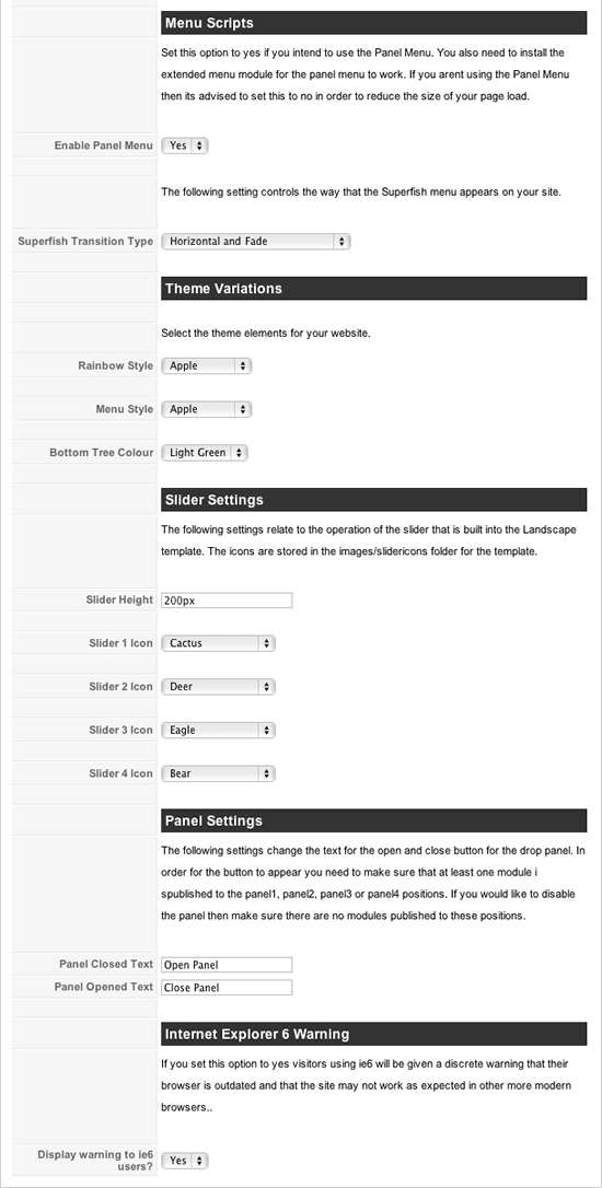
Snapshot of the template configuration
This group of settings control the implementation and the behaviour of the panel menu and the superfish menu. You also need to install and publish the extended menu module to the menu and left module positions for these settings to take effect.
Panel Menu
This option must be enabled if you want to use the panel menu on your site. When enabled the option includes the accordion script in the template allowing the extended menu to take advantage of the funky action and create a sliding/panel menu with your Joomla menu items. If you decide not to use the panel menu then its best for you to disable this option.
Superfish Transition Type
This option controls the behaviour of the animation on the superfish drop down menu. There are 7 transition settings to choose from - Vertical, Horizonal, Fade, Horizontal and Fade, Vertical and Fade, Horizontal and Vertical and Fade, Horizontal and Vertical.
Rainbow Style
This option allows you to select from the following options for the rainbow colour: Apple | Blue | Circus | Dirty | Green | Pale Pink | Pastel | Primary | Red | Rose | Spice | Sunrise | Vintage Blue | Vintage Red | Watermelon. The background image is controlled via class in the template_css.css file and the images are in the images/rainbow folder.
Menu Style
Select the colour for menu. Apple | Blue | Circus | Dirty | Green | Pale Pink | Pastel | Primary | Red | Rose | Spice | Sunrise | Vintage Blue | Vintage Red | Watermelon.
Bottom Tree Colour
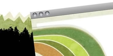
Select the colour scheme for forest illustration at the bottom of the page. The image files are located in the template's images/bg folder.Choose between Blue | Green | Light Green | Mauve | Natural | Orange | Pink | Red | Tan | Yellow
The next group of settings relate to the slider found underneath the content. The slider is automatically published when you assign two or more modules to the slide1, slide2, slide3, slide4 module positions.
Slider Height
Set the height of the slider
Slider1 Icon, Slider2 Icon, Slider3 Icon, Slider4 Icon
There are a choice of 77 different icons to choose from to act as triggers for each slider. Visit the content item for the Built IN slider to view them all.
Panel Closed Text
Select the text to be displayed when the panel is closed
Panel Open Text
Select the text to be displayed when the panel is open.
ie6 Warning
If you set this option to yes visitors using ie6 will be given a discrete warning that their browser is outdated and that the site may not work as expected in other more modern browsers.
The landscape template has a total of 36 module positions. Please use the image below as a guide. Please note the description of the positions are directly below the image.
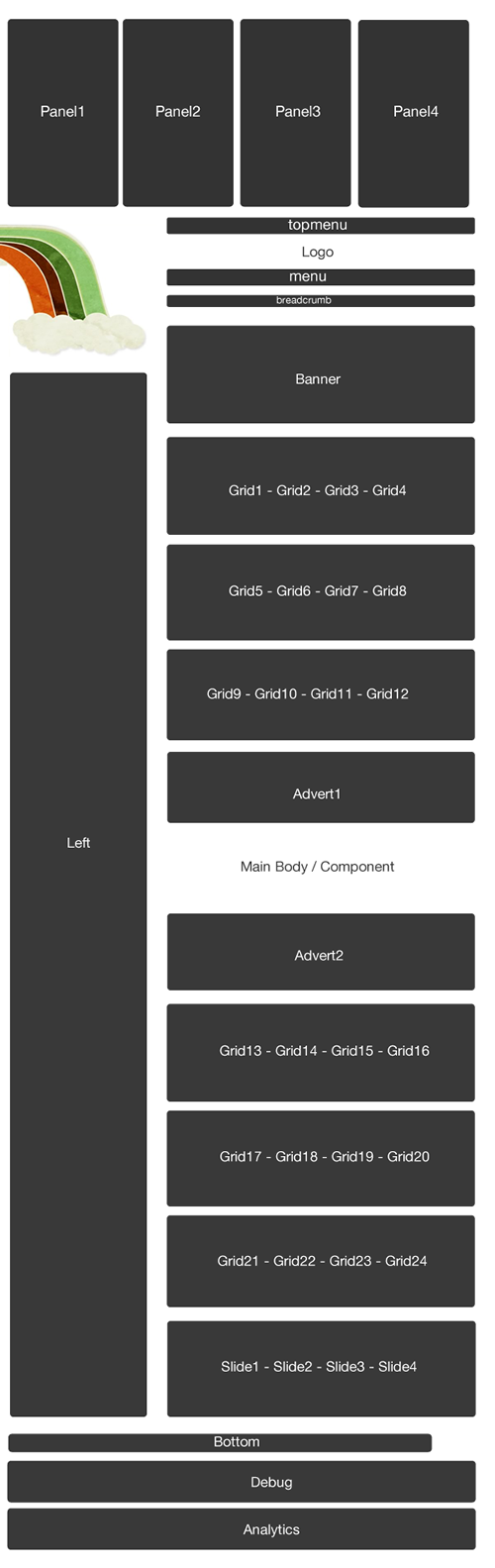
| Position | Description |
|
panel1 panel2 panel3 panel4 |
The panel1 to panel4 module positions are displayed at the top of the site and are hidden via the JB Drop Panel. The panel trigger is automatically displayed whenever you have a module published to any of the four modules positioned here. The demo site has an instance of the core login module, latest news, popular items and the Example Pages menu displayed in these positions. |
| topmenu |
This position sites above the main logo area and on the demo site contains a default Joomla menu published as a flat list. It is aligned to the right but will stretch to the full width of the page. |
| menu |
The menu position is the main nav for the site. You need to publish the extended menu module in this position and use the settings according to the superfish article. The menu needs to be published as a flat list to display the same way that it does on the demo site. |
|
grid1 grid2 grid3 grid4 |
The first row of the grid contains the modules: grid1, grid2, grid3 and grid4. These modules divide evenly across the page according to how many modules you have published. For example four modules take up 25% of the width, three modules take up 30% of the width two modules take up 50% of the width and one module takes up 100% of the width. |
|
grid5 grid6 grid7 grid |
The second row of the grid contains the modules: grid5, grid6, grid7 and grid8. These modules divide evenly across the page according to how many modules you have published. For example four modules take up 25% of the width, three modules take up 30% of the width two modules take up 50% of the width and one module takes up 100% of the width. |
|
grid9 grid10 grid11 grid12 |
The second row of the grid contains the modules: grid9, grid10, grid11 and grid12. These modules divide evenly across the page according to how many modules you have published. For example four modules take up 25% of the width, three modules take up 30% of the width two modules take up 50% of the width and one module takes up 100% of the width. |
| left |
The left position sits to the left of the main content area. The demo site uses a standard Joomla menu module set to flatlist and expand menu items with active parent highlighting on some pages and where you see the accordion menu published its using the accordion menu script with the extended menu module. See the content item on the accordion menu item. |
| advert1 |
This module position sits above the main content. The demo site does not use this position. |
| advert2 |
This module position sits below the main content. The demo site does not use this position. |
|
grid13 grid14 grid15 grid16 |
The second row of the grid contains the modules: grid13, grid14, grid15 and grid16. These modules divide evenly across the page according to how many modules you have published. For example four modules take up 25% of the width, three modules take up 30% of the width two modules take up 50% of the width and one module takes up 100% of the width. |
|
grid17 grid18 grid19 grid20 |
The second row of the grid contains the modules: grid17, grid18, grid19 and grid20. These modules divide evenly across the page according to how many modules you have published. For example four modules take up 25% of the width, three modules take up 30% of the width two modules take up 50% of the width and one module takes up 100% of the width. |
|
grid21 grid22 grid23 grid24 |
The second row of the grid contains the modules: grid21, grid22, grid23 and grid24. These modules divide evenly across the page according to how many modules you have published. For example four modules take up 25% of the width, three modules take up 30% of the width two modules take up 50% of the width and one module takes up 100% of the width. |
| bottom |
The bottom position sits below the main template container. The demo site has a standard Joomla menu module published here set to display as a flat list. |
| debug |
The debug position is the second last module position and can be used to test script and module output. |
| analytics |
The analytics module is at the very bottom of the page. In the template its placed just before the closing body tag which is an ideal place to position your analytics tracking code or any other javascript that needs to be positioned at the bottom of the page. |
The Landscape template has a jQuery driven slider built into the template. Its incredibly easy to use and all thats required is for you to publish at least two modules to slide1, slide2, slide3 or slide4 module positions and the template will do the rest.
You have probably already seen the slider on the front page of the Landscape demo but here is a screenshot.

The icons in the slider are controlled via the template parameters - go to Extensions > Template Manager and click on the JB Landscape template. You can select from 77 different slider icons to use as triggers to slide your content into view. The icons themselves are located in the images/slidericons folder of the template so its relatively easy to open up an icon and edit or replace with a different image of your choosing.
Here is a screenshot of the parameters available in the template administrator.

The icons come from the amazing resource over at Icons etc - top quality free icons freely available for download.
The JB Drop Panel is a flexible 4 module drop panel you can use on your site to create a secret panel area for hiding useful but not necessarily priority website content. Using the drop panel is as simple as publishing any module to the panel1, panel2, panel3 or panel4 positions.

The trigger for the panel automatically appears at the top right of the screen whenever any of these positions have modules published to them.
You can control the text for the button that triggers the drop panel in the template administrator. Changing the open and close text is as simple as changing two fields in the template administrator.