
This document is for the Zen Grid Bridge version of of the Ascent template.
For more information on the Zen Grid Bridge framework please see this document.
Common Overrides - ZGB based themes are a hybrid of the Zen Grid Framework and the One Web framework from Seth Warburton (Zen Grid Bridge themes use Seth's html overrides). So there may be some small differences for the styling of author, category, date etc when compared to the original release.
Interface - ZGB themes use the standard Joomla interface in the administrator and no longer sports the zgf interface that you will have used in Joomla 1.5 and Joomla 2.5.
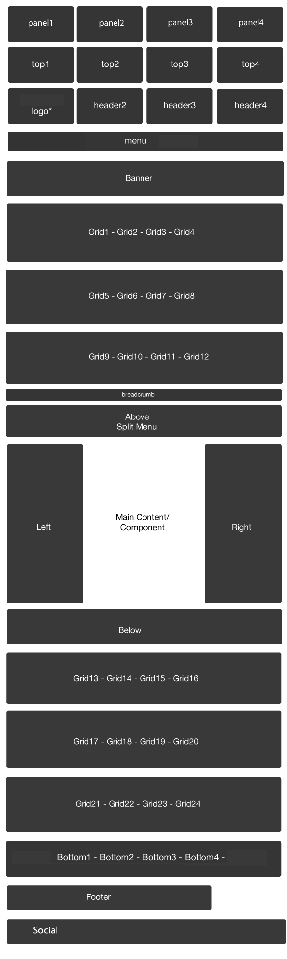
Logo control - ZGF themes use a module position called "logo" and do not provide any other control of the logo position except for font control. The font used for the logo module is set via the template admin while the content of the logo position is entirely set via what ever is published to that position. See below for more information.
Advert1 to advert6 modules no longer available - The Advert1 to 6 module positions have been replaced by the above and below module positions.
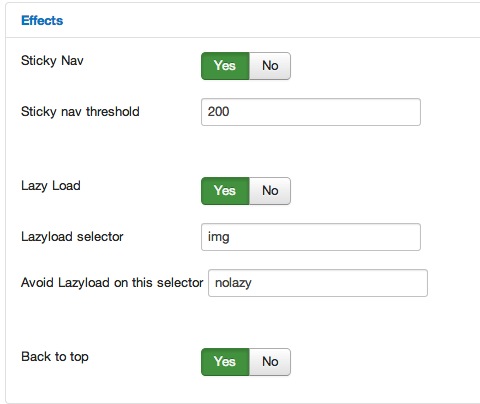
Layout control uses new settings - Please see below for a description of how layouts of modules can be set. jQuery is loaded via Joomla - ZGB themes use the standard Joomla 3 method of using jQuery on the page.
Copyright is now in a module rather than the template - See below
Social icons are rendered via the Zen Social module - See below
Toggle Menu is the only mobile option - Previous Zen Grid Framework themes had the option of using a select menu however this is not available in the bridge themes.
The content for the logo in all Zen Grid Bridge themes is created via publishign a custom html module to the logo position.
Please note this is a different method to creating the module that users of the previous version of this theme would be used to.
It is still possible to create either google font rendered text based logos or use image based logos.
Creating the logo position:
1. In your Joomla administrator naviugate to the module manager via extensions > moduel manager.
2. Click the new button on the top left of the screen.
3. Select Custom HTML module
4. Create a title for the module that you will easily recognise later eg Site Logo.
5. Assign the module to the "logo" position.
6. Ensure that the module title is set to hide.
7. Click on the "Custom Output" tab.
8. Add your logo content:
a. Using a font for the logo text.
If you are using just text for your logo you can add the logo content as per the following.
<h2>My site logo</h2> <p><em>My tagline</em></p>
- You can use any tag that you like here.
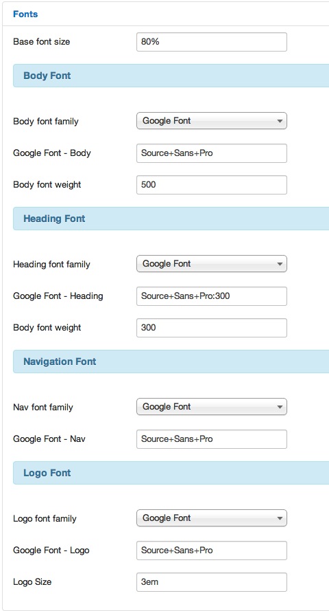
- The font family for the h1,h2,h3,h4,h5,h6 headings are controlled via the template settings. You can assign a google font to be used for your logo here.
b. Using an image for your logo.
Using a logo in this position is as simple as using the default Joomla editor image upload feature to insert an image into the module.
The Zen Grid Bridge based themes use the Zen Social module to replicate the social icons seen in earlier versions of this template.
There may be visual variations with the social icons used in the Zen Social module. This module uses font icons to render the social icons. The colour, size and position for the social icons can be controlled via the module settings.
The Zen Social module must be published to the social module position to replicate the styling seen in the original Ascent template.
Copyright can be added to your site by publishign a custom html module to the copyright position.
This will automatically be positioned to the right of the footer position at the very bottom of the page.
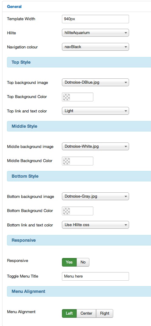
Template Width
Sets the maximum width for the template - can be px or % value.
Hilite
Sets the colour scheme for the template.
Loads a separate css file found in the css/ folder fo the template.
Navigation Colour
Sets the background colour for the menu
Top Style
Sets the background image and or colour for the area above and including the banner.
Middle Style
Sets the background image and or colour for the main content area below the banner row and above the footer row.
Bottom Style
Sets the background image and or colour for the area below the main content area.
Responsive
Allows the user to enable or disable the responsive features of the template.
Toggle Menu title
If responsive is enabled this sets the string used for the word that triggers the opening of the toggle menu on small screens.
Menu alignment
Sets the left, center or right alignment of the menu.
The Ascent Zen Grid Bridge theme uses a toggle menu for displaying the menu on small screens. The mobile menu is a separate module position called "togglemenu" and is automatically displayed when the browser is narrower than 740px.
To display a menu for small screens simply publish a new menu module to the togglemenu position.