Knowledgebase

Joomlabamboo template and extension documentation

Compatible with Joomla 2.5 / Joomla 3+ and uses the T3 framework .

Please note: This template uses the T3 framework. You can download the latest release of the T3 plugin directly from the T3 GitHub repository.

Need help getting started?

The following links may be helpful if you are new to Joomla, T3 or our templates.


Useful T3 documentation

If you are new to T3 please read through the following resources to better acquaint your self with how T3 works.

Overview of default template settings

The screenshots below are taken from the template administrator and highlight the default settings for this template.

Creating columns in megamenu
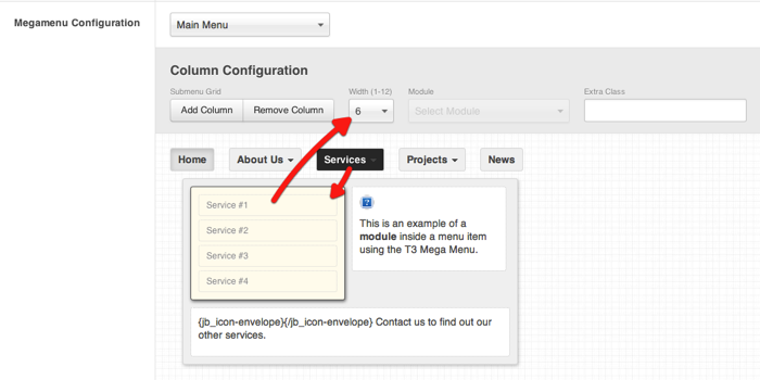
Creating+columns+in+megamenu.png

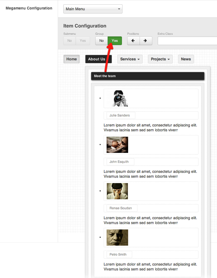
Grouping items in megamenu

Grouping+items+in+megamenu.png

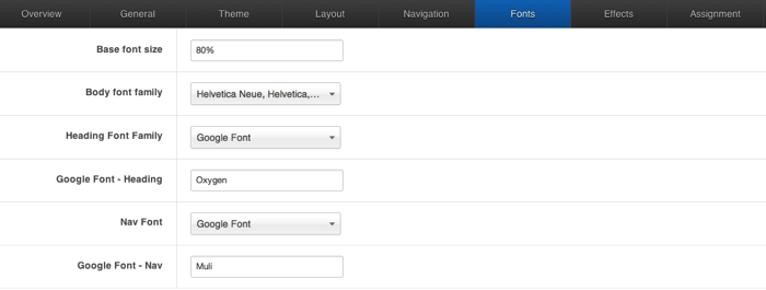
Inspire font settings

Inspire+font+settings.png

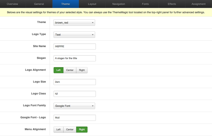
Inspire theme panel

Inspire+theme+panel.png

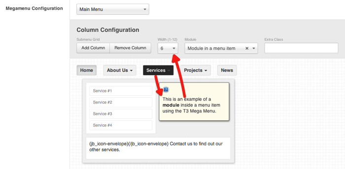
Module in Megamenu

Module+in+Megamenu.png

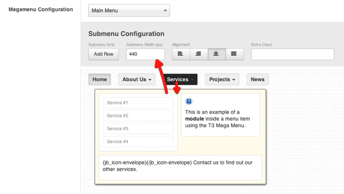
Setting width of megamenu dropdown

Setting+width+of+megamenu+dropdown.png

Starting with Inspire from a fresh installation.

The following steps outline the process involved for setting this template up in a new or existing Joomla installation. Please note: We recommend users use our quickstart packages if they have the opportunity to start completely from scratch.

Elements to install

  • Install the Inspire template and make it the default - Download
  • Install and enable the T3 Framework plugin - Download
  • Install JB Type - required for typography and font icons - Download
  • Install Zentools - slideshows, banners, grids etc - Download

Elements to modify

  • Change the position of the "Main menu" module to the "menu" position.
  • Set the "Show Title" setting of the main menu to Hide.
  • Remove the module and menu classes nav_pills and _menu in the advanced parameters for the menu module.
  • Change the position of the breadcrumb module to the "breadcrumbs" position.
  • Ensure that the module title for the breadcrumb module is also set to hide.
  • Depending on your needs you may like to set this module to not appear on the front page via the menu assignment settings in the module.

What's next?

At this stage you will have a very basic looking template ready for you to customise, add your content and start setting up the other modules you can see on the demo for the Inspire template.

For more information on replicating the front page layout or other extensions used on this site please read the information provided on the frontpage and extensions tab.
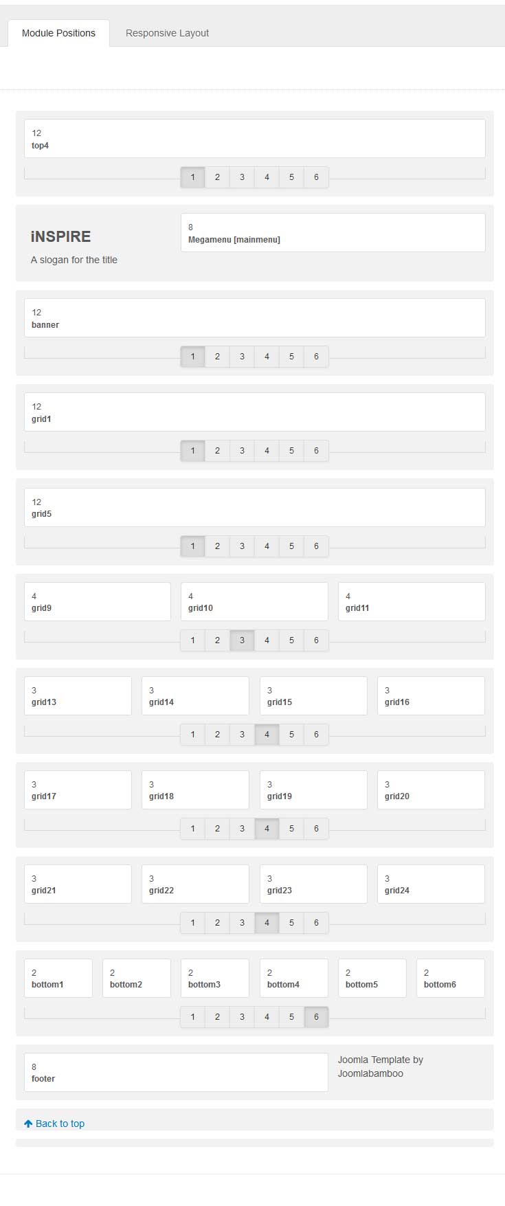
Available module positions

image

Template colour schemes

The following colours are the primary and secondary colours used in the inspire template styles.

blue

blue_red

brown

brown_red

dark

dark_blue

deeppurple

deeppurple_red

eggplant

green

green_red

grunge

grunge_red

pink

Module Classes

About module class suffixes

Module classes are a core Joomla functionality that allow the user to specify how a specific module will appear. The class itself is added to the module in the module parameters.

Combining module classes:

Module classes can be combined to take advantage of multiple complementary styles. An example of a module class suffix using a combination of classes: "hot primary1 top50".

Structural classes

Structural classes can be used to change the general layout or structure of a module.

  • nopadding - this class removes all padding that may be set by default by the template.
  • The following classes are micro adjustment classes that allow you to adjust the top offset of a module in increments of 25px. They start at 25 and move through to 500px offsets in 25px increments.
  • top25
  • top50
  • top75
  • top100
  • top125
  • top150
  • top175
  • top200
  • top225
  • top250
  • top275
  • top300
  • top325
  • top350
  • top375
  • top400
  • top425
  • top450
  • top475
  • top500

Appearance classes

Our themes use a combination of two colours to determine the colour scheme for each template style. In general the colours are determined by the following formula:

  • primary1 - uses the base primary colour
  • primary2 - uses a colour 15% darker than the default primary colour.
  • primary3 - uses a colour 15% lighter than the default primary colour.
  • secondary1 - uses the base secondary colour.
  • secondary2 - uses a colour 15% darker than the default secondary colour.
  • secondary3 - uses a colour 15% lighter than the default secondary colour.
  • dark
  • light
  • inset
  • shadow
  • shadow2
  • border
  • corner
  • hot
  • new
  • icon icon-[icon name]

Mobile classes

Module classes for mobile viewing (mediaqueries classes).

Class Mobile max-767px Tablets 768px to 979px Desktop min-980px
.visible-phone Visible
.visible-tablet Visible
.visible-desktop Visible
.hidden-phone Visible Visible
.hidden-tablet Visible Visible
.hidden-desktop Visible Visible

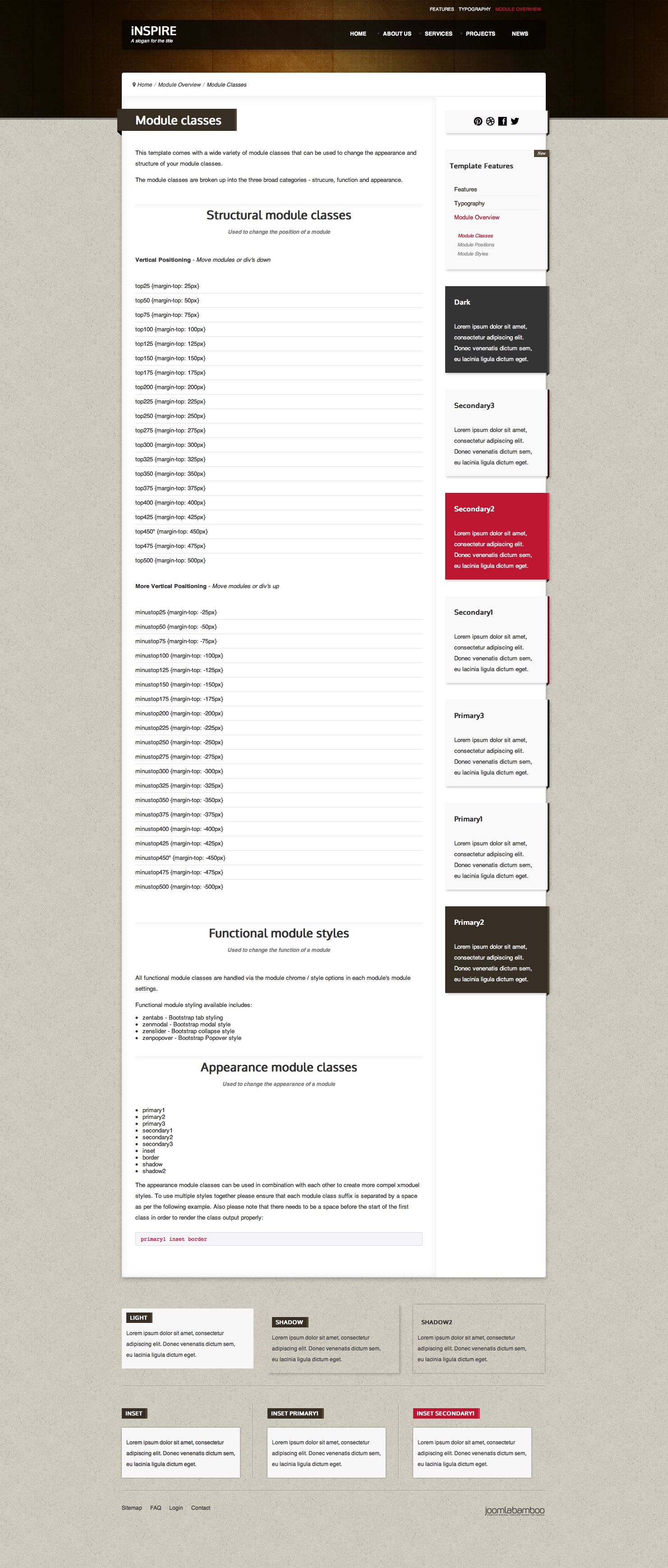
Screenshots of module classes used in the inspire template

The screenshots below highlight the specific implementation or appearance of the module classes found in this template.

Inspire module classes
Inspire+module+classes.jpg

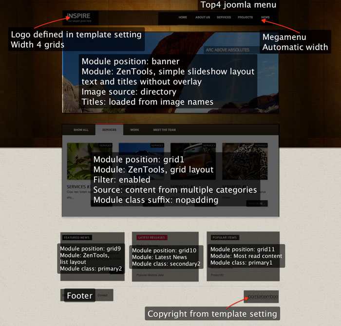
Frontpage Overview

image

Description

Frontpage setup

Like was mentioned before, frontpage is using specific template style with layout called: "default-home".

  • Menu Megamenu defined inside template setting.
  • Logo Logo is defined inside template setting as text with height 2em. IMPORTANT: when you switch to image logo, font-size defined for text logo will still adjust height of logo area.
  • Grid1 Contains ZenTools module width grid layout, to get tabs on top you need enabled filter.
  • Grid9 ZenTools module with list layout, 1 list item, module class suffix: primary2
  • Grid10 Latest news, module class suffix: secondary2
  • Grid11 Most read content items, module class suffix: primary1
  • Footer Menu Menu published to footer position.

Extensions used on the demo site