Please note: This template uses the T3 framework. You can download the latest release of the T3 plugin directly from the T3 GitHub repository.
The following steps outline the process involved for setting this template up in a new or existing Joomla installation. Please note: We recommend users use our quickstart packages if they have the opportunity to start completely from scratch.
At this stage you will have a very basic looking template ready for you to customise, add your content and start setting up the other modules you can see on the demo for the Newstream2 template.
For more information on replicating the front page layout or other extensions used on this site please read the information provided on the frontpage and extensions tab.
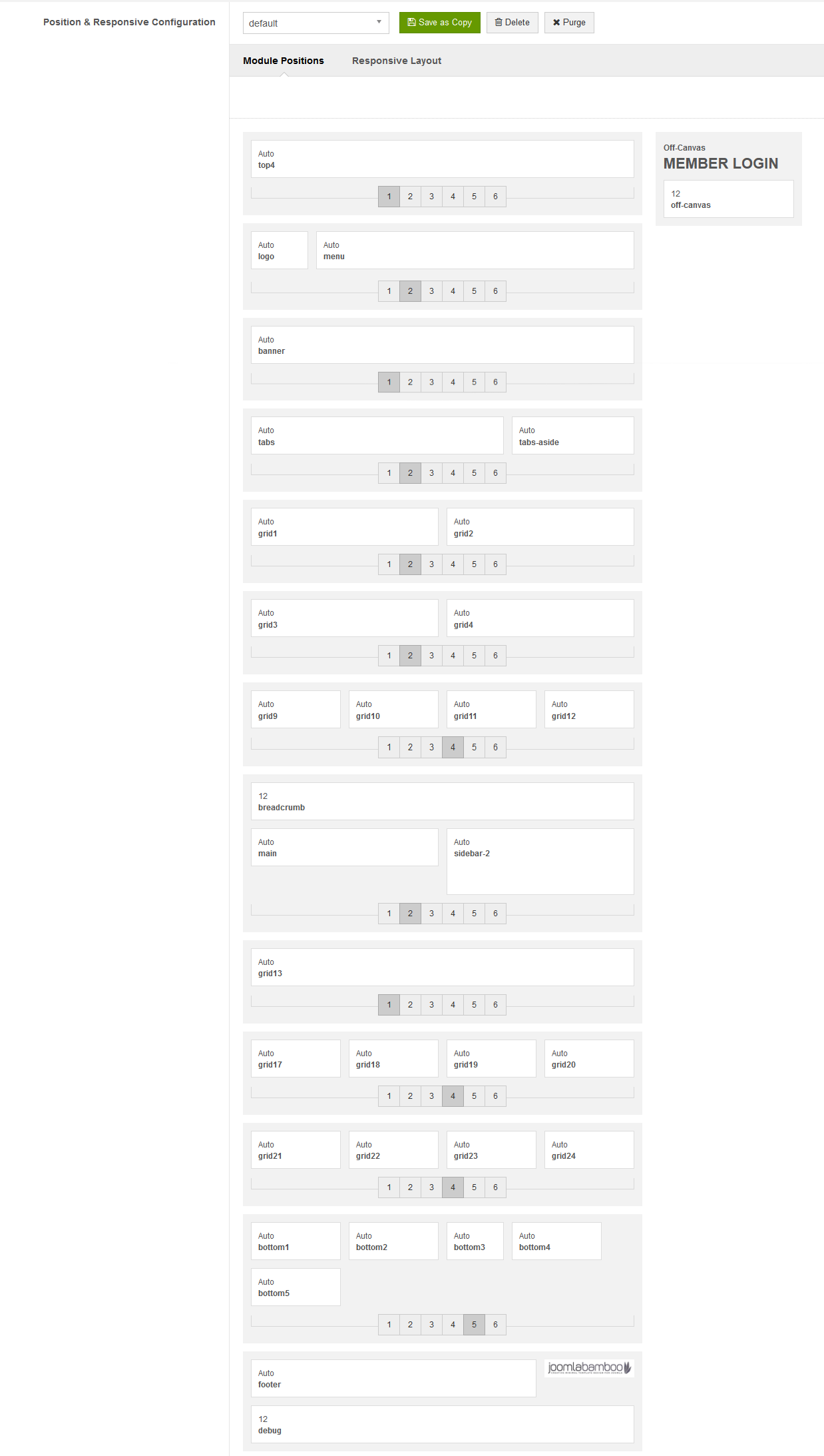
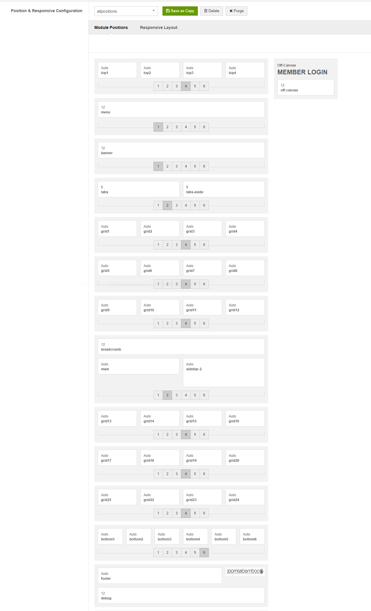
Newstream2 has the ability to create different layouts within different template styles.
A new Newstream2 template style can be created in Joomla by using the save as copy button in the template admin. Using multiple template styles makes it possible to create layouts with different module positions and widths that can be used on different pages of your site.
Newstream 2 uses three styles - one for the front page, one for all the sub pages and one for the all positions page.
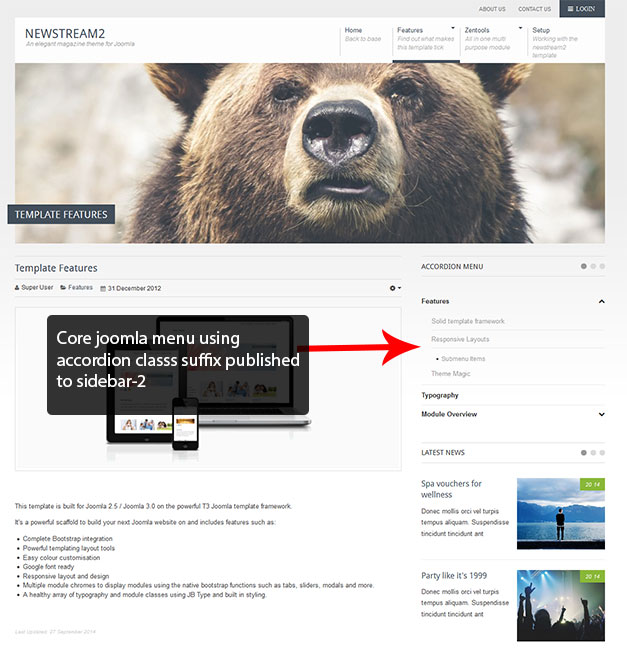
The sub pages of the Newstream2 demo site use a number of modules published to the sidebar-2 position, these include an accordion menu and several Zentool modules.
An Accordion menu is published to the sidebar-2 position and together with template settings utilises the Accordion module class suffix (and is added to the modules advanced settings tab).
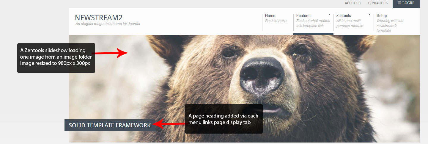
A Zentools slideshow module is published to the banner position on all sub pages. These modules only load the one image from an image directory/folder. The page header sits on top of the module.
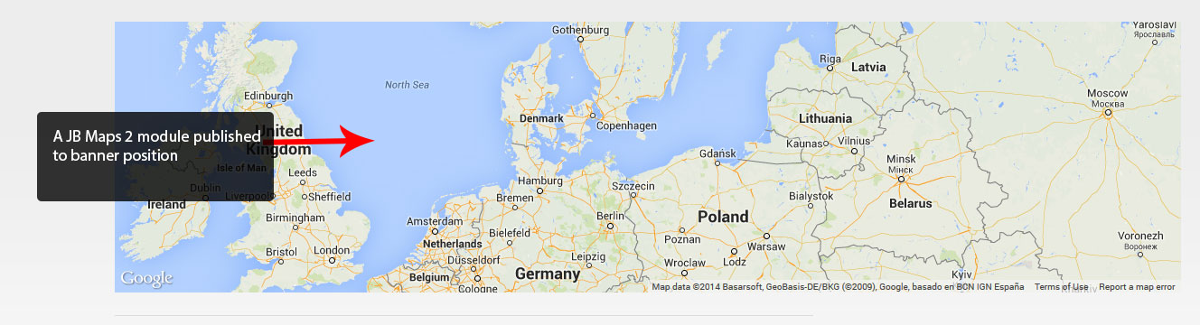
Published to the banner position on the contact form page is a JB Maps 2 module. For more information on this very comprehensive mapping module, check out the JB Maps 2 documentation page.
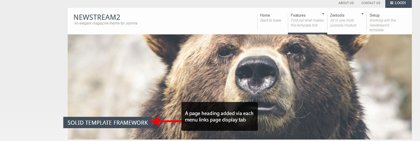
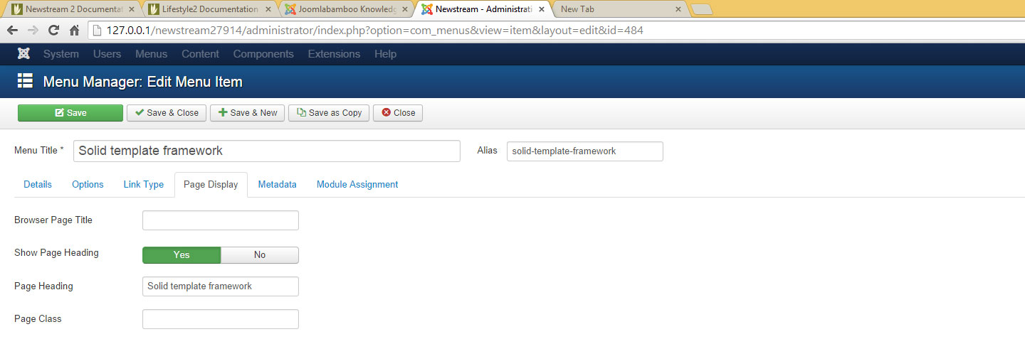
Each page apart from the home page has a page heading added, these are added using the page display tab of each menu link.
Module classes are a core Joomla functionality that allow the user to specify how a specific module will appear. The class itself is added to the module in the module parameters.
Module classes can be combined to take advantage of multiple complementary styles. An example of a module class suffix using a combination of classes: "hot primary1 top50".
Structural classes can be used to change the general layout or structure of a module.
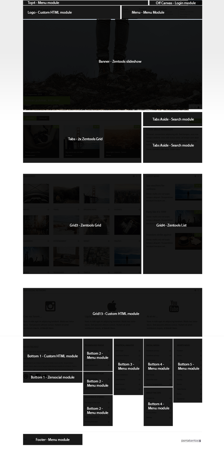
These are position widths assigned to these frontpage modules
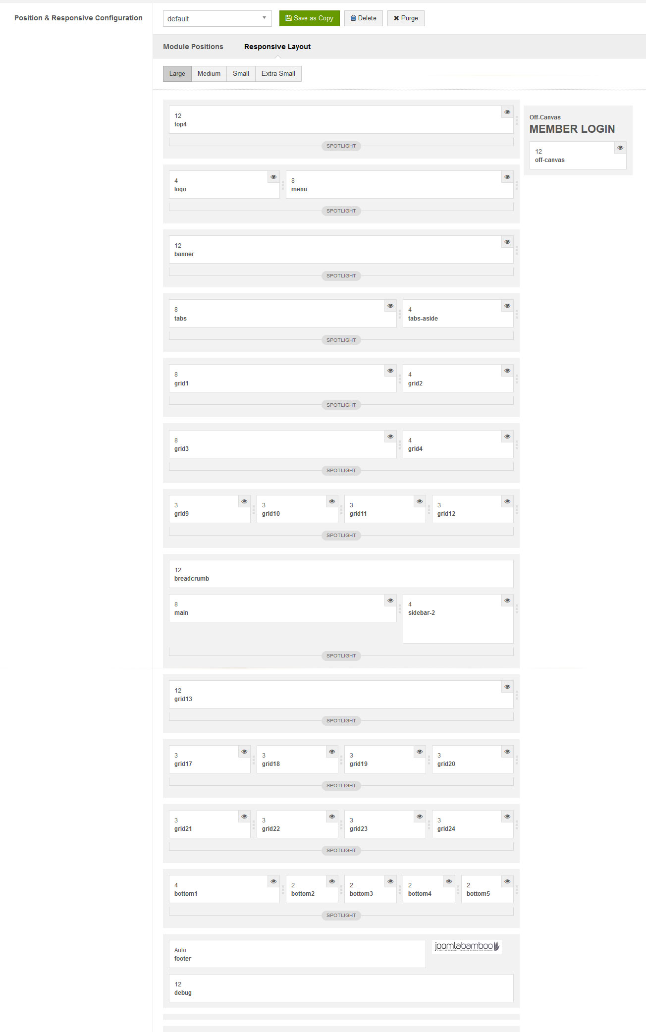
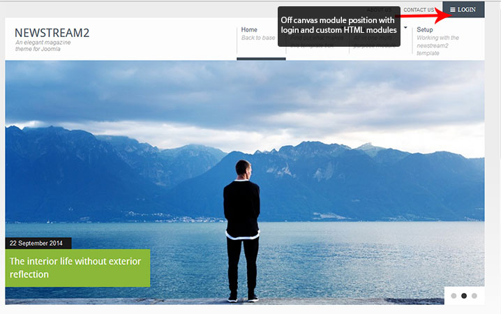
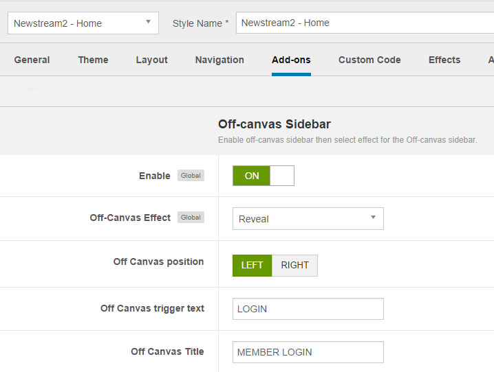
The “Off Canvas” position contains a login module and a Custom HTML module, the options for this position are found in the Add On tab of the template settings.
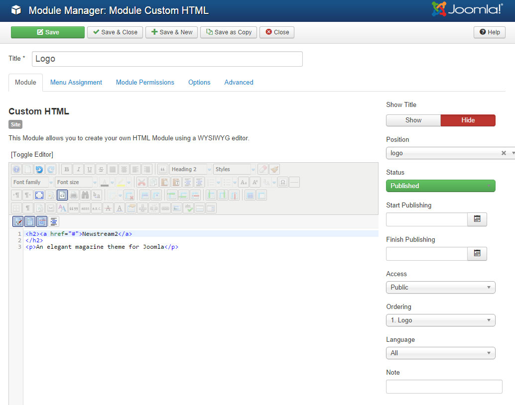
The logo is a Custom HTML module published to the “logo” position and is formatted in this example using a h2 tag for the logo and p tag for the tag line.
The T3 mega menu uses columns with inserted modules and icons
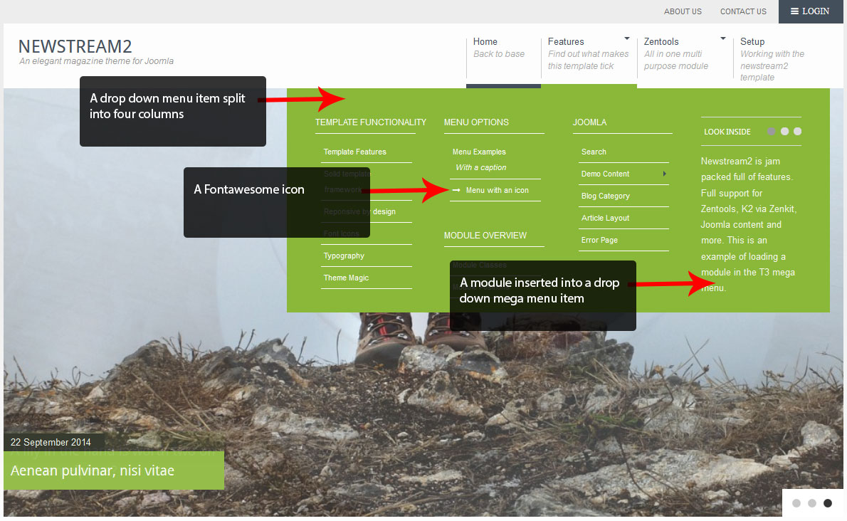
For more information about working with a mega menu take a look at the following:-
Multi Column tutorial
Adding icons
Adding a module
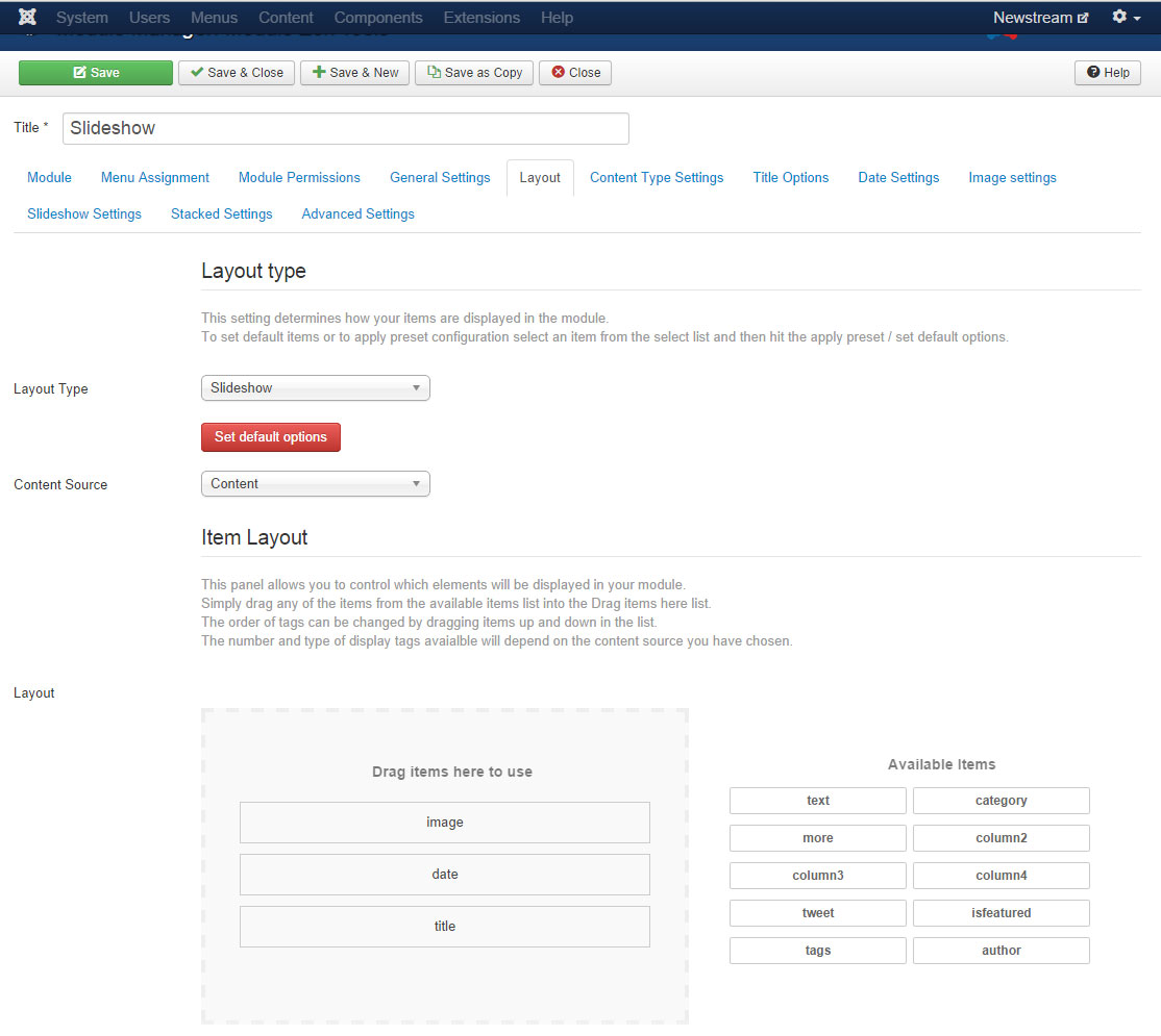
A standard themed Zentools slideshow is published to the Banner position and is assigned to the Home page only. The item layout is image, date and title with the content being loaded from the Slideshow category.
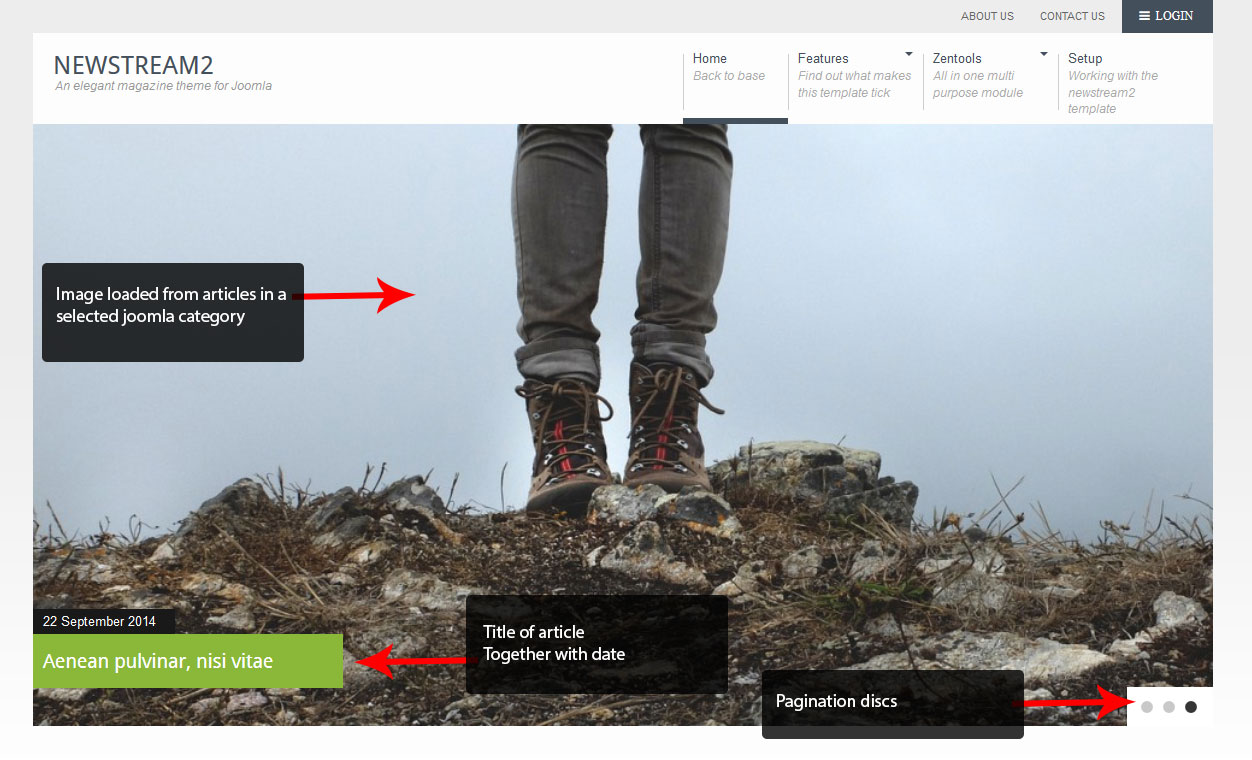
Home Page slideshow Item layout
The date options are as follows:-
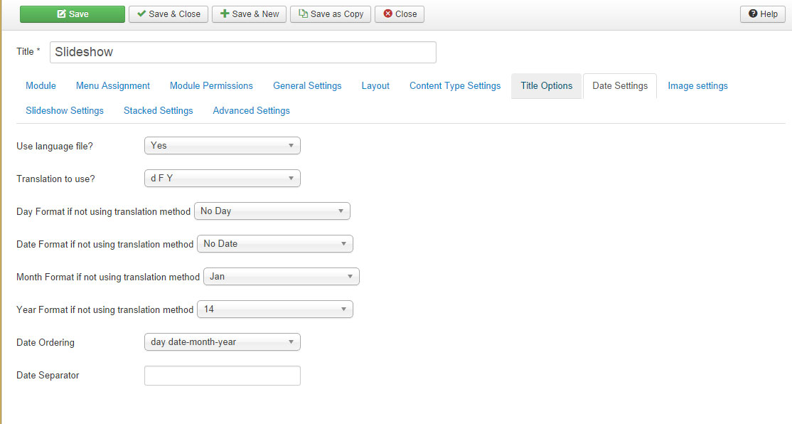
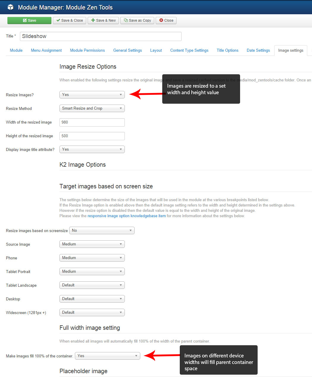
Image Settings
The image settings are as follows:-
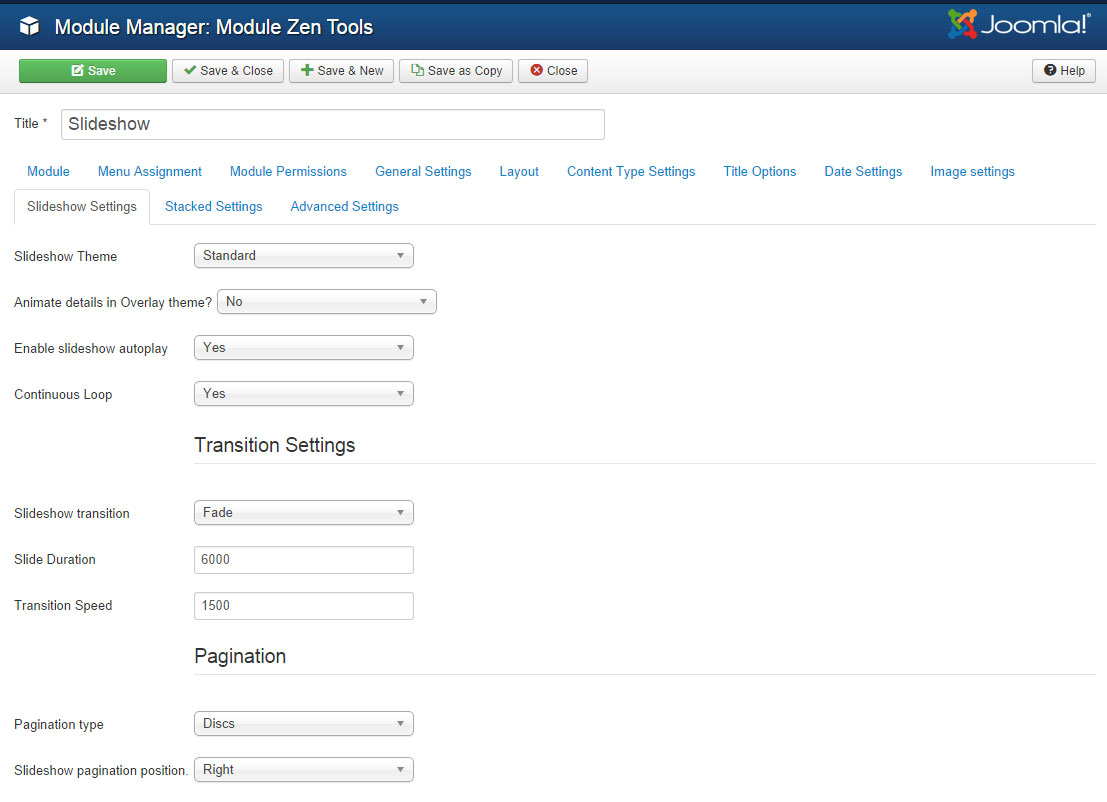
Slideshow Settings
The slideshow uses the standard theme together with fade transitions and disc pagination.
Two Zentools grid style modules are published to the tabs position.
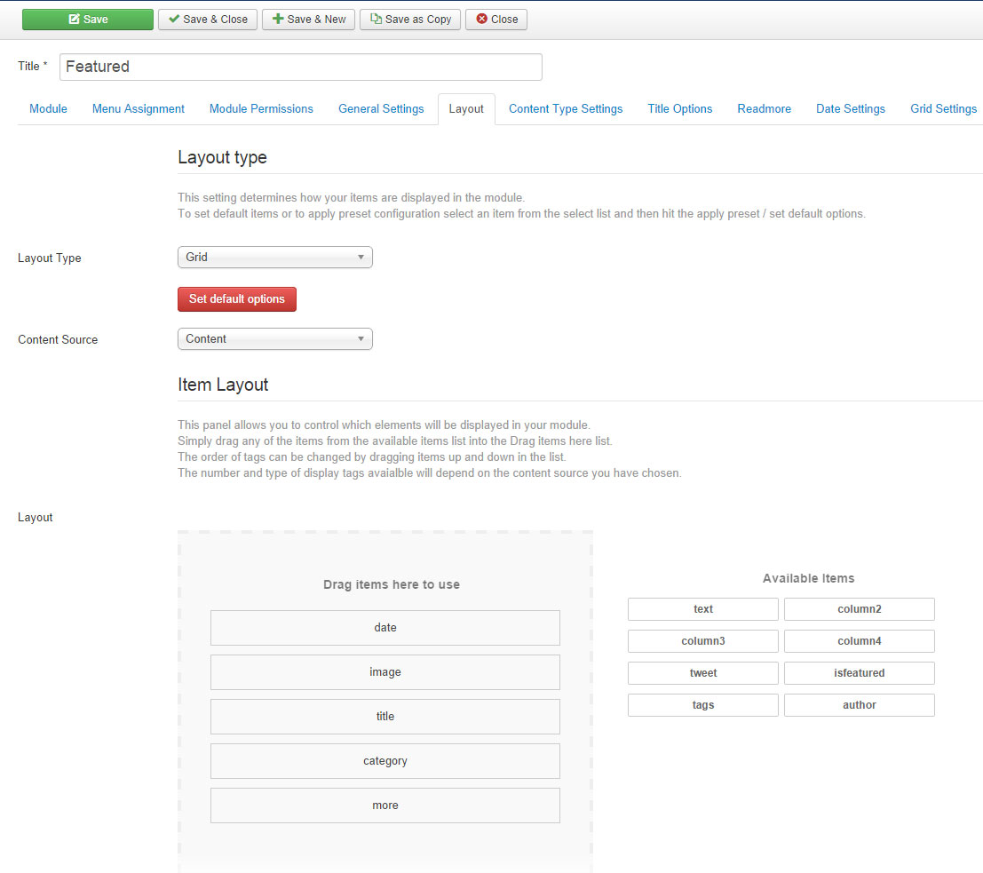
Item layout and content type settings
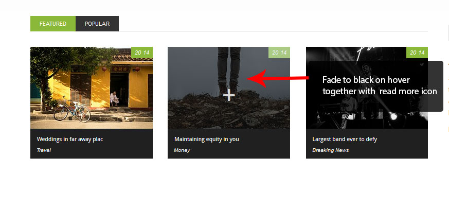
The Zentool modules use the following items in the item layout - date, image, title, category and more. The content options settings load 3 random articles from several categories.
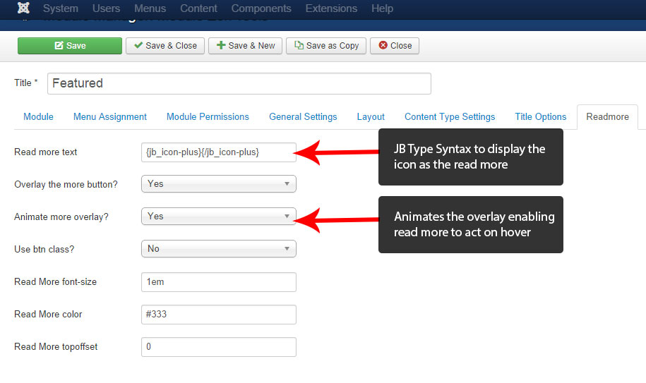
Read more
The read more text uses the JB Type syntax to add the icon, which is then displayed on hover.
Date Settings
The date options are as follows -
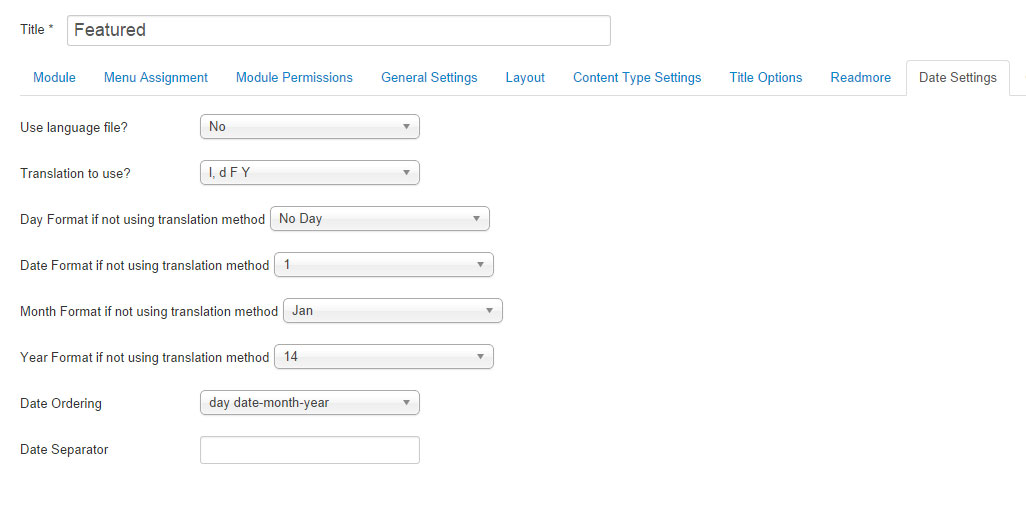
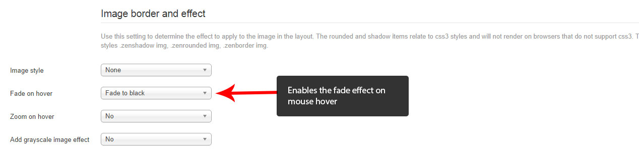
Image resize options
In the image settings tab as well as resizing of the images it enables the black hover effect.
Tabs Aside
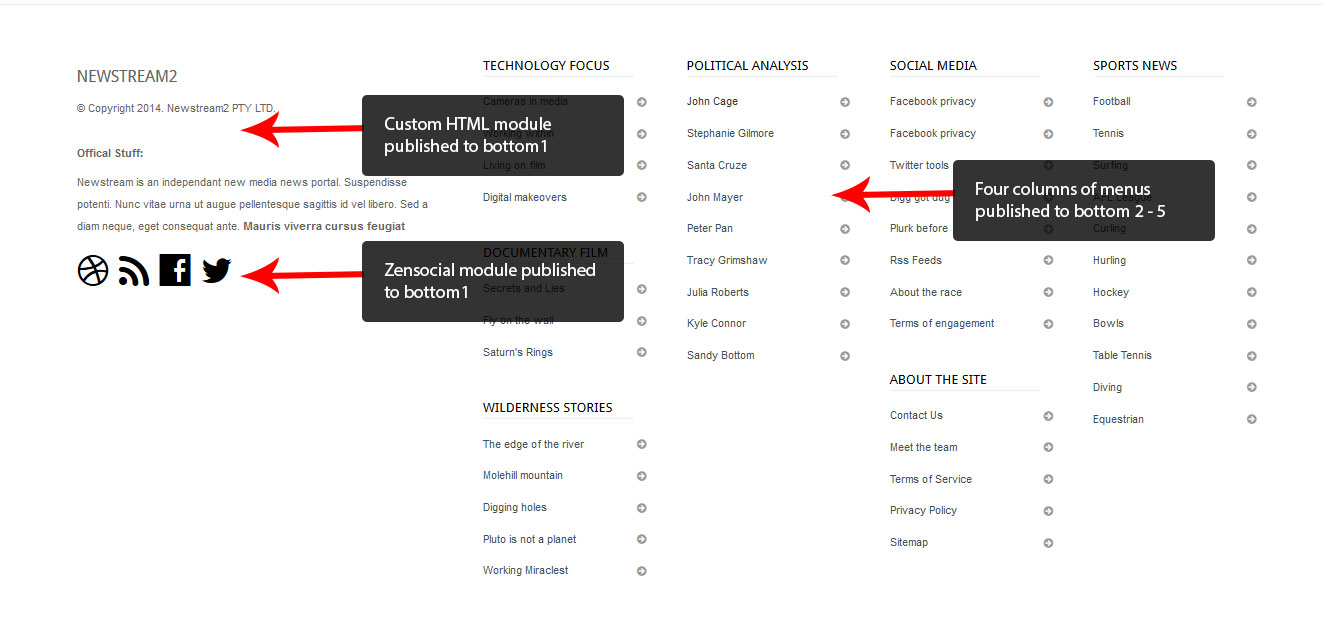
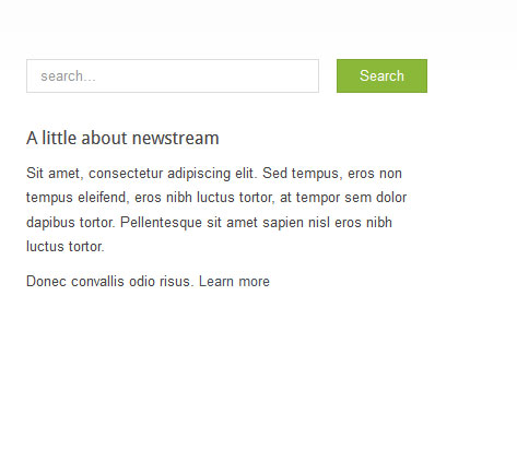
This position contains a search module and Custom HTML module.
Zentools categories published to Grid3 module
This module is set to display various selected Joomla categories using the Zentools layout and category setting tabs - the category images and titles are displayed in a grid layout.
Item Layout and Category selection
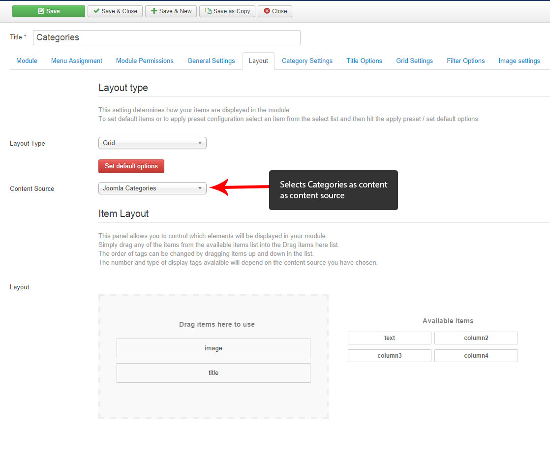
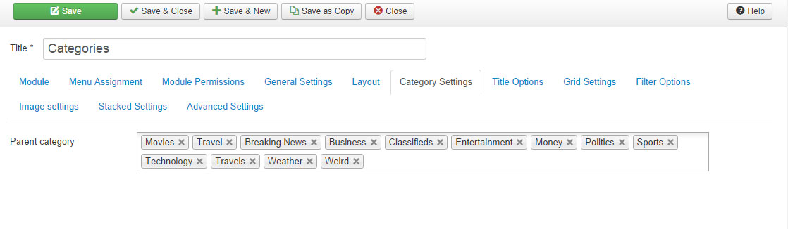
Image Settings Tab - Responsive image settings
This module uses the responsive image settings which can be seen below:-
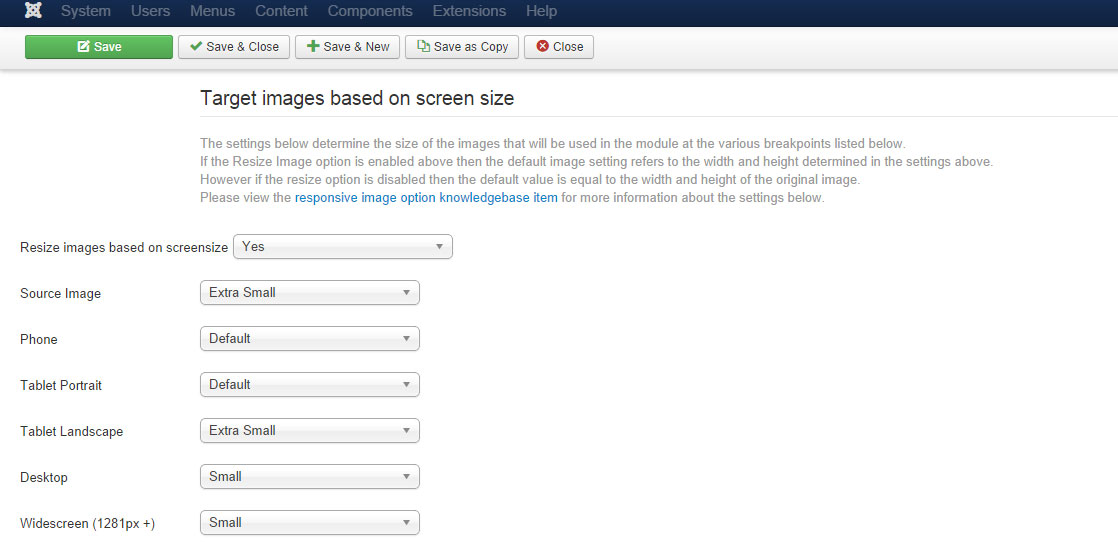
For more information on this feature please check out the Specifying image sizes doc
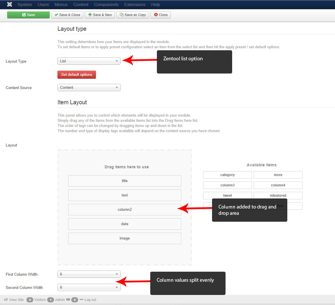
Zentools published to Grid4 as latest news
A Zentools list is used to display the latest news content in the grid4 position. The item layout uses title, text, column2, date and image and the column widths are split evenly.
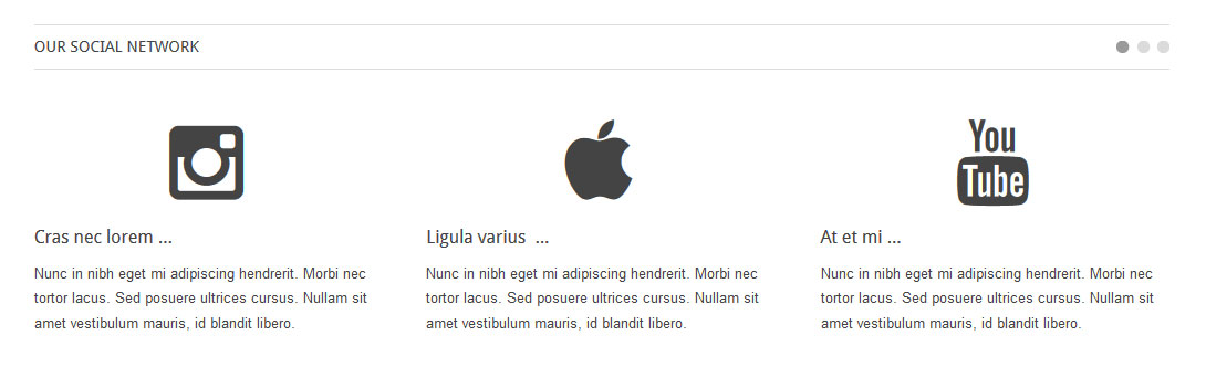
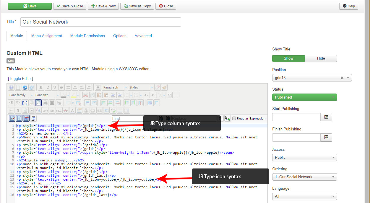
Our Social Network published to the position Grid13
This is a Custom HTML module that displays 3 icons and is split into 3 columns both using the JB plugin syntax.
Bottom Modules and Zensocial