Please note: This template uses the T3 framework. You can download the latest release of the T3 plugin directly from the T3 GitHub repository.
All Themes built prior to January 2013 were built using the Zen Grid Framework while all themes after January 2013 were built using the T3 plugin. A select number of themes from before January 2013 have been moved to the T3 plugin.
The following steps outline the process involved for setting this template up in a new or existing Joomla installation. Please note: We recommend users use our quickstart packages if they have the opportunity to start completely from scratch.
At this stage you will have a very basic looking template ready for you to customise, add your content and start setting up the other modules you can see on the demo for the Base3 template.
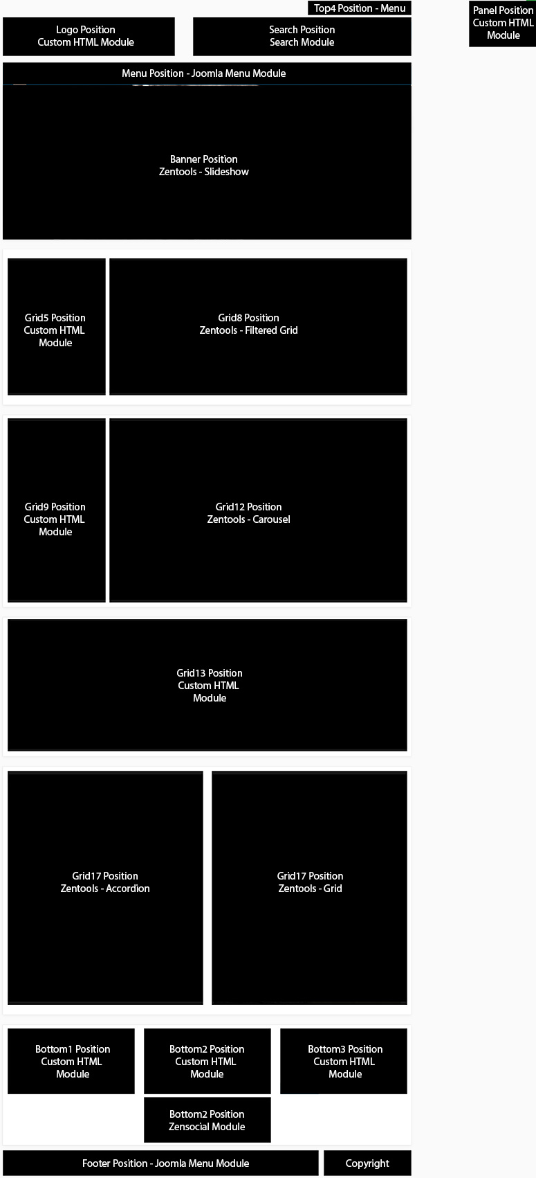
For more information on replicating the front page layout or other extensions used on this site please read the information provided on the frontpage and extensions tab.
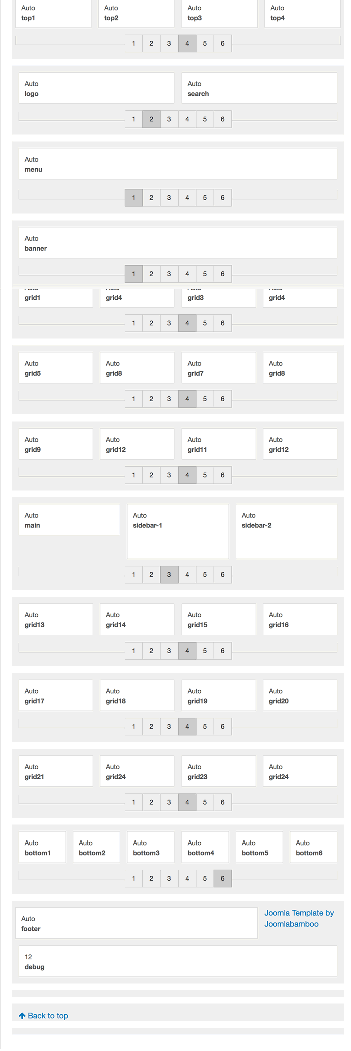
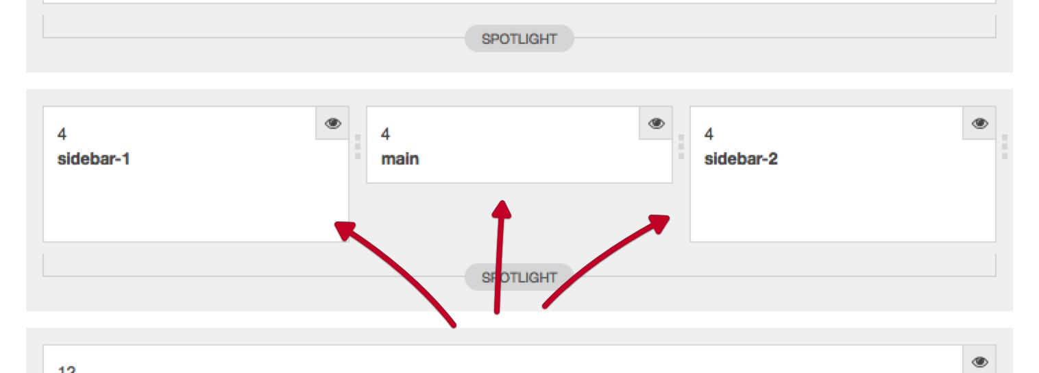
One of the big changes to the Base3theme is the ability to control the main content and sidebar widths from the template admin. If you have used our previous T3 themes (or any other T3 themes) then you will know that this is a quirky limitation in an otherwise highly configurable template.
The Base3theme changes this by adding the ability to determine the number of sidebars available in the template and also to use the draggable layout controls to determine the widths of these areas. Because of the way that the T3 framework calculates column widths we now need to duplicate template styles if you want to have pages with a different number of sidebars.
Once the main content area is enabled you will now see the main content block in the layout schematic under the layout panel. It is now possible to adjust the number of items in the main content. For best results we advise that you use up to 3 positions here.
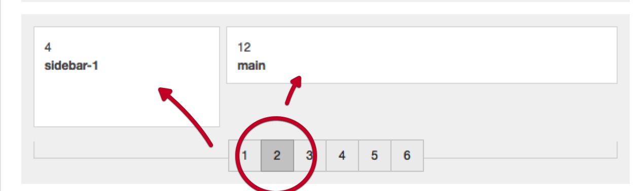
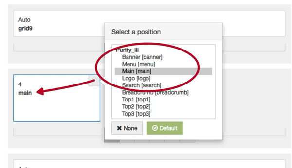
Once you have selected the number of sidebars you want to display for this template style you can then assign the positions of the main content and sidebars.
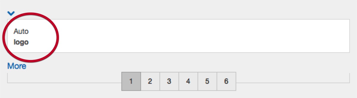
Another change to the way our themes work is that much of the logo functionality has been moved out of the template. Previously the logo content was generated and controlled via the template settings however now the logo is controlled via a custom html module position.
The first part of the step is to create a new custom html module.
Once you have created a custom html module and published it we need to assign the logo position in the template's layout schematic. Just in the same way we assigned the main content or sidebar blocks to the page we also need to assign the logo to a position. By default the logo is positioned in the position that you see on the demo, however this is easily changed to a new position as per the screen shot below.
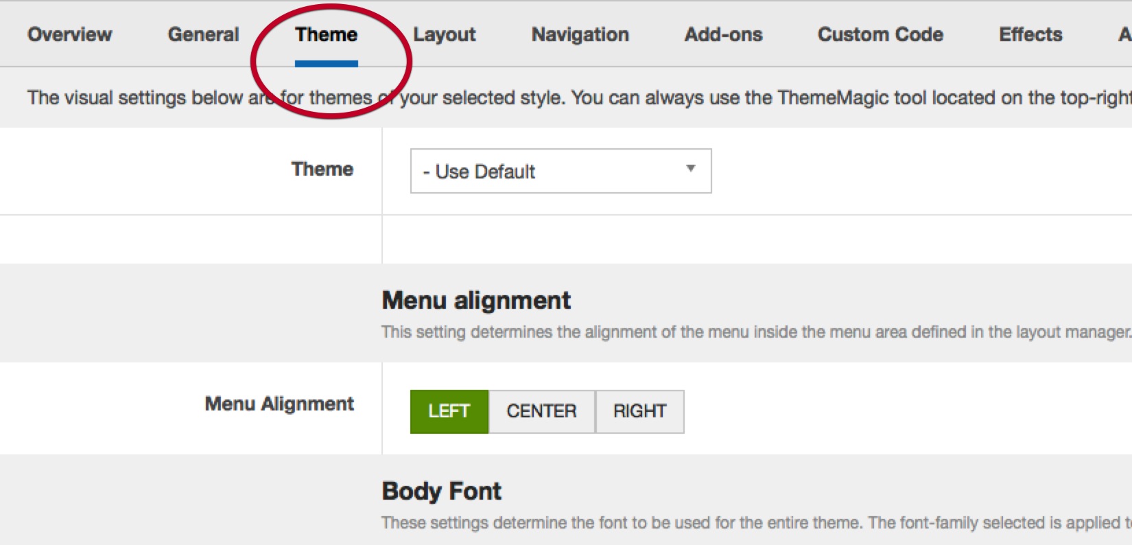
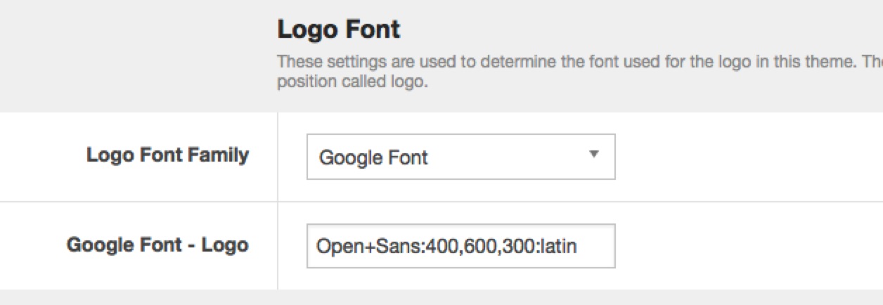
The logo font is controlled under the Theme menu item in the template administrator. The template automatically targets the module that is positioned to the logo position with the required settings to allow you to control the font-family used for this area of the template.
The menu position in this template is also able to be positioned effectively anywhere on the page via the use of the T3 layout tool.
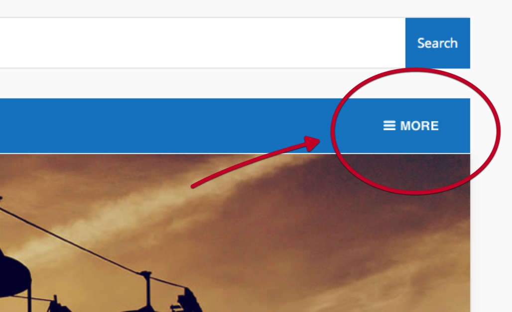
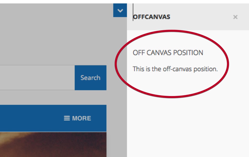
The offcanvas panel is a secondary content area that is hidden from the page until a user clicks on the off canvas toggle button. In the Base3theme this toggle button is positioned in the navbar to the right of the main menu.
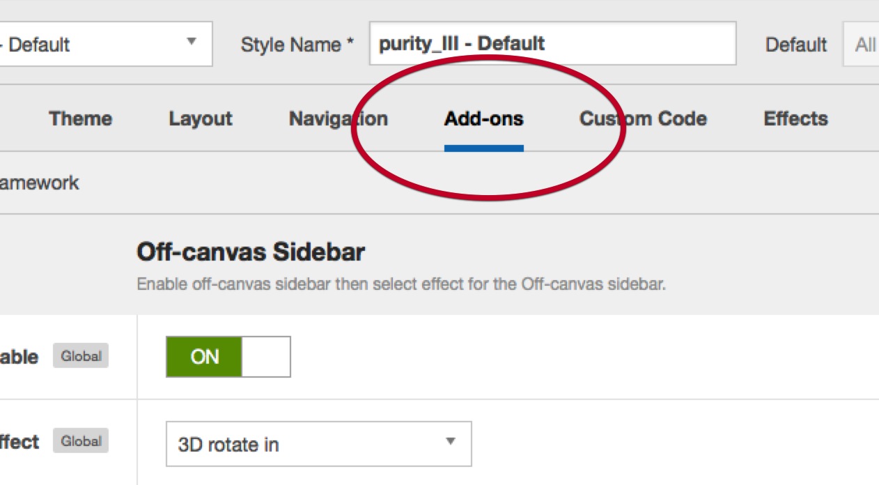
The off canvas settings are available under the addon panel in the template admin.
The off canvas settings are available under the addon panel in the template admin.
In addition to needing to publish a module to the off canvas module position you also need to ensure that the off canvas function is enabled.
You can choose from fourteen different animations for the off canvas effect.
This setting determines the position of the page the off canvas is located. Left is to the left of the page while right is to the right of the page.
This is the text used to accompany the button that triggers the off canvas effect.
Off-canvas Title
This is the text that is placed at the very top of the off canvas area above the off canvas content.
Module classes are a core Joomla functionality that allow the user to specify how a specific module will appear. The class itself is added to the module in the module parameters.
Module classes can be combined to take advantage of multiple complementary styles. An example of a module class suffix using a combination of classes: "hot primary1 top50".
Structural classes can be used to change the general layout or structure of a module.
In order to enable the accordion menu on your site you need to follow three key steps.
The accordion settings can be found in the template administrator under the effects panel. Ensure that the "enable accordion" menu item is enabled.
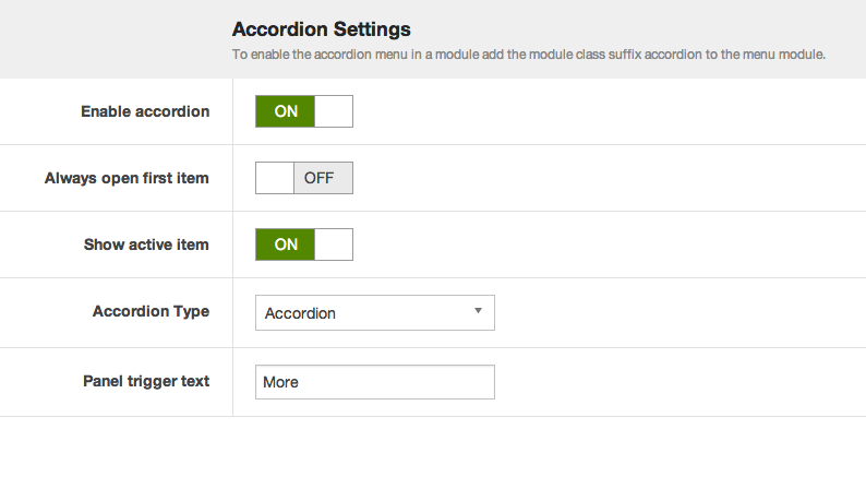
Other accordion menu settings explained:
Always open first item
This setting means that when the accordion is loaded on the page the first item in the menu will always be open.
Show active item
When enabled this option ensures that the active menu item will always be open on the page.
Accordion Type
The Accordion menu type means that when one menu item is opened then the previously opened item is closed. While the panel option means that when menu items are clicked open items remain open. In order to close each menu level the user needs to click on the top level menu item for that accordion level.
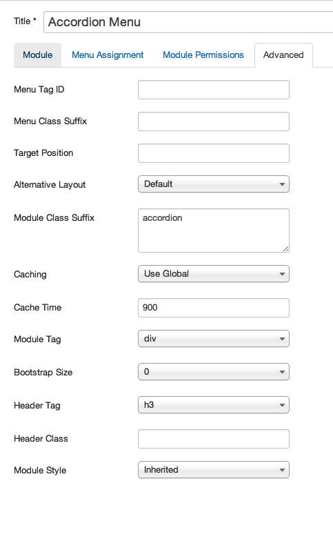
Now that the accordion menu scripts have been added it is necessary to add a module class suffix to the menu module. Adding the "accordion" module class to the module class suffix will automatically apply the correct code required to create the accordion menu.
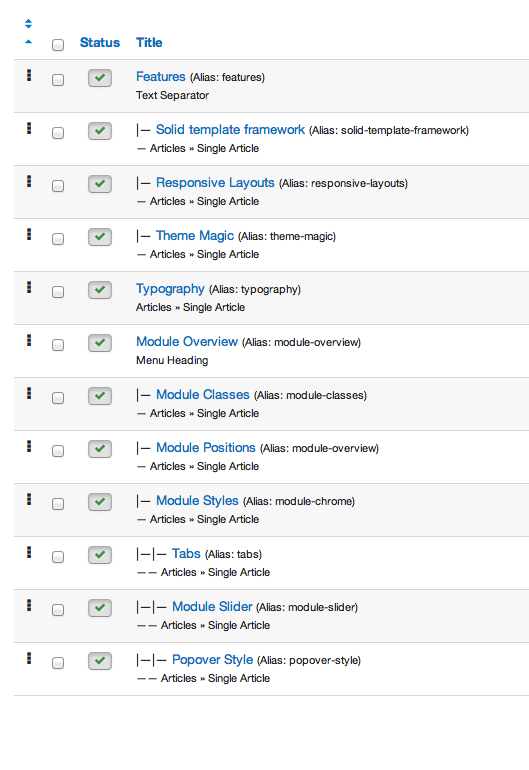
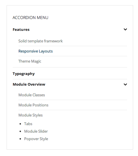
The accordion menu is designed to be flexible enough to accomodate both normal content links or accordion triggers for any of the top level menu items.
Joomla provides two types of menu items that can be used as top level menu items in the accordion menu.
The Text Separator or menu heading menu type will both function as triggers for the accordion menu.
A typical accordion menu setup looks like the example in the screenshot below.