For all Joomla 3+ templates built using the Zen Grid Framework v4 (any theme after October 2014) please refer to the Zen Grid Framework v4 documentation.
The general widths and layouts of the module positions are controlled under the main layout tab and the sub items in the template administrator. The Zen grid template is split up into 12 rows of module positions with up to 4 modules per each row.
There are five settings that are available on most of the parameter settings that relate to controlling the layout. The first option is to equalize all of the module widths for that row. So if that option is enabled it means that the subsequent options within that section are no longer relevant, as the widths for each of the modules in that row are determined by a percentage based on the number of modules that are published to that row on that page. in other words the template displays the modules evenly spaced across the entire row.
If on the other hand the option to equalize the module positions is set to no, then the widths below come in to play. The widths in the drop-down menu relate to the number of columns that each module will be displayed in and the number of columns available in a row depends on the setting for the number of columns that you set in the general layout settings. For example if you set the number of columns to 12 in the general layout settings section, then the widths in the four options need to all add up to 12.
However if you only intend on publishing one module to the top row for instance, then you can set the width of that one module to the number of columns you require with the greatest number of available being 12.
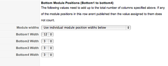
This layout configuration is true for the top row of modules, the header row of modules, the six rows of grid modules and bottom modules. For help on laying out the modules and widths of the main content area please view the main content layout article.
As mentioned above the framework is based on a grid system that evenly divides the site width into a 12 column or 16 column grid. The widths and dimensions of the grid are all configurable and are controlled by the settings you see below and in the rest of this section.
The general width and layout elements for the entire theme are controlled in the first group of parameters. There are basically two tracks that you can follow here:

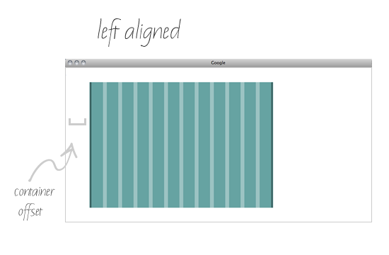
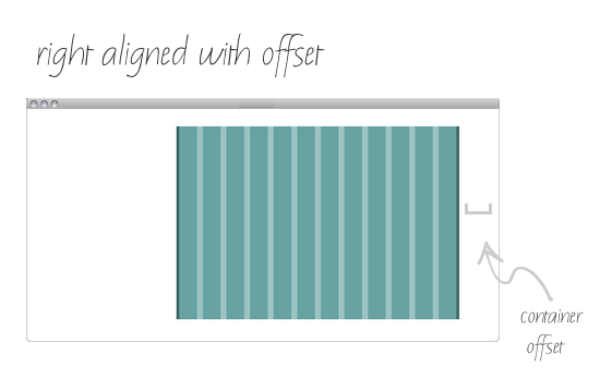
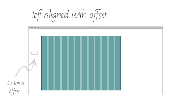
This option allows you to control the general alignment of the website container. Select between left, center and right alignment.

If you have looked through our back catalogue you probably will have noticed that we are quite fond of left aligned website layouts. Sometimes a design or site lends itself to being left of center so we have put some functionality into the framework to help you to select a left or ight aligned layout.
The left or right offset is the pixel distance from the edge of the browser window you want the main container to sit if you have chosen left or right as the alignment option above. If however you would prefer the layout to be centered then theres no need to touch this option as centered is set to default.
This setting determines the number of columns the entire site container area (minus the gutter width) is divided into. The number of columns, the gutter width and the template width in the next two inputboxes provide the basis for the layout for the rest of the layout settings.
The template takes the template width and calculates the space to allow for each "column" on the site based on your gutter width and the number of columns you divide your site into.
For example: if you have a template width of 960px, a gutter width of 20px and 12 columns specified then a single column width will be around 58px. In doing the calculations we only count 11 gutter widths since the last column doesnt have a gutter and we also remove the side gutter widths from the overall template width.
If you are using the advanced width options, once those settings have been set its just a matter of specifying the ratio of widths you require for each module within a group of modules. As an example, the number of columns you specify for the top row of modules needs to equal 12 (if you choose the 12 column layout) or 16 if you choose the 16 column layout. So if you only have three out of the four modules published to any of the top1, top2, top3 or top4 modules then they still need to add up to 12 (12 column mode) or 16 (16 column mode).
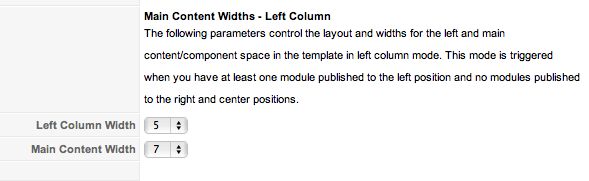
Please note that in the Woodflower theme the columns for the maincontent layout need to add upto 11 and 15 when the right column has modules published to it.
The template calculates the width required and automatically floats the modules so that they sit nicely next to each other. The first three modules in any row float to the left while the fourth module floats to the right. This means that if you are using less than the four modules in any row at any time to achieve full symmetry you must always have the last module in the row published. For example if you are publishing three modules to the first grid row you must publish two of the first three modules (ie grid1, grid2 or grid3) plus the fourth module (ie grid4).


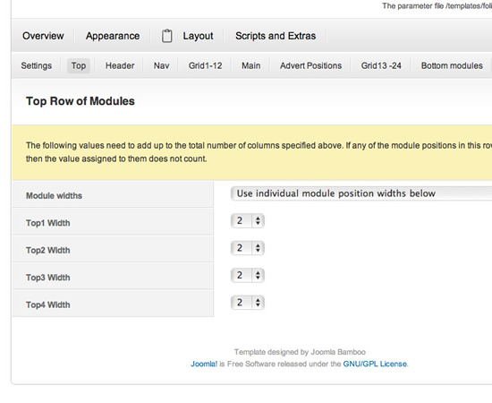
The image below displays the options available for the row of modules that include the top1, top2, top3 and top4 module positions.
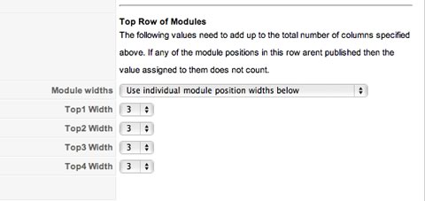
The first drop down menu determines the way you want to control the widths of these module positions. There are two options:
If you select the equalise width option then you dont need to set any of the ratios below as the template will automatically recalculate the widths required to create an even spread across the row. This setting is dynamic and takes into account the number of modules published per page.
If however you select the "individual module position widths option" then you need to make sure that the widths total no more than column width you have set at the top of the parameters eg 12 or 16.
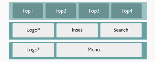
The logo and navigation row settings control the position of the logo, as well as the width of the logo, header1, header2, header3, header4 and menu module positions.
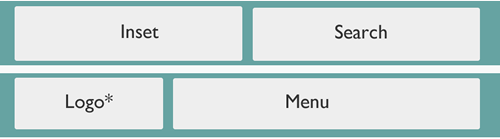
The position of the logo refers to whether it appears on the row with the header1 to header4 positions or whether it sits on the same row as the menu.
If you choose to position the logo on the same row as the header modules then the logo takes the position of header one, and the remaining modules on that row header2, header3, header4. also if you choose to let the template calculate the width of each of those modules the template will count the logo position as one module but it will not set the width for the logo position. The logo position width is set in the parameters below. If you choose to use the manual option of setting the width of the logo and header module positions then you need to make sure that the widths for the logo, header2, header3, and header4 all at up to the total number of columns you have set above.
If the logo is positioned on the same row as the navigation then the widths of the inset and search positions are calculated and then menu and logo widths are calculated according to the widths you specify below.
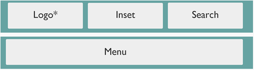
Here is a screenshot of the options available for controlling the logo, menu, inset and search layout.
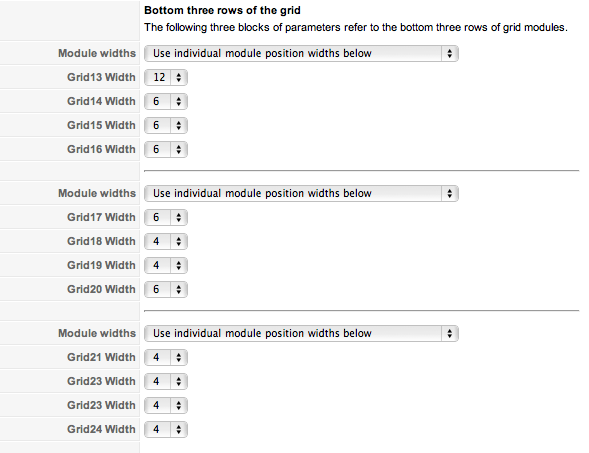
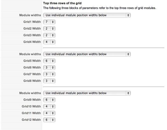
The following screenshot shows the width options available for the first three rows of the grid modules. Row 1 includes grid1 to grid4, row 2 includes grid5 to grid8 and row 3 includes grid9 to grid12. You have the option of having the modules evenly spaced or you can specify individual widths for each of the module positions.
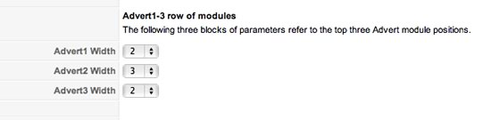
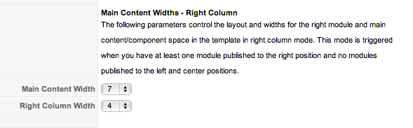
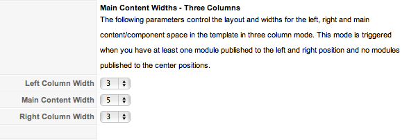
The following settings control the widths of the advert1, advert2 and advert3 positions. This group is actually a little different to the others and the total of the width ratios should not add up to the column number (eg 12 or 16) but should equal the number of columns assigned to the main content column. The width of the main content column depends on the width assigned in the various layout options below.
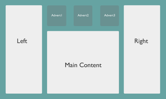
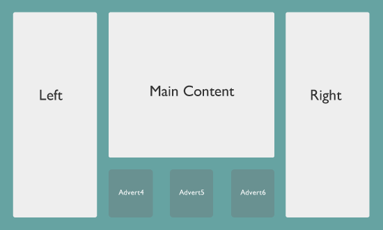
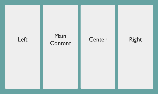
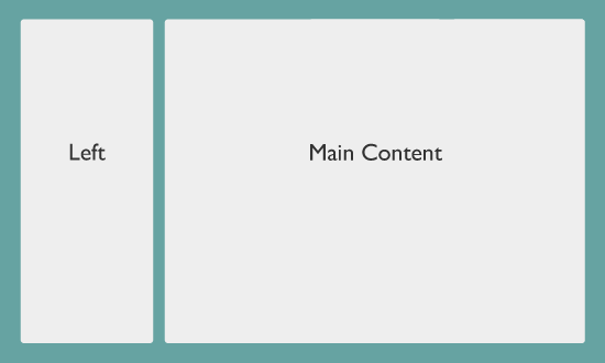
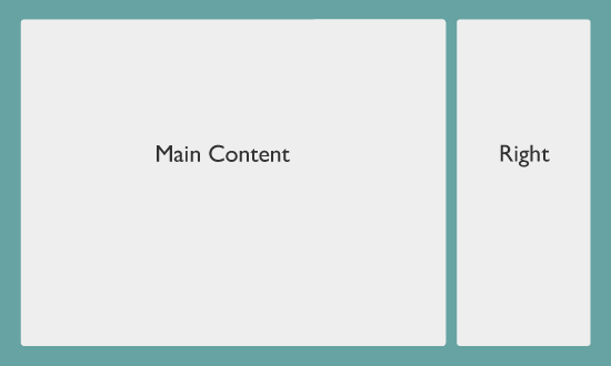
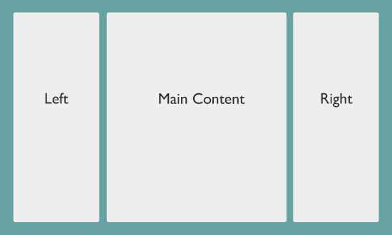
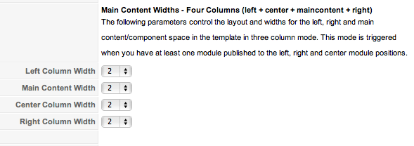
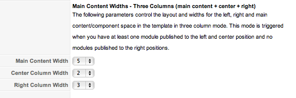
The following settings control the layout options for the main content area. These settings relate to the following module positions: left, center, right, advert1, advert2, advert3, advert4, advert5, advert6.
Please note that in the Woodflower theme the columns for the maincontent layout need to add up to 11 and 15 when the right column has modules published to it.
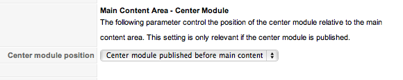
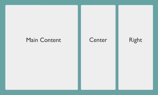
The center module position controls the order of the four main columns available in the main content area. In addition to the left, main content/component and right columns we have add a center module that can be placed either before or after the main content area.
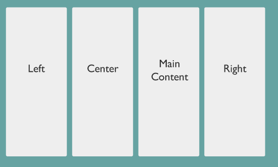
The options shown in the screenshot below highlight the two options that are available.
Options
Options
Options
Options
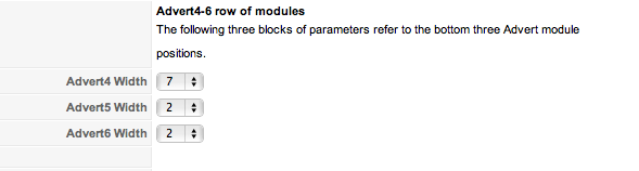
The following settings control the widths of the advert4, advert5 and advert6 positions. This group is actually a little different to the others and the total of the width ratios should not add up to the column number (eg 12 or 16) but should equal the number of columns assigned to the main content column. The width of the main content column depends on the width assigned in the various layout options below.