Please note: This template uses the Zen Grid Framework. You can download the latest version of the framework on the Zen Grid Framework download page.
All Themes built prior to January 2013 were built using the Zen Grid Framework while all themes after January 2013 were built using the T3 plugin. A select number of themes from before January 2013 have been moved to the T3 plugin.
The following steps outline the process involved for setting this template up in a new or existing Joomla installation. Please note: We recommend users use our quickstart packages if they have the opportunity to start completely from scratch.
At this stage you will have a very basic looking template ready for you to customise, add your content and start setting up the other modules you can see on the demo for the Platform template.
For more information on replicating the front page layout or other extensions used on this site please read the information provided on the frontpage and extensions tab.

Module classes are a core Joomla functionality that allow the user to specify how a specific module will appear. The class itself is added to the module in the module parameters.
Module classes can be combined to take advantage of multiple complementary styles. An example of a module class suffix using a combination of classes: "hot primary1 top50".
Structural classes can be used to change the general layout or structure of a module.

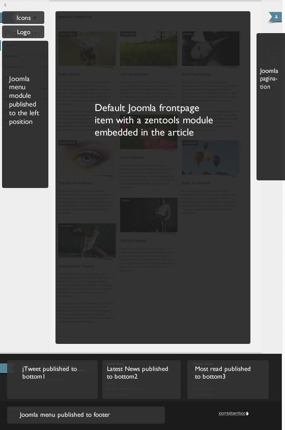
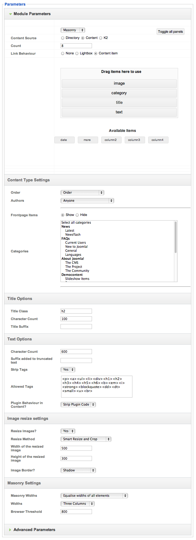
The frontpage of the Platform demo site features the Zentools module using a masonry layout. The settings used in the demo site are shown below. This module is referencing items from the k2 component which is how we are able to display videos in the items.

Â
Please note that teh category tag will sit above the image in this layout only if the image item is first in the list and then the category item directly follows it as per the screenshot above.
Â
The platform template uses a left aligned layout that changes the way that we calculate the various column widths. Please note that this is different to the way that column widths are normally calculated in the framework.
Platform essentially combines the overall template width as well as a single width (specified in px) in the template parameters to determine the width of the main content area.
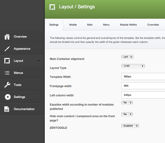
The settings for this are available on the layout > Settings panel.

Â
Left column width. This needs to be a px width value and controls the width of the left column. The left column will always sit on the left edge of the browser and sits to the left of all os the other positions.
Template Width. This setting controls the overal width of the page if the layout type is anythign other than 1140. If the layout type is 1140 then the width of the page is limited to a maximum width of 1140px.
Frontpage Width. The frontpage width is a new setting and essentially allows you to specify a different width for menu types that use a the featured or frontpage menu type. We implemented this so that users could take advantage of fullscreen fullwidth layouts but not be limited to the front page width on the sub pages.
The width of the main column. The main column width is calculated by subtracting the left column value + some padding from the overall template width. The column count for any module widths on the positions set within the main column (see the all module position page) can then be determined in the usual way that the framework calculates the widths for an item.