Compatible with Joomla 1.5 / Joomla 2.5 and uses the Zen Grid Framework framework .
Please note: This template uses the Zen Grid Framework. You can download the latest version of the framework on the Zen Grid Framework download page.
All Themes built prior to January 2013 were built using the Zen Grid Framework while all themes after January 2013 were built using the T3 plugin. A select number of themes from before January 2013 have been moved to the T3 plugin.
The following links may be helpful if you are new to Joomla, T3 or our templates.
If you are new to T3 please read through the following resources to better acquaint your self with how T3 works.
The screenshots below are taken from the template administrator and highlight the default settings for this template.
Layout main settings
Layout settings
Logo settings
Panel menu

The following steps outline the process involved for setting this template up in a new or existing Joomla installation. Please note: We recommend users use our quickstart packages if they have the opportunity to start completely from scratch.
At this stage you will have a very basic looking template ready for you to customise, add your content and start setting up the other modules you can see on the demo for the Sidetrack template.
For more information on replicating the front page layout or other extensions used on this site please read the information provided on the frontpage and extensions tab.

The following colours are the primary and secondary colours used in the sidetrack template styles.
Module classes are a core Joomla functionality that allow the user to specify how a specific module will appear. The class itself is added to the module in the module parameters.
Module classes can be combined to take advantage of multiple complementary styles. An example of a module class suffix using a combination of classes: "hot primary1 top50".
Structural classes can be used to change the general layout or structure of a module.
Our themes use a combination of two colours to determine the colour scheme for each template style. In general the colours are determined by the following formula:
Module classes for mobile viewing (mediaqueries classes).
| Class | Mobile max-767px | Tablets 768px to 979px | Desktop min-980px |
|---|---|---|---|
.visible-phone |
Visible | Hidden | Hidden |
.visible-tablet |
Hidden | Visible | Hidden |
.visible-desktop |
Hidden | Hidden | Visible |
.hidden-phone |
Hidden | Visible | Visible |
.hidden-tablet |
Visible | Hidden | Visible |
.hidden-desktop |
Visible | Visible | Hidden |

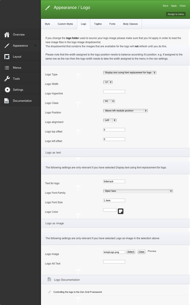
Logo is displayed above left module position and is created with text. Text is using font replacement for logo. Logo width is defined as 12 grids.

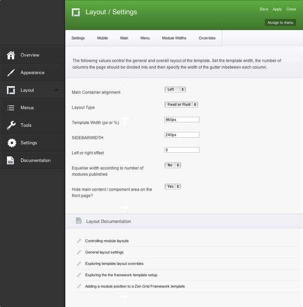
Here you can see basic layout setting defining template width and left column width.

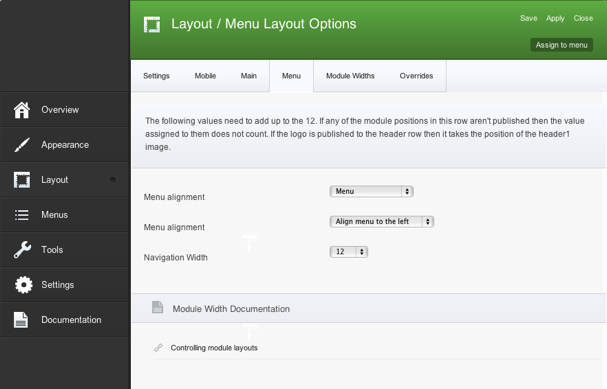
Menu is 12 grids wide and aligned to the left.
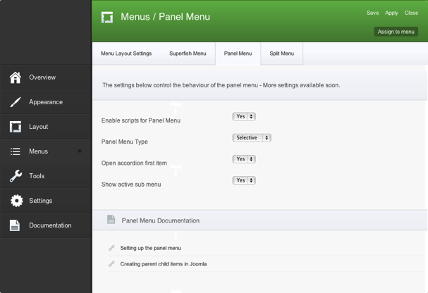
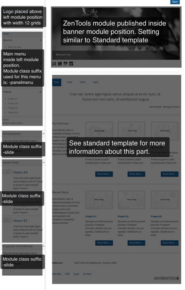
Important is to enable panel menu iniside menu setting. And following with using -panelmenu as module class suffix for mainmenu placed inside left module position.
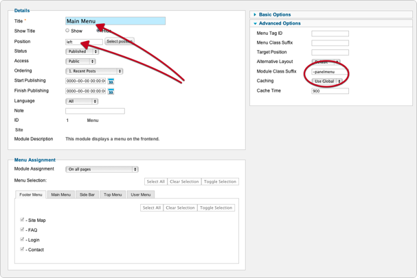
Panelmenu inside left module position.
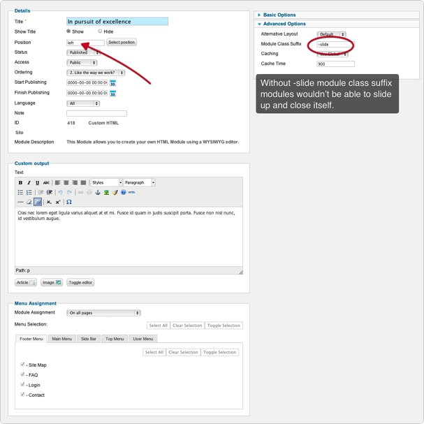
Modules inside left module position does feature arrow next to module title that allows module to slide up and hide. So don't forget to use -slide as module class suffix.
The screenshots below are taken from the modules used in the demo and quickstart packages for this template.

