Compatible with Joomla 2.5 / Joomla 3+ and uses the T3 framework .
Please note: This template uses the T3 framework. You can download the latest release of the T3 plugin directly from the T3 GitHub repository.
The following links may be helpful if you are new to Joomla, T3 or our templates.
If you are new to T3 please read through the following resources to better acquaint your self with how T3 works.
The following steps outline the process involved for setting this template up in a new or existing Joomla installation. Please note: We recommend users use our quickstart packages if they have the opportunity to start completely from scratch.
At this stage you will have a very basic looking template ready for you to customise, add your content and start setting up the other modules you can see on the demo for the Revision template.
For more information on replicating the front page layout or other extensions used on this site please read the information provided on the frontpage and extensions tab.

The following colours are the primary and secondary colours used in the revision template styles.
Module classes are a core Joomla functionality that allow the user to specify how a specific module will appear. The class itself is added to the module in the module parameters.
Module classes can be combined to take advantage of multiple complementary styles. An example of a module class suffix using a combination of classes: "hot primary1 top50".
Structural classes can be used to change the general layout or structure of a module.
Our themes use a combination of two colours to determine the colour scheme for each template style. In general the colours are determined by the following formula:
Module classes for mobile viewing (mediaqueries classes).
| Class | Mobile max-767px | Tablets 768px to 979px | Desktop min-980px |
|---|---|---|---|
.visible-phone |
Visible | Hidden | Hidden |
.visible-tablet |
Hidden | Visible | Hidden |
.visible-desktop |
Hidden | Hidden | Visible |
.hidden-phone |
Hidden | Visible | Visible |
.hidden-tablet |
Visible | Hidden | Visible |
.hidden-desktop |
Visible | Visible | Hidden |

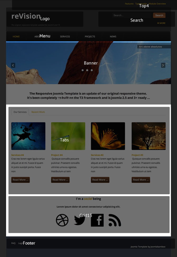
Top4 – Menu module called Template Features is published to this position with a hidden-phone class to hide the module on mobile width.
Logo – The logo is defined inside the template Theme tab with a text setting of left aligned h2 with a Google font of Open+Sans:400,600,300:latin. The Tagline is visible.
Search – A Search module is assigned to the search position with search button enabled.
Panel1 – A Custom HTML module is published to the Panel1 position.
Banner – A Zentools slideshow is assigned to the banner position and is named Frontpage Slideshow. The slideshow loads from a directory with image, title and text enabled, together with centred navigation and the content being loaded in a lightbox.
Banner – A Custom HTML module displaying a slogan in the banner position – module is ordered to display below the slideshow.
Tabs – Two Zentools modules published to the tab position – both Zentool modules are configured with image, title, text and more, set to grid layout with Joomla content selected.
Grid1 – A Custom HTML module published to Grid1 using JB Type syntax titled “I'm a social being” .
Grid1 – A Zensocial module published to Grid1 using font icons to display – Dribble, Twitter, Facebook and RSS.
Footer – menu module called Footer Menu displaying.
Copyright – Copyright enabled in Theme panel.