Compatible with Joomla 2.5 / Joomla 3+ and uses the T3 framework .
Please note: This template uses the T3 framework. You can download the latest release of the T3 plugin directly from the T3 GitHub repository.
The following links may be helpful if you are new to Joomla, T3 or our templates.
If you are new to T3 please read through the following resources to better acquaint your self with how T3 works.
The following steps outline the process involved for setting this template up in a new or existing Joomla installation. Please note: We recommend users use our quickstart packages if they have the opportunity to start completely from scratch.
At this stage you will have a very basic looking template ready for you to customise, add your content and start setting up the other modules you can see on the demo for the Sidewinder template.
For more information on replicating the front page layout or other extensions used on this site please read the information provided on the frontpage and extensions tab.
The following colours are the primary and secondary colours used in the sidewinder template styles.
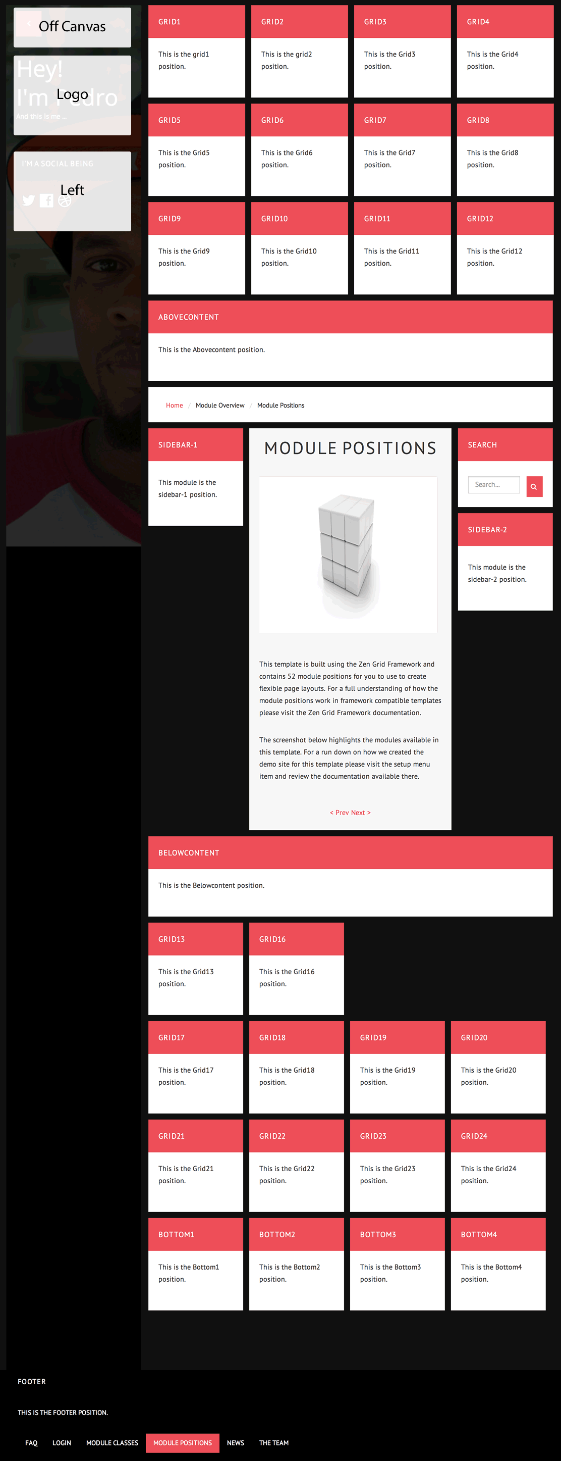
Module classes are a core Joomla functionality that allow the user to specify how a specific module will appear. The class itself is added to the module in the module parameters.
Module classes can be combined to take advantage of multiple complementary styles. An example of a module class suffix using a combination of classes: "hot primary1 top50".
Structural classes can be used to change the general layout or structure of a module.
Our themes use a combination of two colours to determine the colour scheme for each template style. In general the colours are determined by the following formula:
Module classes for mobile viewing (mediaqueries classes).
| Class | Mobile max-767px | Tablets 768px to 979px | Desktop min-980px |
|---|---|---|---|
.visible-phone |
Visible | Hidden | Hidden |
.visible-tablet |
Hidden | Visible | Hidden |
.visible-desktop |
Hidden | Hidden | Visible |
.hidden-phone |
Hidden | Visible | Visible |
.hidden-tablet |
Visible | Hidden | Visible |
.hidden-desktop |
Visible | Visible | Hidden |
In order to enable the accordion menu on your site you need to follow three key steps.
The accordion settings can be found in the template administrator under the effects panel. Ensure that the "enable accordion" menu item is enabled.
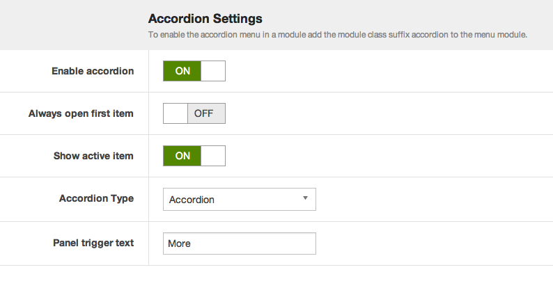
Other accordion menu settings explained:
Always open first item
This setting means that when the accordion is loaded on the page the first item in the menu will always be open.
Show active item
When enabled this option ensures that the active menu item will always be open on the page.
Accordion Type
The Accordion menu type means that when one menu item is opened then the previously opened item is closed. While the panel option means that when menu items are clicked open items remain open. In order to close each menu level the user needs to click on the top level menu item for that accordion level.
Now that the accordion menu scripts have been added it is necessary to add a module class suffix to the menu module. Adding the "accordion" module class to the module class suffix will automatically apply the correct code required to create the accordion menu.
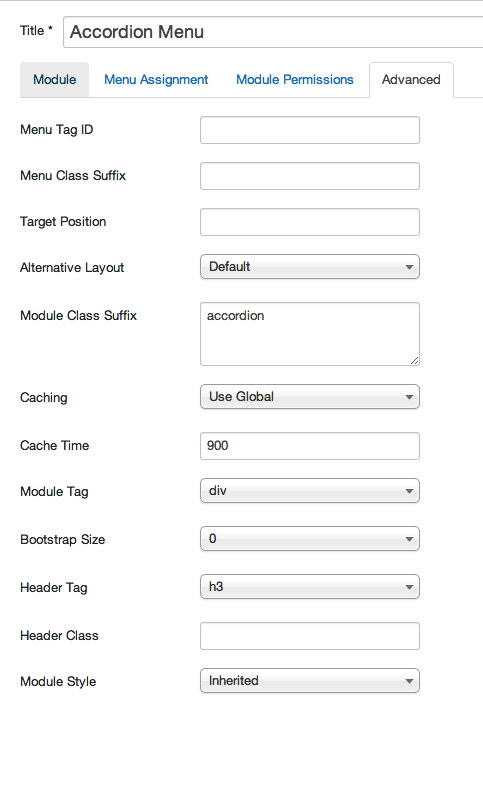
The accordion menu is designed to be flexible enough to accomodate both normal content links or accordion triggers for any of the top level menu items.
Joomla provides two types of menu items that can be used as top level menu items in the accordion menu.
The Text Separator or menu heading menu type will both function as triggers for the accordion menu.
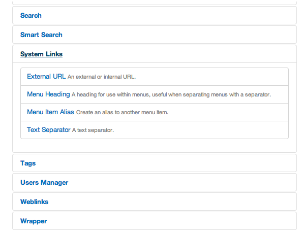
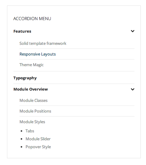
A typical accordion menu setup looks like the example in the screenshot below.
