Compatible with Joomla 2.5 / Joomla 3+ and uses the T3 framework .
Please note: This template uses the T3 framework. You can download the latest release of the T3 plugin directly from the T3 GitHub repository.
The following links may be helpful if you are new to Joomla, T3 or our templates.
If you are new to T3 please read through the following resources to better acquaint your self with how T3 works.
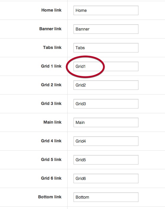
The one page template's menu is controlled via the template settings under the general tab in your template's admin.
Each menu item that appears in the menu corresponds to a row of modules in the template.
1. To determine the title for the menu item that points to the grid1 row of modules (grid1, grid2, grid3 or grid4), specify the menu title in the template admin.

2. The menu will now have that value placed in the grid1 link position.

3. When clicked the page will automatically be scrolled to the grid 1 row of modules.

The following steps outline the process involved for setting this template up in a new or existing Joomla installation. Please note: We recommend users use our quickstart packages if they have the opportunity to start completely from scratch.
At this stage you will have a very basic looking template ready for you to customise, add your content and start setting up the other modules you can see on the demo for the Onepage template.
For more information on replicating the front page layout or other extensions used on this site please read the information provided on the frontpage and extensions tab.

The following colours are the primary and secondary colours used in the onepage template styles.
Module classes are a core Joomla functionality that allow the user to specify how a specific module will appear. The class itself is added to the module in the module parameters.
Module classes can be combined to take advantage of multiple complementary styles. An example of a module class suffix using a combination of classes: "hot primary1 top50".
Structural classes can be used to change the general layout or structure of a module.
Our themes use a combination of two colours to determine the colour scheme for each template style. In general the colours are determined by the following formula:
Module classes for mobile viewing (mediaqueries classes).
| Class | Mobile max-767px | Tablets 768px to 979px | Desktop min-980px |
|---|---|---|---|
.visible-phone |
Visible | Hidden | Hidden |
.visible-tablet |
Hidden | Visible | Hidden |
.visible-desktop |
Hidden | Hidden | Visible |
.hidden-phone |
Hidden | Visible | Visible |
.hidden-tablet |
Visible | Hidden | Visible |
.hidden-desktop |
Visible | Visible | Hidden |

The demo content for the One Page template is setup very simply to highlight the structure of this template. As with all of our T3 and Zen Grid Framework themes the layout is divided into a number of rows of grids. The demo site for this theme uses a number of custom html modules to create the content seen across the grids. None of the content is being derived from the core Joomla content however it is possible to publish items to the main content area. In order to do this please ensure that the "remove mainbody output from home page" is disabled on the general tab in the template admin..
More link: The hidden panel / more button is a common feature across all of our themes and is automatically created on the site when a module is published to the any of the panel1 to panel4 positions.