Knowledgebase

Joomlabamboo template and extension documentation

Compatible with Joomla 2.5 / Joomla 3+ .

Please note: This template uses the T3 framework. You can download the latest release of the T3 plugin directly from the T3 GitHub repository.

All Themes built prior to January 2013 were built using the Zen Grid Framework while all themes after January 2013 were built using the T3 plugin. A select number of themes from before January 2013 have been moved to the T3 plugin.

Starting with Client from a fresh installation.

The following steps outline the process involved for setting this template up in a new or existing Joomla installation. Please note: We recommend users use our quickstart packages if they have the opportunity to start completely from scratch.

Elements to install

  • Install the Client template and make it the default - Download
  • Install JB Type - required for typography and font icons - Download
  • Install Zentools - slideshows, banners, grids etc - Download
  • Install the Maps2 - Google maps in a module - Download
  • Install Skillset Module - Circular, animated bar and count up characteristics / stats display Download
  • Install Zensocial - Social Icons - Download

Elements to modify

Menu

  • Remove the module and menu classes nav_pills and _menu in the advanced parameters for the menu module.
  • Set the Menu module title to hide

Breadcrumbs

  • Change the position of the breadcrumb module to the "breadcrumbs" position.
  • Ensure that the module title for the breadcrumb module is also set to hide.
  • Depending on your needs you may like to set this module to not appear on the front page via the menu assignment settings in the module.

Search Module

  • Publish a search module to the search position.
  • Ensure that the module title is set to hide.

logo

  • Create a new custom html module and publish it to the logo position.
  • Use an h2 tag to surround your site name and attach a link to the site name.
  • <h2><a href="http://docs.joomlabamboo.com/">My sitename</a></h2>
    
  • Ensure that the module title is set to hide.

Social Icons

  • Create a new instance of the zen social module.
  • Set social icon display type to "use font icons".
  • The alignment option has no effect in this position
  • The colour of the icons is overridden by the template and does not have any effect.
  • Set the font-size to 2em
  • Specify the icons you want to display in the module using the font icon panel.
  • Publish the module to the social position
  • Ensure that the module title is set to hide.

What's next?

After following the preceeding instructions you should have a Joomla site that looks like the one captured in the screenshot below.
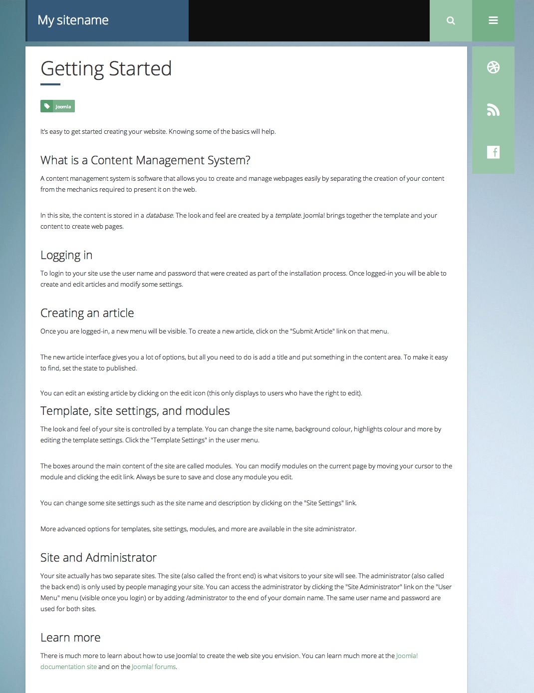
freshstart

At this stage you will have a very basic looking template ready for you to customise, add your content and start setting up the other modules you can see on the demo for the Client template.

For more information on replicating the front page layout or other extensions used on this site please read the information provided on the frontpage and extensions tab.
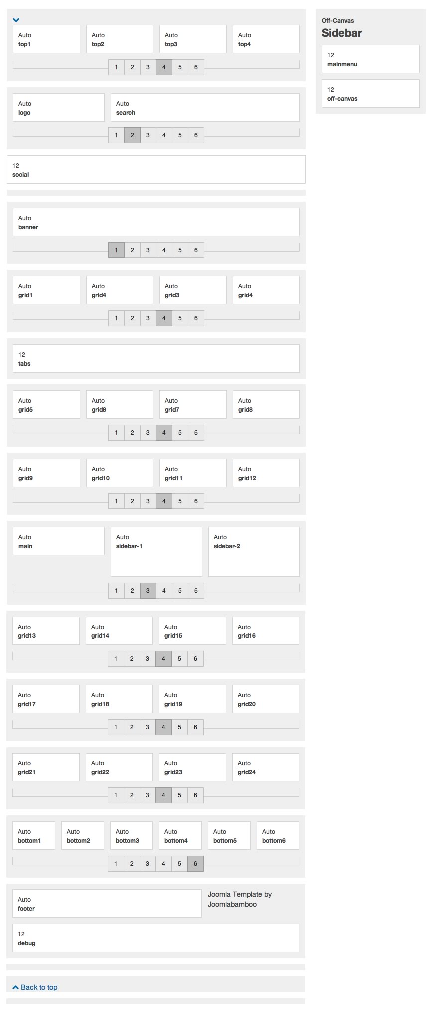
Available module positions

client-positions

Controlling the logo in the Client theme.

Another change to the way our themes work is that much of the logo functionality has been moved out of the template. Previously the logo content was generated and controlled via the template settings however now the logo is controlled via a custom html module position.

Create the logo content.

The first part of the step is to create a new custom html module.

Once you have created a custom html module and published it we need to assign the logo position in the template's layout schematic. Just in the same way we assigned the main content or sidebar blocks to the page we also need to assign the logo to a position. By default the logo is positioned in the position that you see on the demo, however this is easily changed to a new position as per the screen shot below.

Default logo position

default-logo


Controlling the logo font in the Client theme.

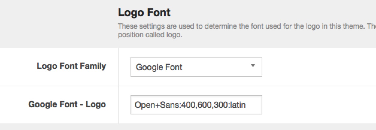
The logo font is controlled under the Theme menu item in the template administrator. The template automatically targets the module that is positioned to the logo position with the required settings to allow you to control the font-family used for this area of the template.
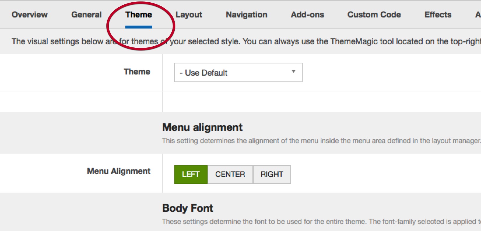
Logo-font-1

Logo-font-2

The Offcanvas panel

The offcanvas panel is a secondary content area that is hidden from the page until a user clicks on the off canvas toggle button. In the Client theme this toggle button is positioned in the navbar to the right of the logo and search buttons.

Offcanvas settings

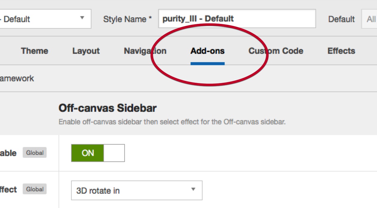
The off canvas settings are available under the addon panel in the template admin.
Offcanvas-1

The off canvas settings are available under the addon panel in the template admin.


Enable the off canvas sidebar

In addition to needing to publish a module to the off canvas module position you also need to ensure that the off canvas function is enabled.

Off-canvas Effect

You can choose from fourteen different animations for the off canvas effect.

Off-canvas Position

This setting determines the position of the page the off canvas is located. Left is to the left of the page while right is to the right of the page.

Off-canvas Trigger

This is the text used to accompany the button that triggers the off canvas effect.

Off-canvas Title

This is the text that is placed at the very top of the off canvas area above the off canvas content.


Module Classes

About module class suffixes

Module classes are a core Joomla functionality that allow the user to specify how a specific module will appear. The class itself is added to the module in the module parameters.

Combining module classes:

Module classes can be combined to take advantage of multiple complementary styles. An example of a module class suffix using a combination of classes: "hot primary1 top50".

Module class examples

Basic classes


Border classes


Inset classes


Icon classes


Hot and new classes


Corner classes

Structural classes

Structural classes can be used to change the general layout or structure of a module.

  • nopadding - this class removes all padding that may be set by default by the template.

Frontpage Overview

client-frontpage

Description

Very top right menu - This is a core Joomla menu module published ot the top4 position. On small screens this position is designed to float to the left and on larger screens it is designed to float to the right.
Logo - The logo is a module position that uses an h2 tag to display the text Jacqui Smith. The width and font settings for the logo position are controlled via the template parameters. Please view the layout tab for more information.
Search - The search position sits to the right of the logo. When you publish a search module to this position an icon for the search functionality is automatically displayed. When the user clicks on this item the search bar expands to reveal the input area for the search form.
Offcanvas Menu trigger - This is the menu icon that sits to the right of the search icon. This is automatically displayed when you use the off canvas menu or publish a module to the offcanvas position.
Social icons - The social icons are an instance of the Zensocial module which is published to the social position. When a module does not exist in this position the main content area expoands to fill the entire width of the page. The width of the social position is determined by the Theme Mafic setting which call navbar height. The height of the logo bar and the social icons column are equal.
Custom HTML module published ot the banner position - The "Building steam with a grain of sand" text is a custom html module published to the banner position.
Market Health and Future stock blocks - These two blocks of content are custom html modules published ot the grid1 and grid4 positions. They use the nopadding module class suffix which targets the first paragraph tag (in this case an image) and removes the padding around that image.
Tabbed layout - The items marked Core proficiencies, meet the team and Passionate technicians are a collection of modules that are published to the tabs position. When any modules are published to this position the modules are automatically displayed in a tabbed layout. 
Core Proficiencies - This module is an instance of the Skillset module using the circular layout.
Meet The Team - This is an instance of the Zentools module using the list layout
Passionate Technicians - This is a custom html module.
By the Numbers - This is an instance of the Skillset module published to the grid6 position. It uses the skillbar layout.
Biostats - This is an instance of the skillset module using the count up layout.
Galleries - The two blocks of images are two separate instances of the Zentools module using a grid layout. The two modules reference two separate folders.
Frequently Asked Questions - This is an instance of the Zentools module using the accordion layout. It is published to the grid13 position.
Come Find Us - This is an instance of the Maps2 module published to the grid17 position. It uses the module class nopadding.
Like to know more and Need to talk to us - These two modules are custom html modules published to the bottom1 and bottom2 positions. 
Footer Menu - This is an instance of the core Joomla menu moduel published ot the footer position.
 

Extensions used on the demo site

Adding an accordion menu to the sidebar.

In order to enable the accordion menu on your site you need to follow three key steps.
Enable the accordion in the template settings

The accordion settings can be found in the template administrator under the effects panel. Ensure that the "enable accordion" menu item is enabled.
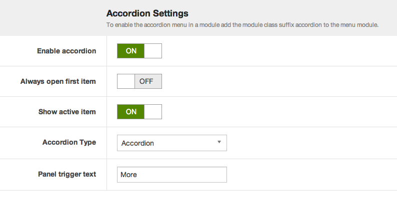
Other accordion menu settings explained:

  • Always open first item

    This setting means that when the accordion is loaded on the page the first item in the menu will always be open.

  • Show active item

    When enabled this option ensures that the active menu item will always be open on the page.

  • Accordion Type

    The Accordion menu type means that when one menu item is opened then the previously opened item is closed. While the panel option means that when menu items are clicked open items remain open. In order to close each menu level the user needs to click on the top level menu item for that accordion level.

Add a module class to your menu

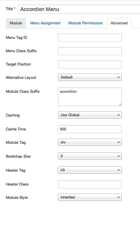
Now that the accordion menu scripts have been added it is necessary to add a module class suffix to the menu module. Adding the "accordion" module class to the module class suffix will automatically apply the correct code required to create the accordion menu.
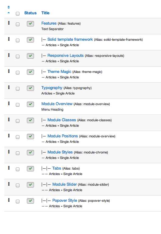
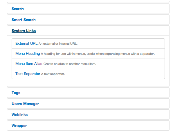
Use text separators or menu headings for top level menu items

The accordion menu is designed to be flexible enough to accomodate both normal content links or accordion triggers for any of the top level menu items.

Joomla provides two types of menu items that can be used as top level menu items in the accordion menu.

The Text Separator or menu heading menu type will both function as triggers for the accordion menu.
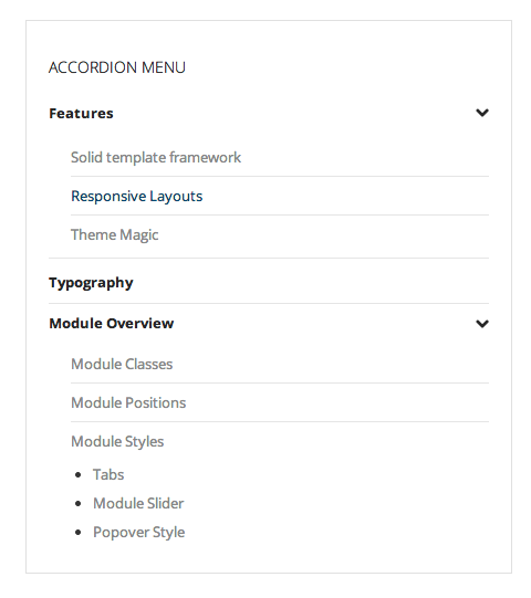
A typical accordion menu setup looks like the example in the screenshot below.