What are module class suffixes?
Joomla uses module class suffixes as a way to attach css styling to specific individual modules. The class suffix is applied to the module and the css is provided by the template to provide the required styling.
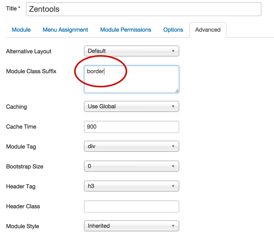
How to add a module suffix to a module.
- Navigate to the edit screen of the module you wish to target.
- Edit the advanced tab in the module settings
- Enter your desired module class eg border
- Click save
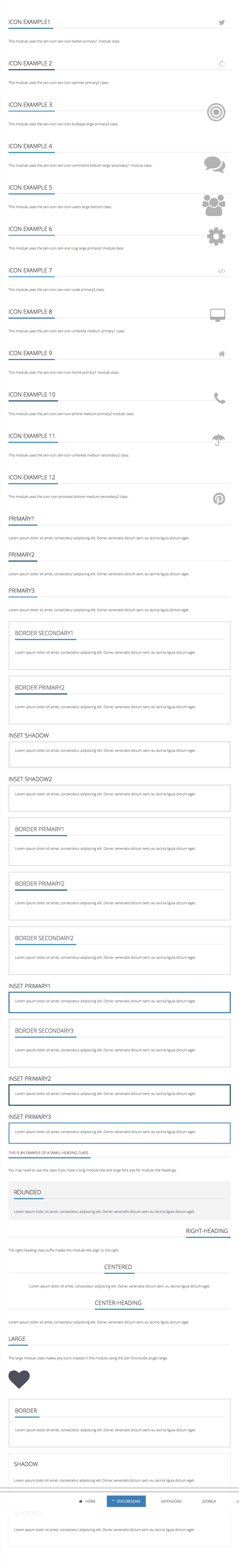
Appearance Classes
Appearance classes are used to change the way a module looks. The primary and secondary class suffixes use colours that are defined in your template settings or via the variables.less associated with the primary and secondary variables.
- primary1 (uses the theme's primary color)
- primary2 (a 10% darker colour than the primary color)
- primary3 (a 10% lighter colour than the primary color)
- secondary1 (uses the theme's secondary colour)
- secondary2 (a 10% darker colour than the secondary color)
- secondary3 (a 10% lighter colour than the secondary color)
- inset (Styling applied to the module content and not the title)
- border
- shadow
- shadow2
- hot (adds the word hot to the .moduletable h3 span:after)
- new (adds the word new to the .moduletable h3 span:after)
The appearance module classes can be used in combination with each other to create more complex module styles. To use multiple styles together please ensure that each module class suffix is separated by a space as per the following example. Also please note that there needs to be a space before the start of the first class in order to render the class output properly:
Font Icon Classes
Using a combination of module classes, it is possible to create a wide range of module styles using the font awesome font icons. The icons that are available for use are referenced from the font awesome font library, however you need to ensure that the template has included the Font Awesome Library in it's css file. This is done in the settings tab in the template settings and will be available after you enable the option, select all icons and then compile the less to css.
A typical module class suffix using the font icons looks like this:
zen-icon zen-icon-comments large bottom secondary1- zen-icon - initiates the font icon display
- zen-icon-comments - selects the icon to display.
- large - (optional) You can choose between tiny, medium or large which set the font-size of the icon as follows: 1em, 2em (default), 4em and 8em.
- bottom - (optional) Displays the icon at the bottom of the module. By default the icon is set to display at the top.
- secondary1 - as per the examples on this page this refers to the built in colour control in the template.
Structural Module Classes
The following module classes add the specified top margin offset on your element. eg adding top50 to a module class will add margin-top:50px for that module.
- top25
- top50
- top75
- top100
- top125
- top150
- top175
- top200
- top225
- top250
- top275
- top300
- top325
- top350
- top375
- top400
- top425
- top450
- top475
- top500
Screenshot of module classes