
Using Breakpoints
Breakpoints are literally the point at which your design breaks in the browser. At the point at which the design breaks media queries can be used to specify css rules that affect the design at that specific browser width.
This is usually done using the css rule max-width or min-width. An example media query might look something like this.
@media screen and (max-width:787px) {
    //Enter css rules here that only affect browsers below 787px
}
Using less language syntax allows us to use variables to specify breakpoints values used in this theme. Example breakpoints in the less files look like this:
@media screen and (max-width:@nav-collapse) {
    //Enter css rules here that only affect browsers below the nav collapse value set in the variables.less file or the template admin
}
Using variables for breakpoints allows us to control the way that the design works at specific browser widths rather than using fixed values that target specific devices.
The language used in the theme settings for breakpoints refer to device types however these are meant be more of a guide rather than specifically related to the device type specified.
Breakpoint Settings
Desktop, tablet and phone references in the layout tool
The breakpoints set in the responsive > breakpoint panel dictate the browser widths referenced in the layout tool. The layout tool allows the user to hide or stack modules using the tablet and the phone breakpoints specified in the breakpoint section.
Mobile Detect library
A related option in the Zen Grid Framework 4 themes is the ability to use a server side script to target phone or tablet devices. This setting can be found in the settings > mobile detect area of the template settings.
This option uses a light weight PHP implementation for detecting your visitors device. The Mobile Detect library as implemented in ZGF4 themes specifically target devices that are tablet, phones or desktops.
The layout tool settings for hide or stack on phones or tablets triggers uses the mobile detect settings if this option is enabled. This means that breakpoints settings are ignored on those devices and if a device tests as a tablet, for instance, then it inherits the settings for tablets set in the tool, regardless of whether the device is held in landscape or portrait mode.
The benefit to using the mobile detect library is that it can significantly reduce the load time for tablet and phone devices.
Example of Mobile Detect vs using css classes
To illustrate the difference in behaviour with Mobile Detect enabled can be in the case where you may want to hide or not load a slideshow on tablet or phones published to the banner position.
If not using the Mobile Detect option the markup for the slideshow is hidden from view from the user. The slideshow and it's assets will still load but they wont be visible on the page.
On the other hand if the Mobile Detect is enabled and the user is using a tablet or phone device the entire markup for the banner block will not load. This means that the slideshow and it's assets are not loaded at all and the user is able to download your page making significant savings in terms of bandwidth and page load speed.
Mobile Detect will only target mobile devices so on the desktop the markup loads regardless of the screensize. When the user resizes the browser above the breakpoint specified then the slideshow will be visible.
Developers please note that while the Mobile Detect library when enabled targets the entire page - eg you cant target a specific row of modules with the mobile detect rules via the template settings you can use the mobile detect classes in the template markup.
If you wish to use mobile detect rules in the template files use the following syntax in the tpls/blocks files:
$this->is_tablet or $this->is_mobileTo hide a full block within a layout file, eg /tpls/mylayout.php use:
$zen->is_tablet or $zen->is_mobile Specifying breakpoints
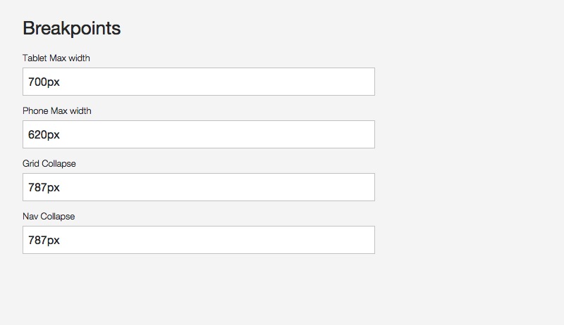
There are 4 breakpoints available in the template administrator.
- Tablet Max Width
- Phone Max Width
- Grid Collapse - Used to determine the browser width where all grids and module positions collapse to 100% width.
- Nav Collapse - Determines the browser width where the main navigation changes according to the Collapsed Menu Behaviour setting.
As mentioned above the breakpoints for the tablet and phones specified here tie into the settings available in the layout tool.
The values here also determine the widths that the following responsive classes apply to your design. These responsive classes are specified in the zen/libs/zen/less/_responsive.less file.
- .hidden-desktop
- .visible-desktop
- .visible-tablets
- .hidden-tablets
- .stack-tablets
- .stack-phones
- .hidden-phones
- .visible-phone
- .visible-navcollapse
- .hidden-navcollapse
- .visible-gridcollapse
- .hidden-gridcollapse
These classes are available to use in your content items, module classes or in any custom template layout you create.