
Template widths, gutters and spacing
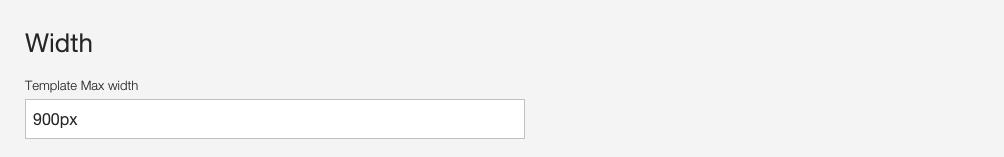
Width
Determines the maximum width of the template. On screen sizes smaller than the maximum width set here the theme will respond by scaling to a percentage of the viewport.
Width
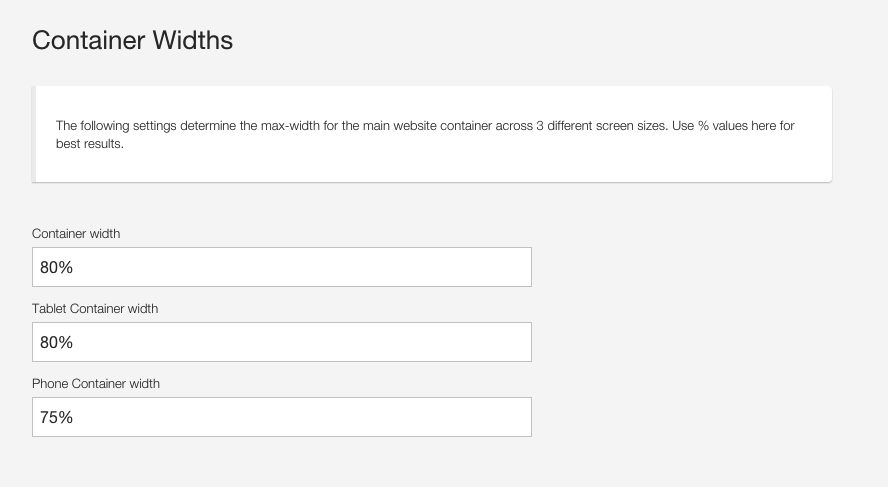
Container Widths
The setting that controls that percentage is found in the responsive template settings in the Container width section as per the screenshot below.
LESS Variables
@twidth: 980px // Maximum width of the template
@container-width:   80%; // Width of the container element on desktops
@tablet-container-width: 70%; // Width of the container element on tablets
@phone-container-width: 75%; // Width of the container element on phones
Padding and spacing
The settings found in the padding and spacing section determine the vertical and horizontal space applied to elements in the theme.
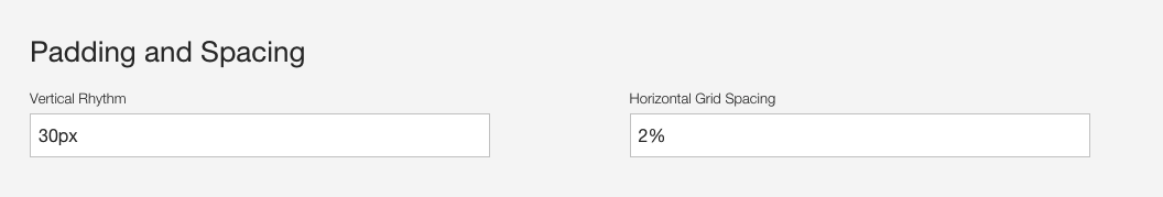
Vertical Rhythm
Applies to the bottom margin between major sections in the template.
Horizontal Grid Spacing
Determines the space between grid elements on the page. This value needs to be specified as a % value and is used to calculate the widths of the grid columns.
LESS Variables
@gutter-pc: 30px
@gutter: 30px