
Colours
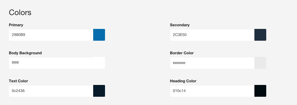
Determines the colours used as variables across the theme as well as basic colour settings for background, border, text and headings.
Colors
LESS Variables
@primary:                   #2980B9; // Can be re-used in other colour settings in the template
@secondary:                 #2C3E50; // Can be reused in other colour settings in the template
@body-bg:                   #fff; // Applies to the html, body and Zen-wrap divs in the template
@bordercolor:               #eee; // Used as the base colour for borders in the template
@text-color:                #333; // Color applied to all text elements that are not headings or otherwise specified in other settings
@headings-color:            #999; // Can also use @heading-color
Primary and Secondary colours
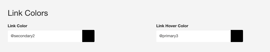
The primary and secondary colours are variables that are created based on the colours you assign to @primary and @secondary values. The template takes them and makes them 15% darker (@primary2 and @secondary2) or 15% lighter (@primary3 and @secondary3). This makes it possible to automatically spin new colours based on your @primary and @secondary variables and use them in your template, as in the screenshot below.
LESS Variables
// Primary colours
@primary2:              darken(@primary, 15%);
@primary3:              lighten(@primary, 15%);

// Secondary colours
@secondary2:            darken(@secondary, 15%);
@secondary3:            lighten(@secondary, 15%);