
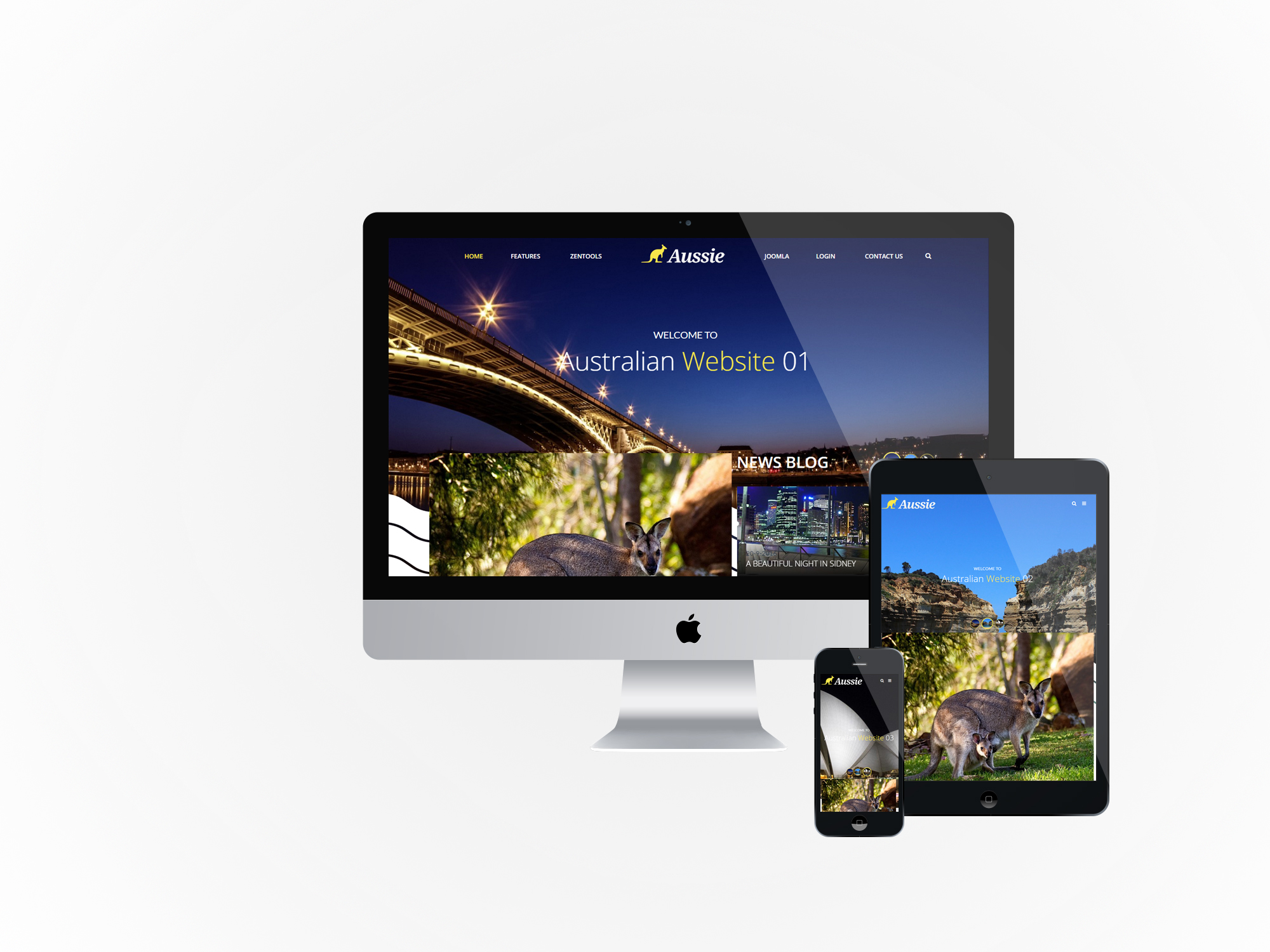
In Progress
Aussie is a child theme of the Buildr template. This means it uses the Build.r template and applies Aussie specific style via Buildr's built in child theme functionality.
The files for child themes are located in the templates/buildr/child folder and are selected in the template admin design side panel. You can read a full explanation of child theming in Build.r here.
The following applies to situations where you have already installed the Buildr template on your site or are installing buildr for the first time.
Step 1 - Download and install the latest version of the Buildr template.
Step 2 - Once installed navigate to the template manager and edit the Buildr template.
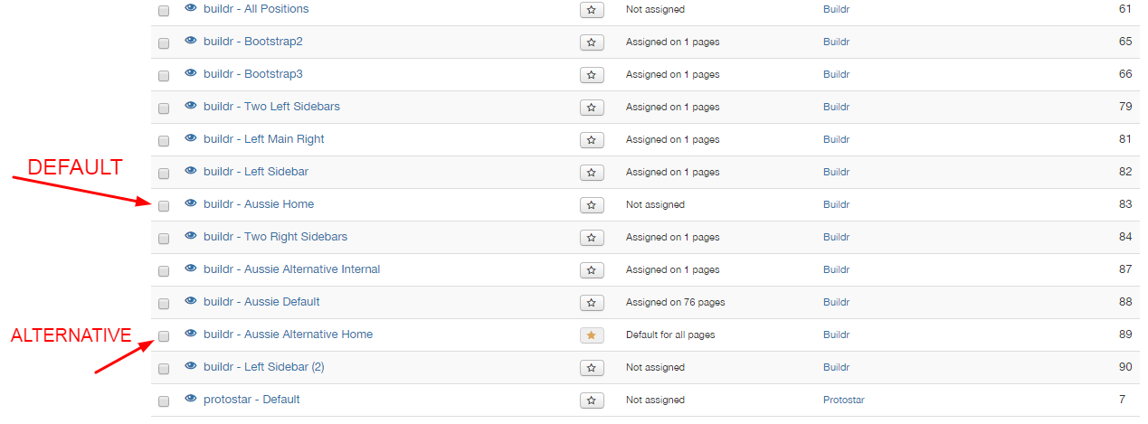
Step 3 - Select the Aussie example configuration from the load saved settings dropdown.
After doing this the Aussie child theme will be selected and the Aussie preset will be set in the preset dropdown list.
Applying the Aussie example configuration sets the required theme panel options including the layout blocks used on the demo site in the layout tool.
Step 4 - Click Save. After clicking save the required assets for the Aussie theme will be generated (theme files, css files etc) and will now be available for use on your website.
You can customize the template through the theme control panel, according to the image:
If you are starting a new website from scratch we highly recommend installing the Aussie quickstart package. This is by far the simplest way to recreate the demo site on your server.
Learn about installing the quickstart package.
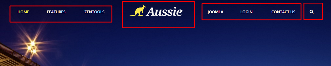
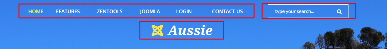
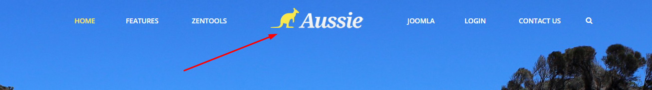
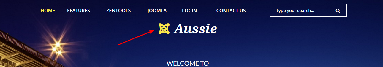
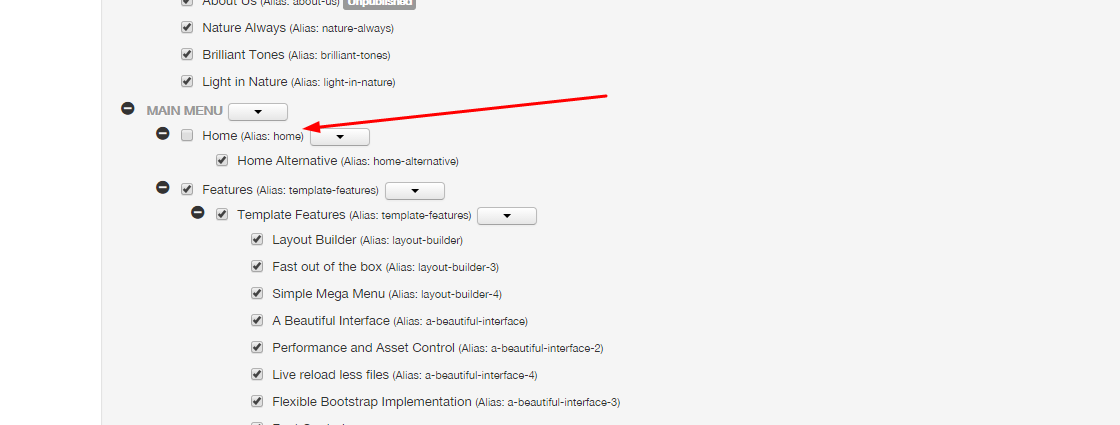
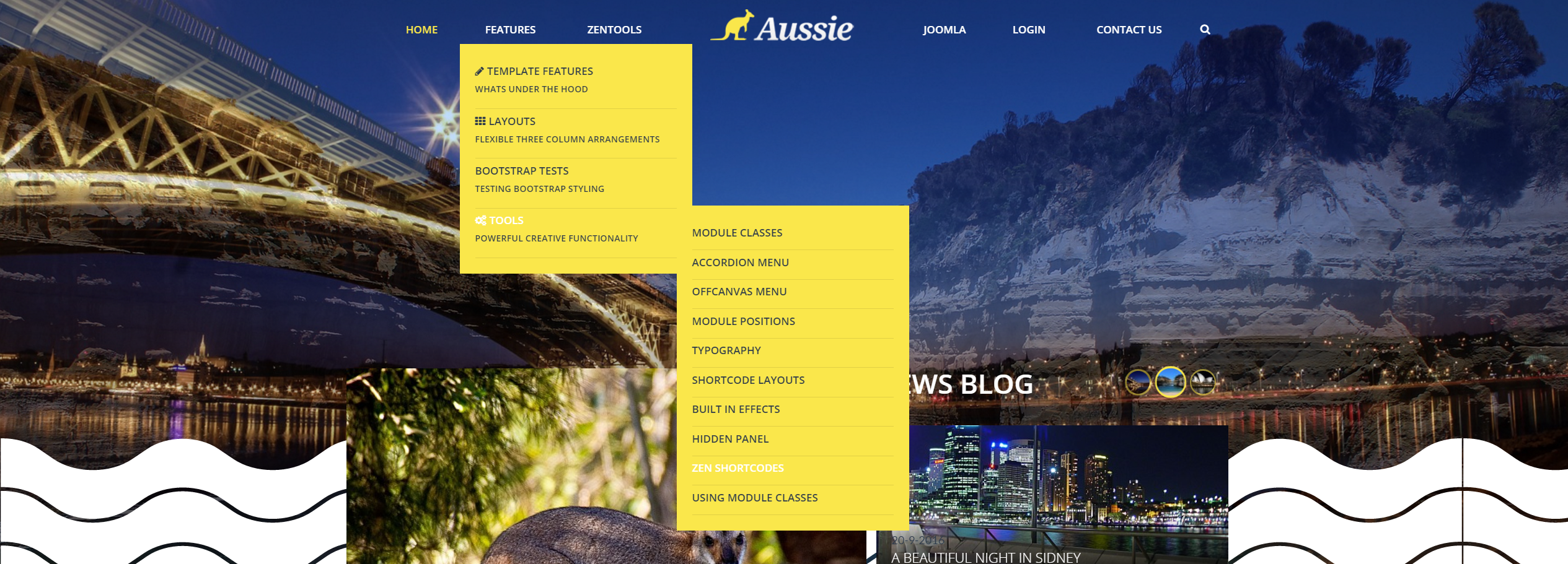
The Aussie theme has two versions of the menu layout, configured as follows:
1 - The first version is MENU >> LOGO >> MENU >> SEARCH
2 - The second version consists of MENU >> SEARCH >> LOGO (below)
To configure the menus you need to configure the following:
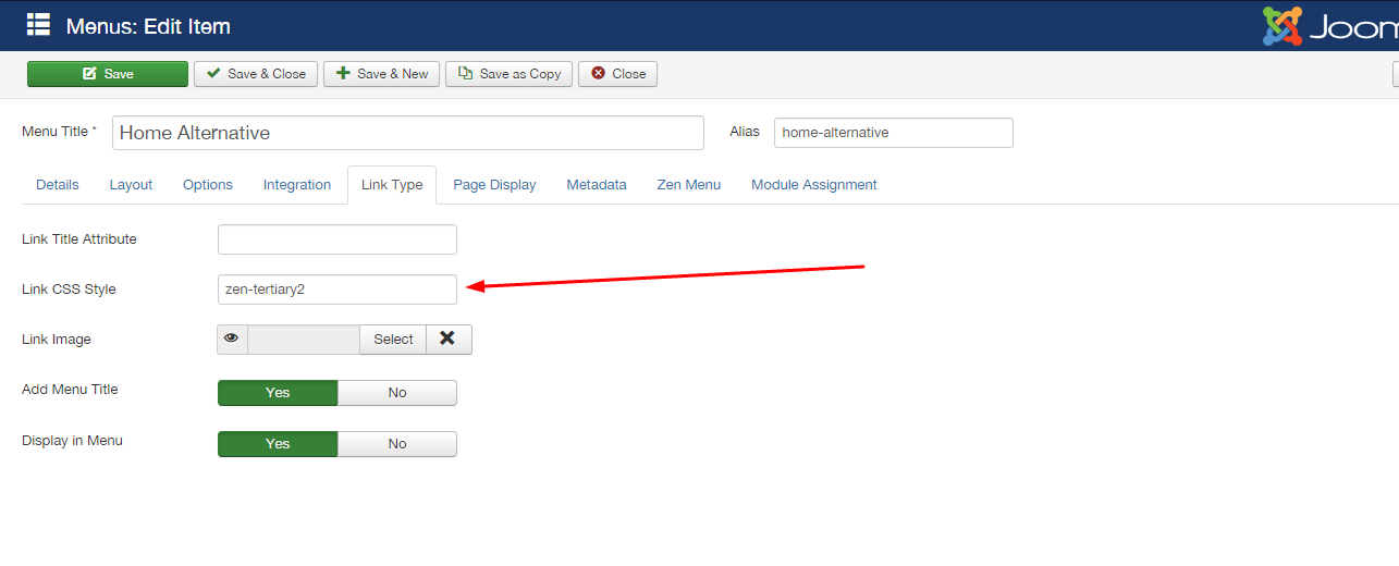
Within each menu, you need to enter these classes:
Menu Default
Menu Alternative
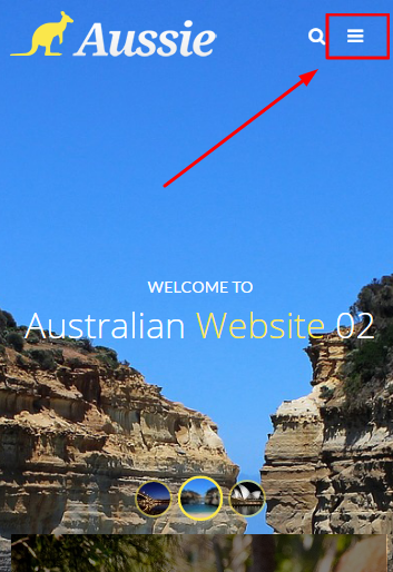
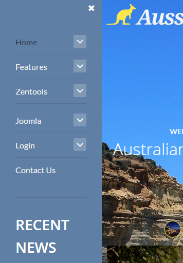
The offcanvas menu
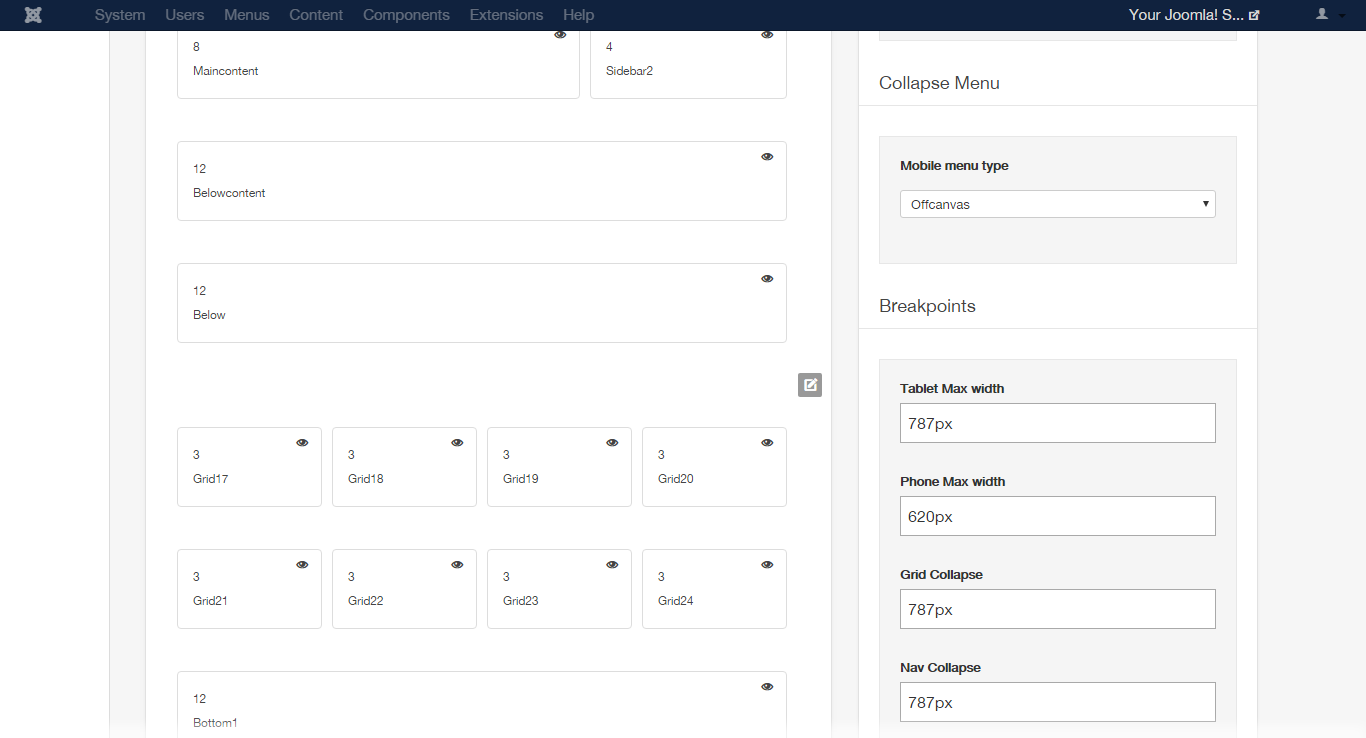
Collapsed menu
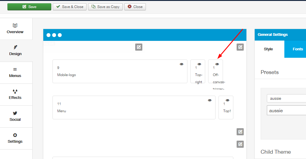
The configuration of offcanvas menu is controlled according to the following screen in the theme admin panel
Offcanvas button settings
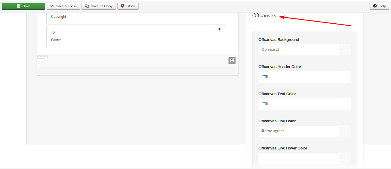
The settings used to customize the offcanvas menu are controlled according to the next image.
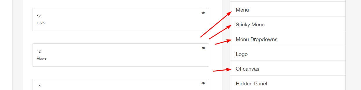
Positioning the offcanvas menu
The offcanvas menu is located according to the image below. It is enabled to access the website on portable devices.
Please note: The offcanvas menu will only be activated and viewed when accessing the website from a portable device.
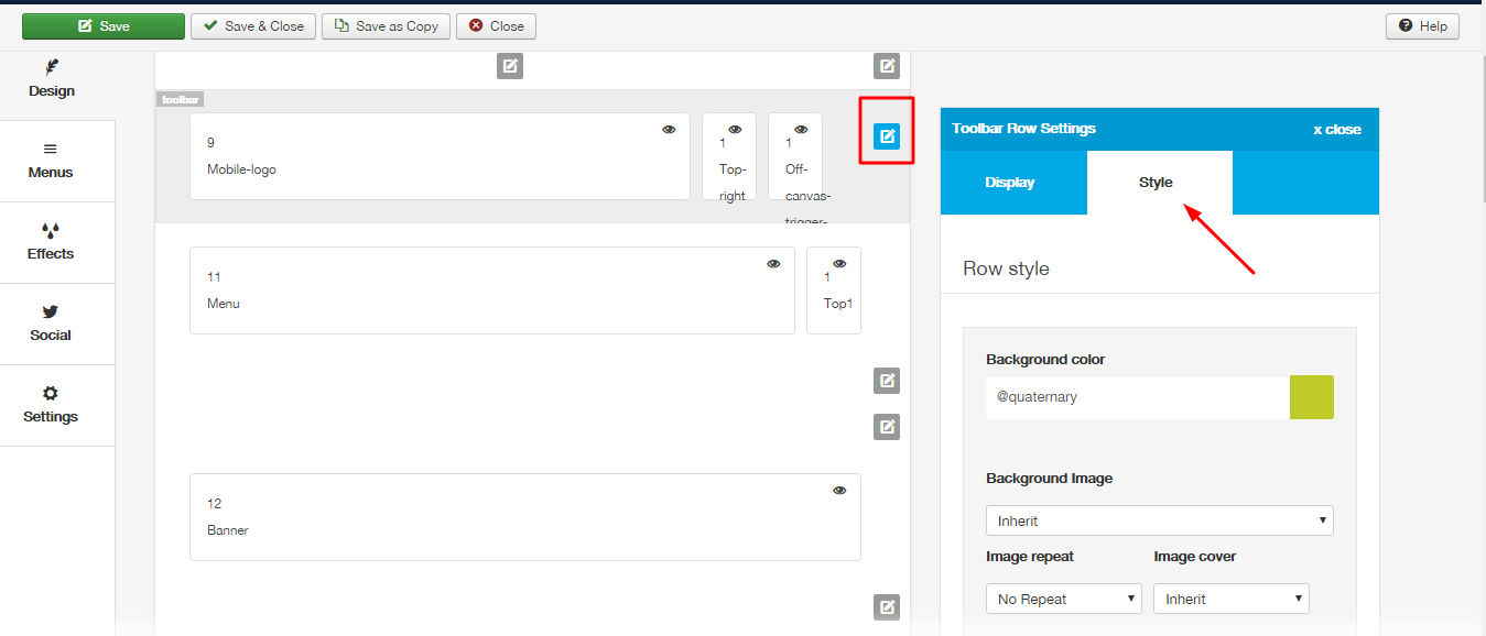
To edit the row settings, click the row icon according to the figure below and then go into the style tab. To copy the settings from the demo, set them according to the next image.
To customize the menus, follow the panel according to the image:
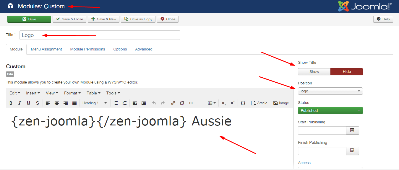
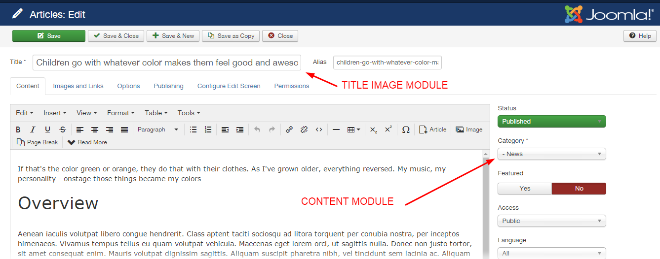
The logo in the Aussie template uses a custom html module published to the logo position.
The logo is presented in two forms, one for each menu:
1 - Menu default - With the default menu, the logo is used as the image
<h1><a href="index.php"><img src="images/democontent/logo-aussie.png" alt="logo" /></a></h1>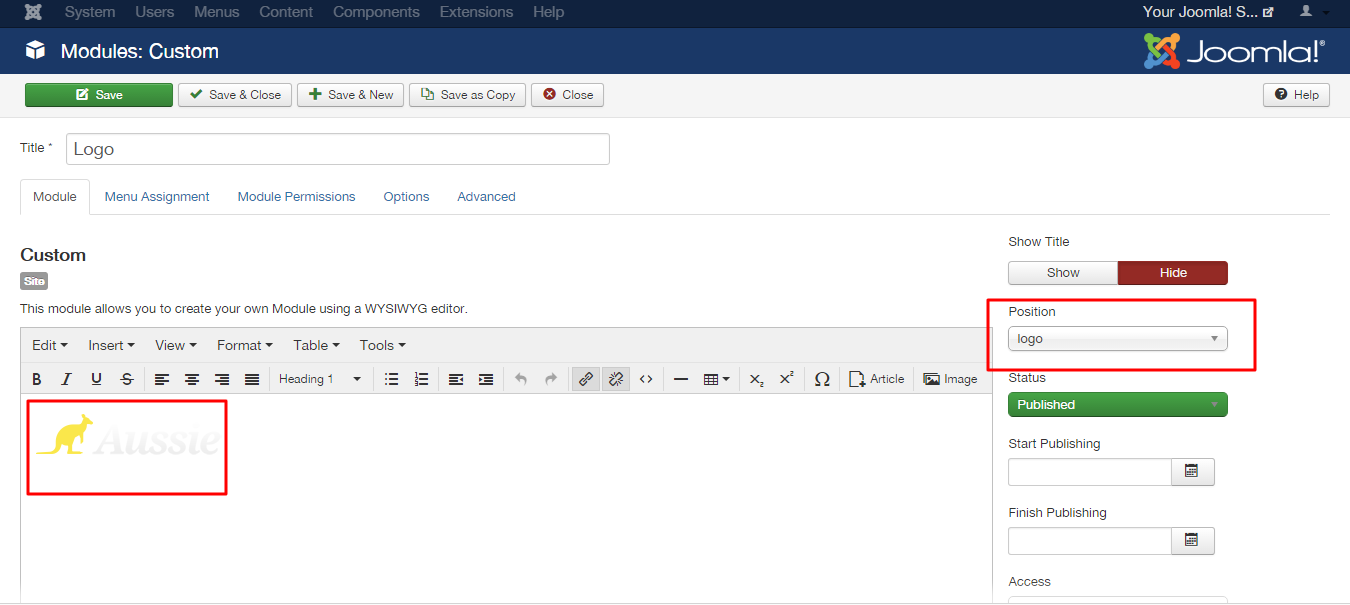
2 - Menu alternative - With the alternative menu, the logo is used as html
<h1><a href="index.php">{zen-joomla}{/zen-joomla} Aussie</a></h1>The logo consists of an icon and text. The icon is displayed using syntax from the zen shortcodes plugin. As per the following image:
Disable this option so only the alternate logo is displayed!
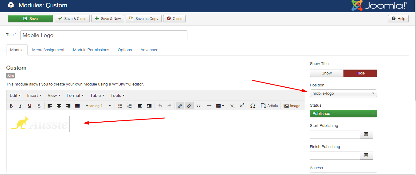
 Do not forget to create a module for the logo of the mobile version as the image. The other settings are the same as the previous one.
Remember to select all the contents within the text field, and add the link under the picture.
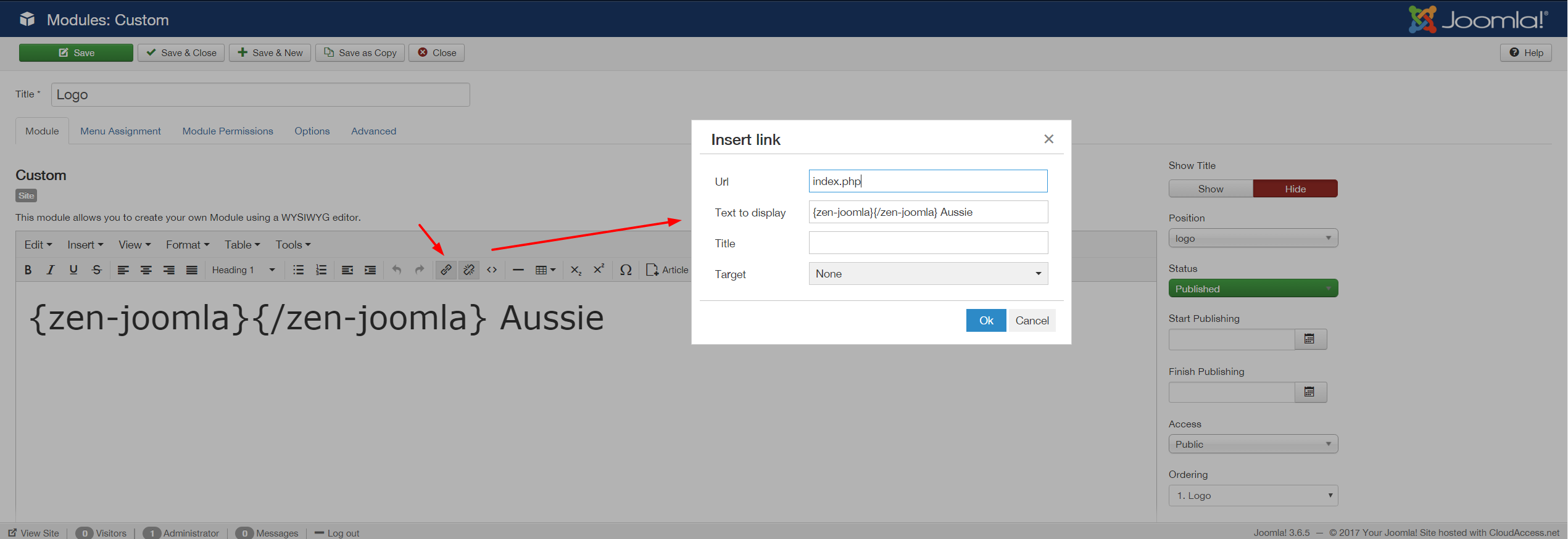
To view the list of Zen Shortcode tags, access path: Features menu> Tools > Zen Shortcode> tab font icons:
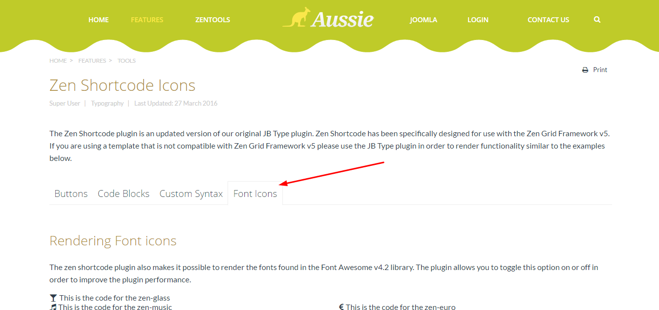
To customize the logo, follow the panel according to the image:
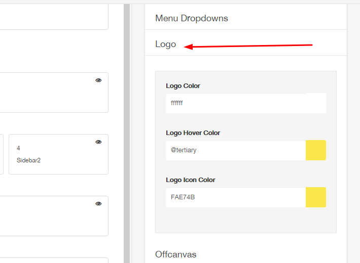
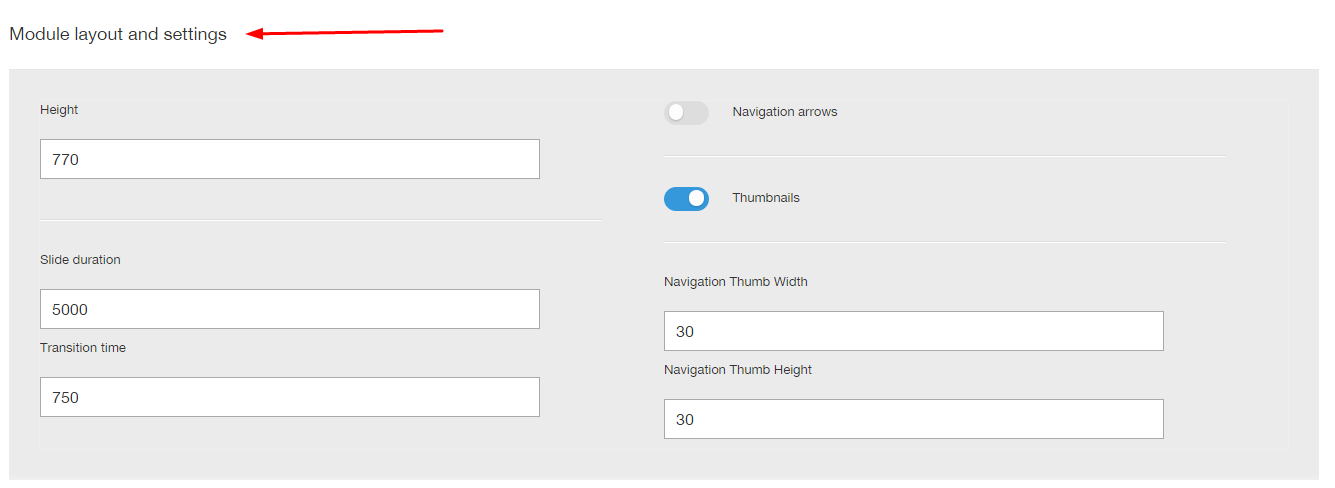
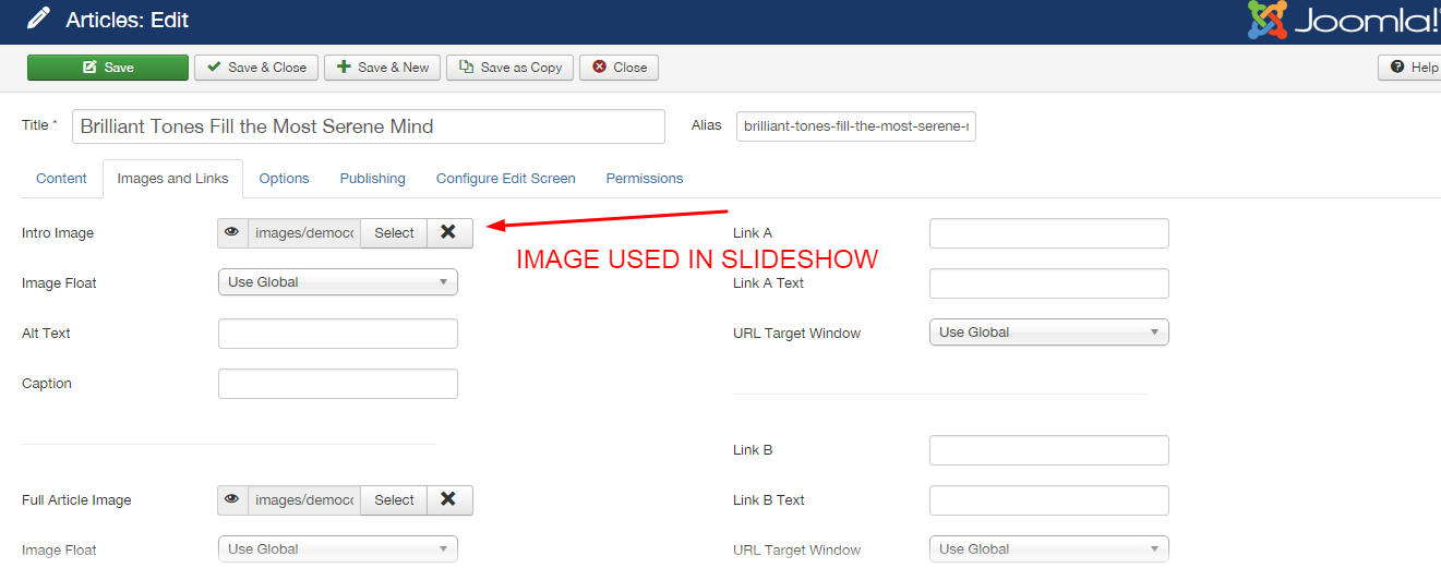
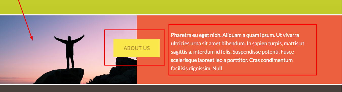
To configure the top slideshow, see the illustration below:
See the settings screens:
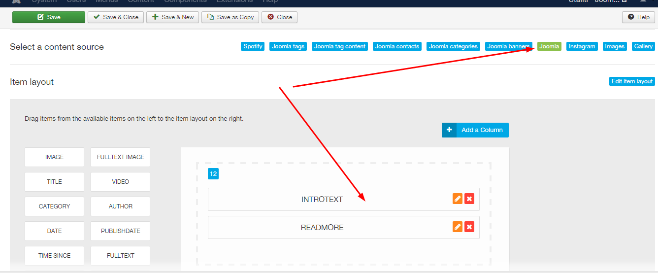
Slideshow items use standard joomla articles:
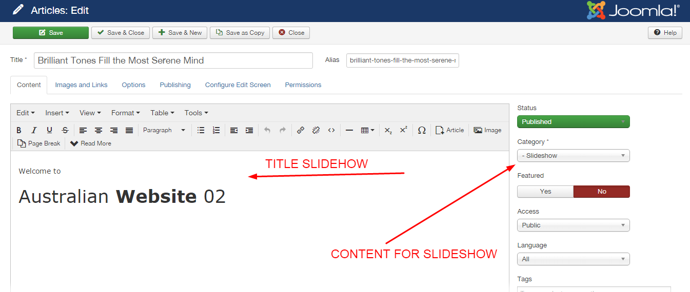
The content selection is made according to the image:
The image is automatically retrieved from the item currently set to display however if the image doesn't exist then the slideshow will display a blank tile which uses the primary color set in the Zentools2 theme panel.
To use the Aussie slideshow style, you need to add a class suffix in the modules advanced settings tab equal to the following:
aussie-slideshow wave-border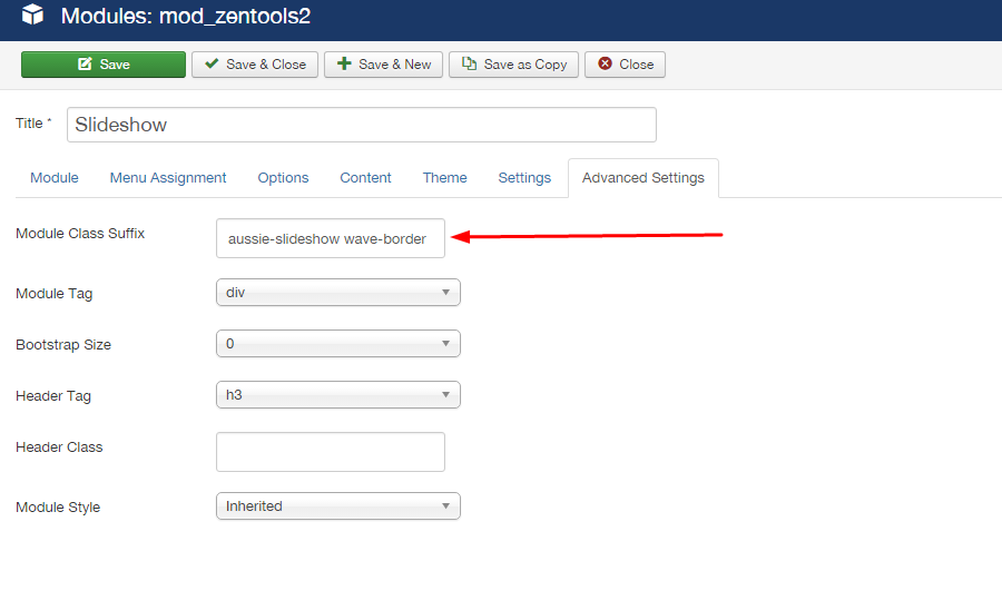
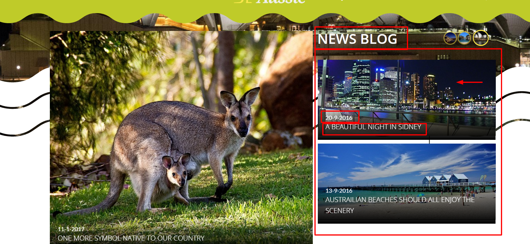
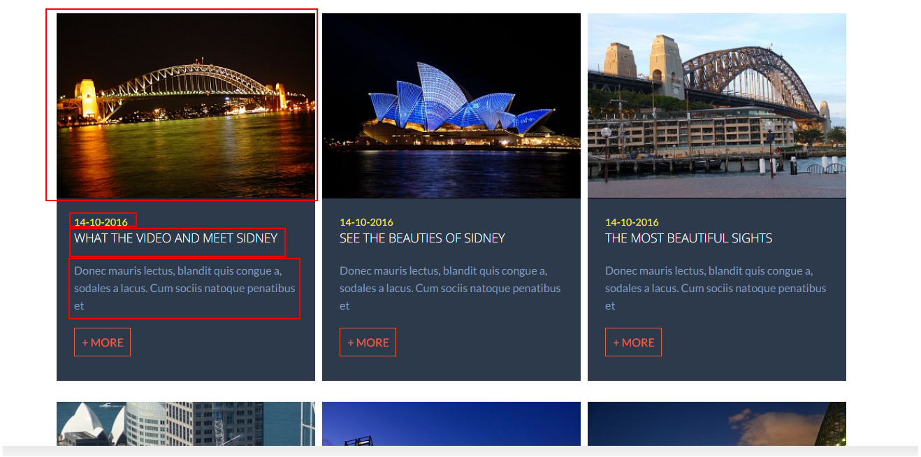
This part is composed of two modules in the same position:
Featured: Controls left-side images
- Featured
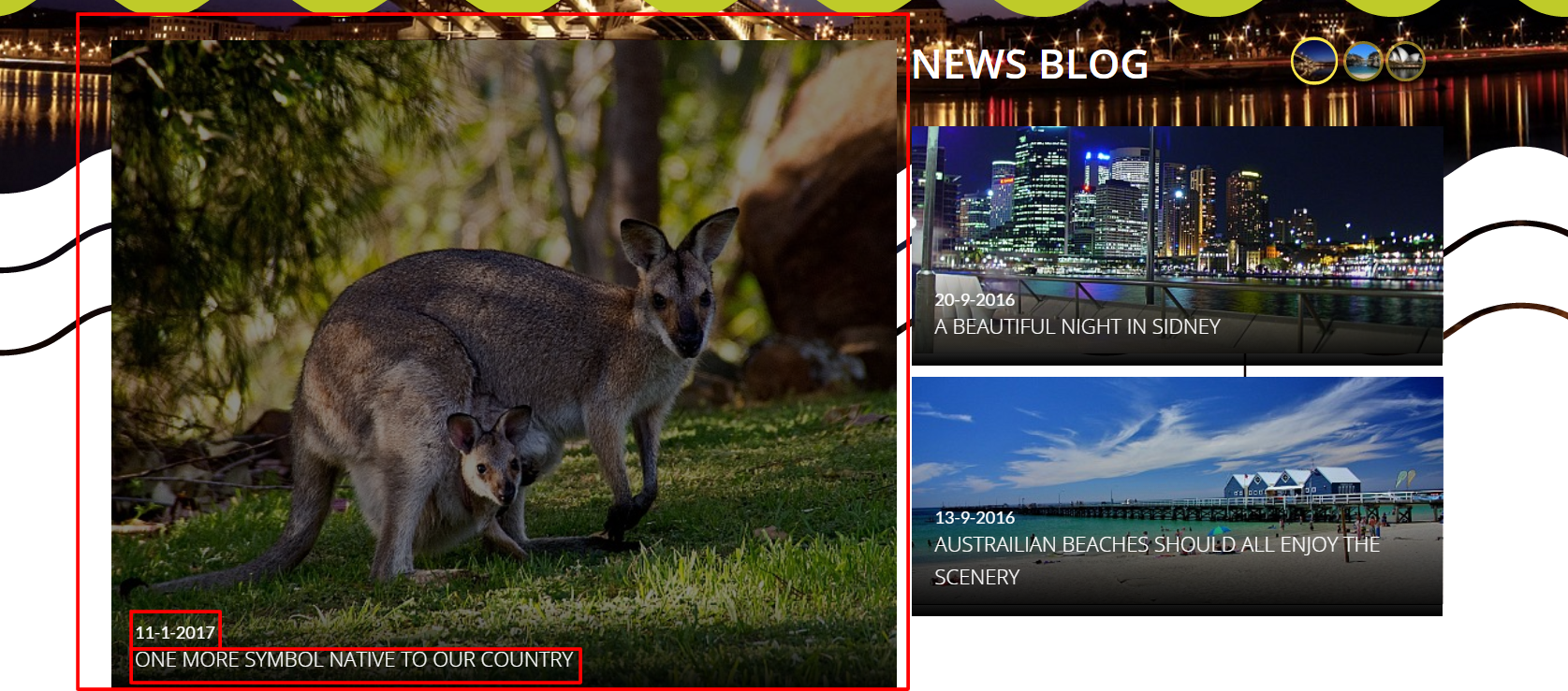
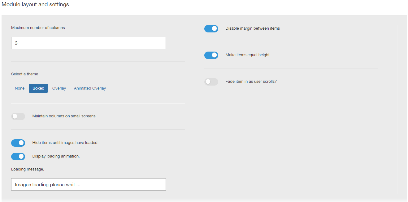
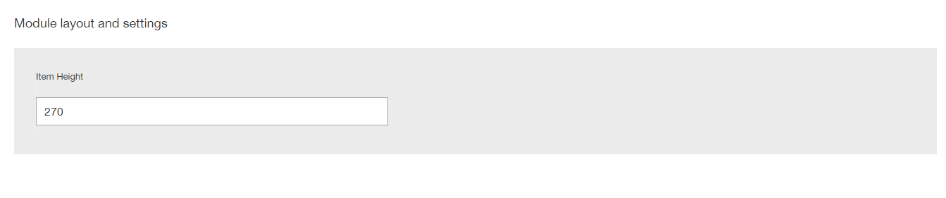
The module configuration in accordance with the image:
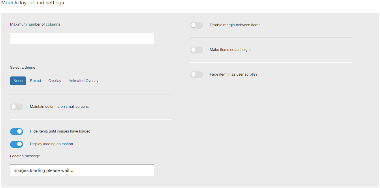
For setting the module items, follow the picture:
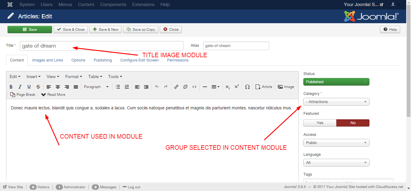
The content that is displayed is generated from joomla articles.
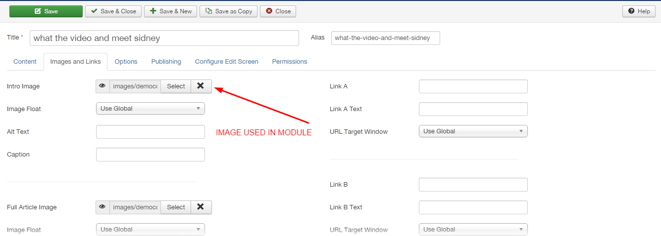
For the Featured module assume the style of the Aussuie theme, do not forget to use it, according to the image below
Module class suffix:
aussie-featured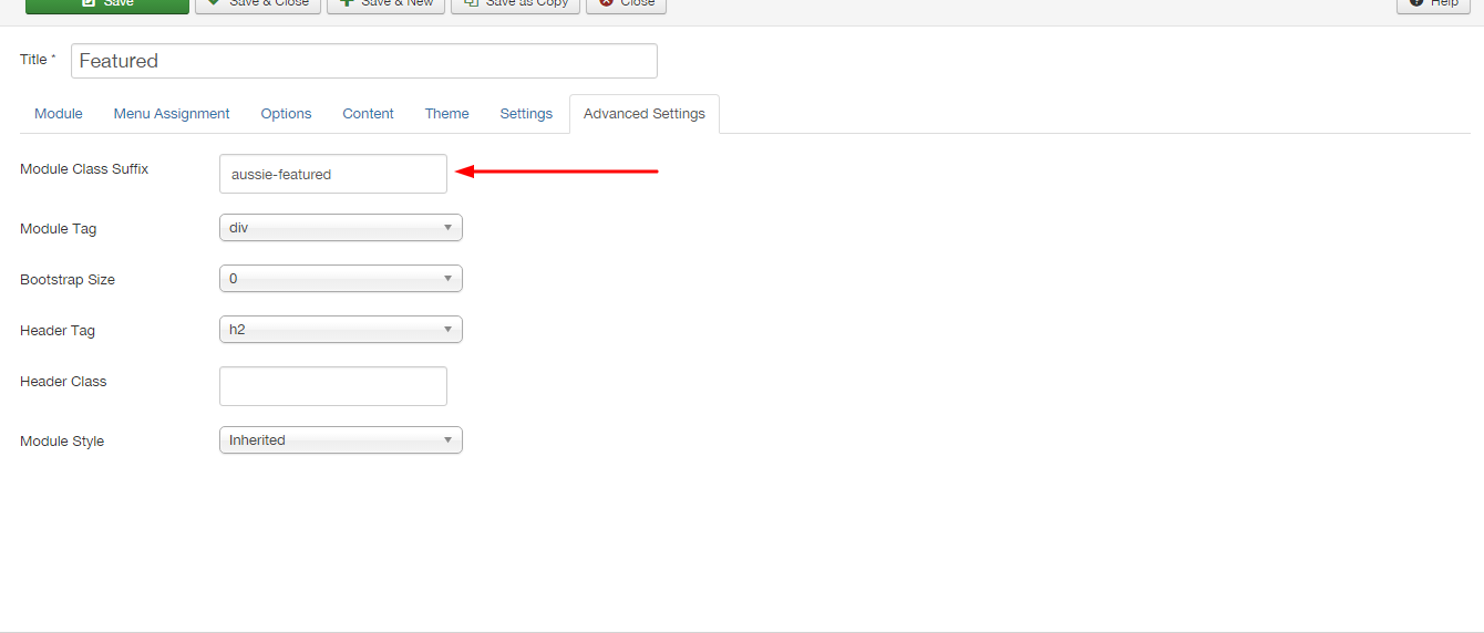
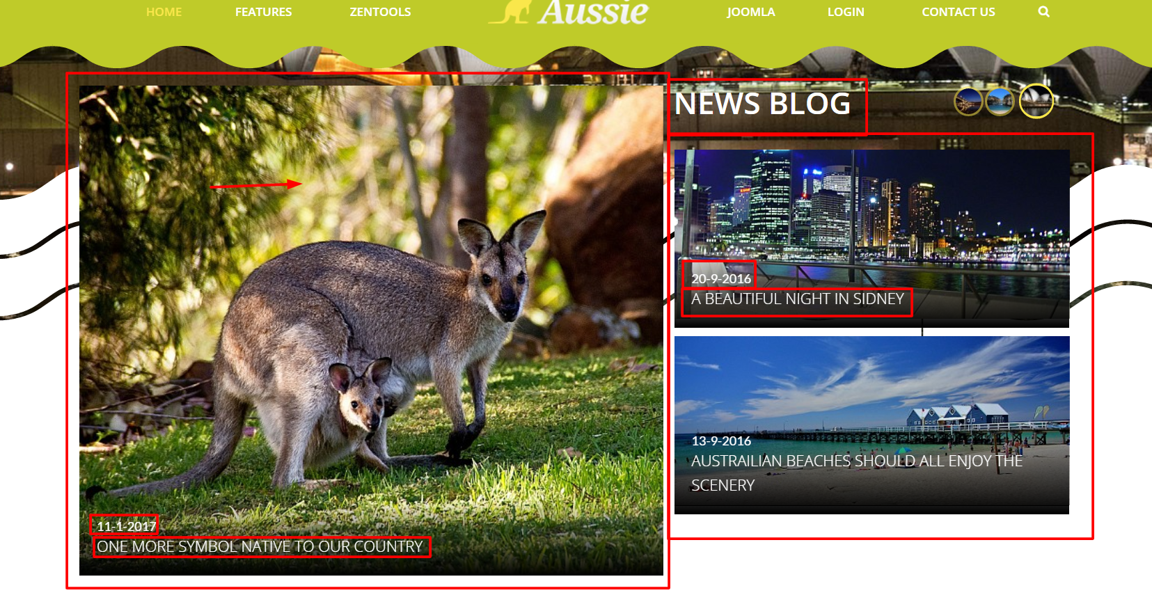
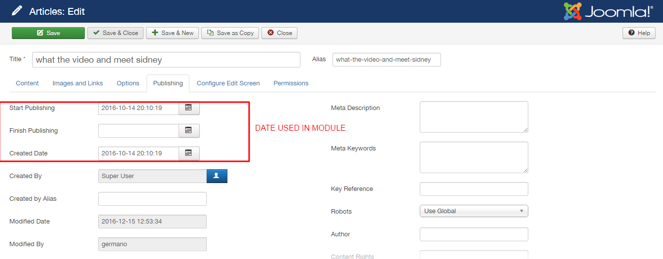
- News Blog
The module configuration in accordance with the image:
For setting the module items, follow the picture:
The content that is displayed is generated from joomla articles.
For the Featured module assume the style of the Aussuie theme, do not forget to use it, according to the image below
Module class suffix:
aussie-news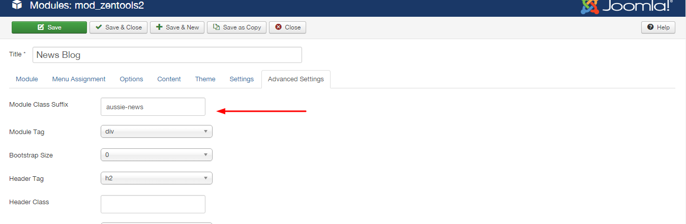
The module configuration follows the image:
For the other setting the module items, follow the picture:
The content that is displayed is generated from joomla articles.
For the News Blog 2 module assume the style of the Aussuie theme, do not forget to use it module class sulfix, according to the image below
Module class suffix:
aussie-more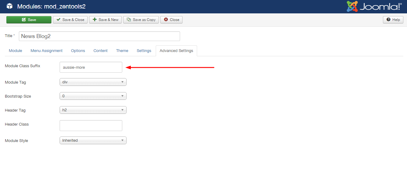
The module configuration follows the image:
For the other setting the module items, follow the picture:
The content settings are according to the image:
The content that is displayed is generated from joomla articles.
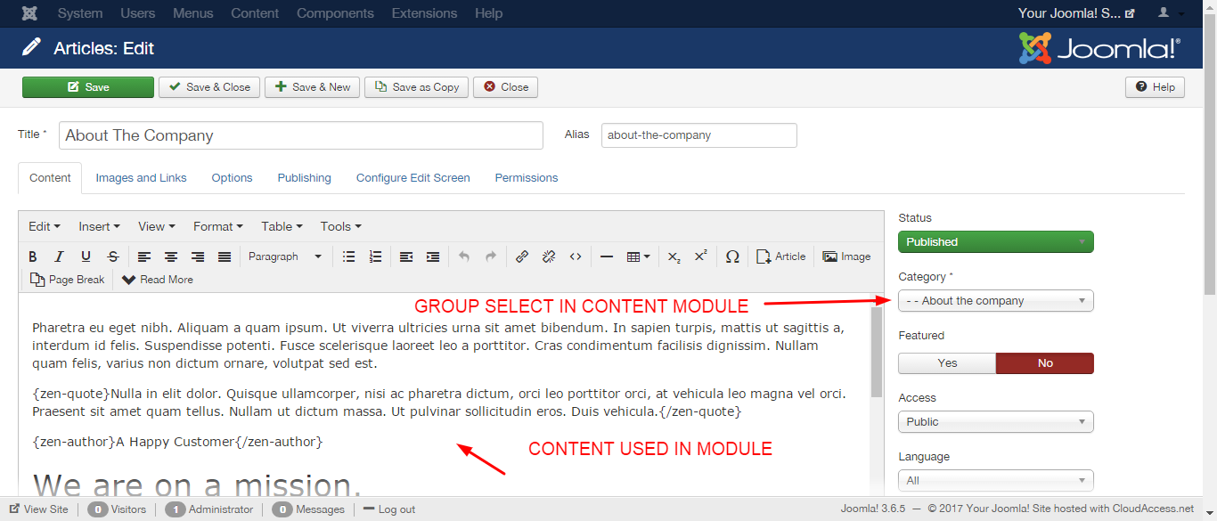
To select more than one category in the 'CONTENT' tab, press CTRL (Windows) or Command (MAC).
For the Attractions module assume the style of the Aussuie theme, be sure to use class sulfix module, according to the image below
Module class suffix:
aussie-slide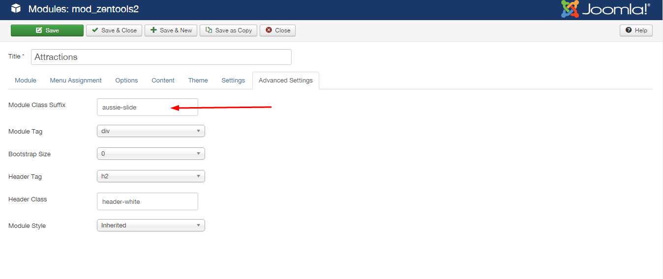
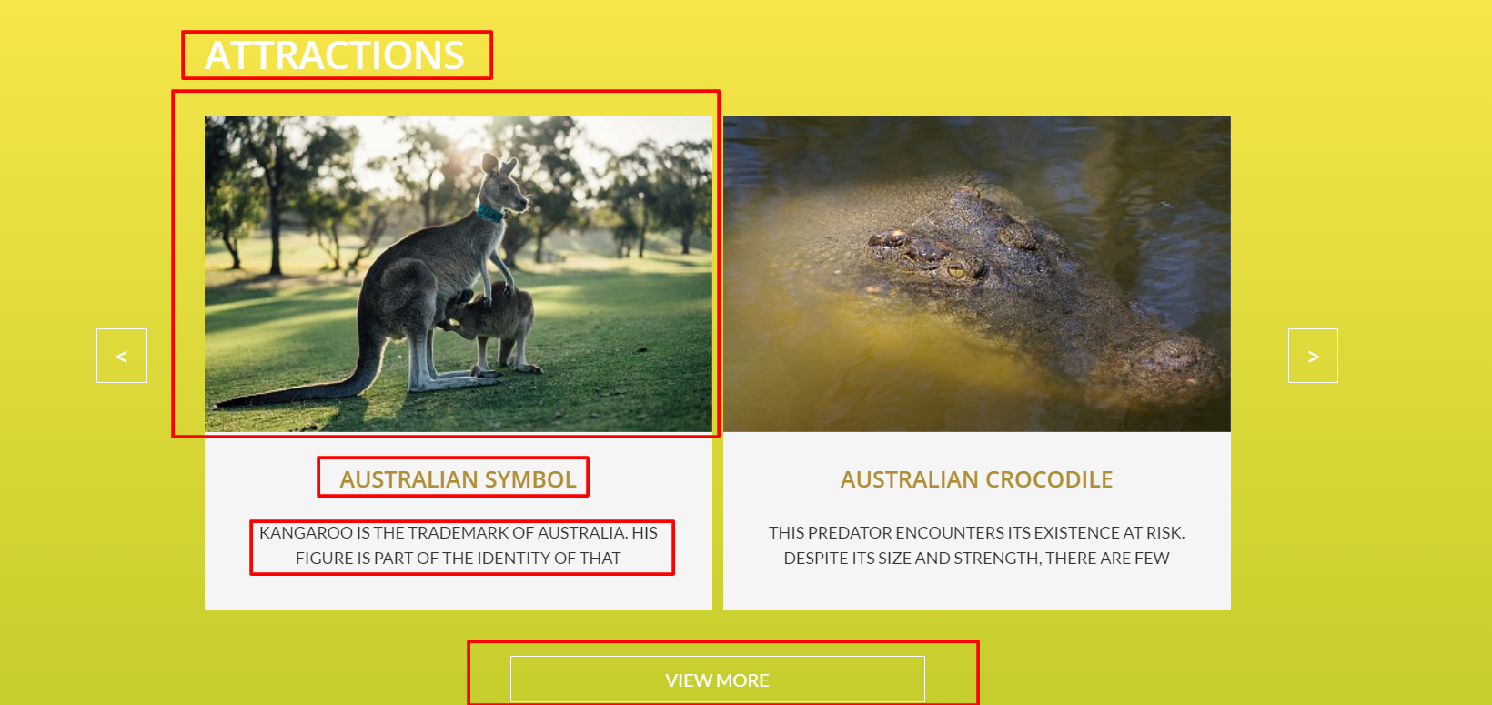
The module configuration follows the image:
For the other setting the module items, follow the picture:
The content that is displayed is generated from joomla articles.

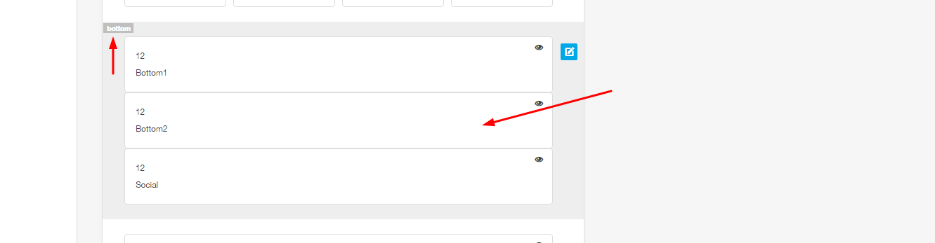
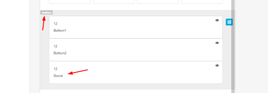
This menu is positioned on the bottom row, in the position bottom 1:
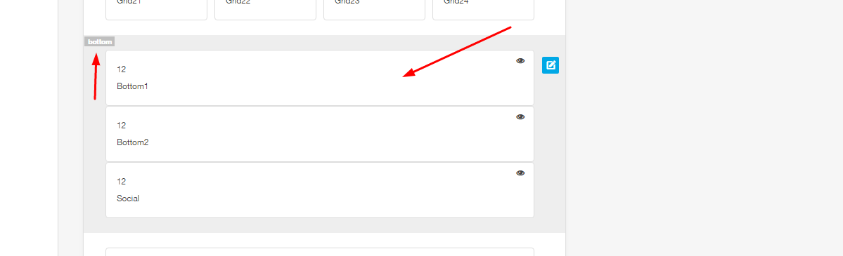
This menu is linked to the menu Footer Menu
This menu is positioned on the bottom row, in the position bottom 2:
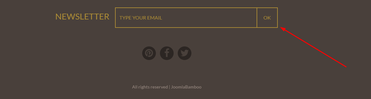
Attention! This module is only an illustrative version of a newsletter module, without any effective action. If you want, you need to install a newsletter module for this
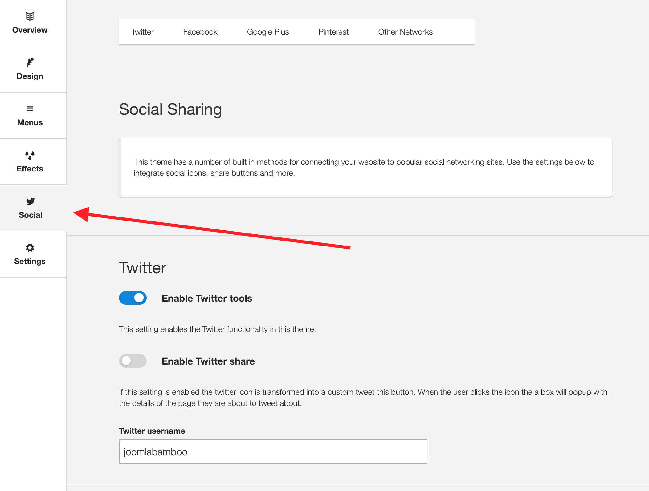
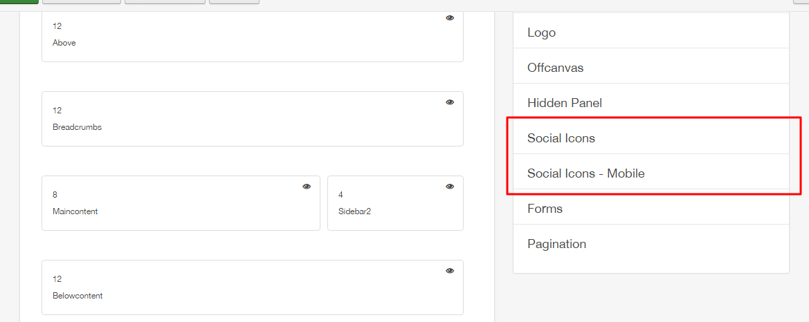
The social icons are located in the bottom position of the theme.
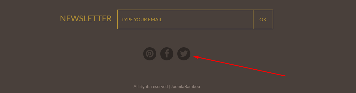
The content for the social icons can be set in the social panel in the template panel.
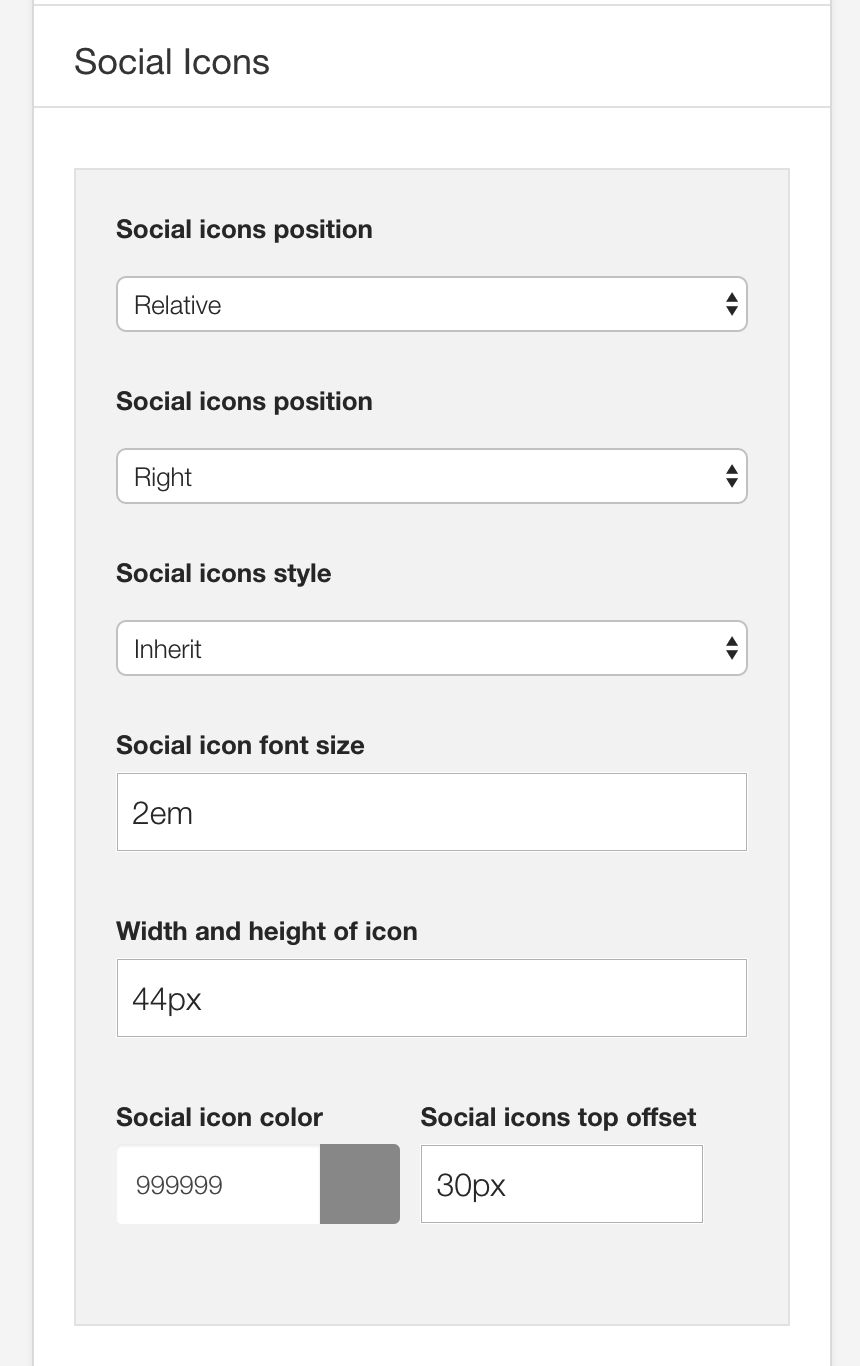
The color, size and other aspects of the social icon appearance can be controlled via the general settings side panel in the template's design panel.
Accessing the project in portable devices, social icons are like the image:
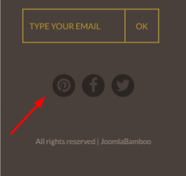
As can be seen in the screenshot above, the social block is designed to be hidden on all screens larger than the phone breakpoint size. The value for the breakpoints can be set in the Layout > Breakpoints section of the General settings side panel.
The colour, size and other aspects of the social-mobile icon appearance can be controlled via the general settings side panel in the template's design panel.
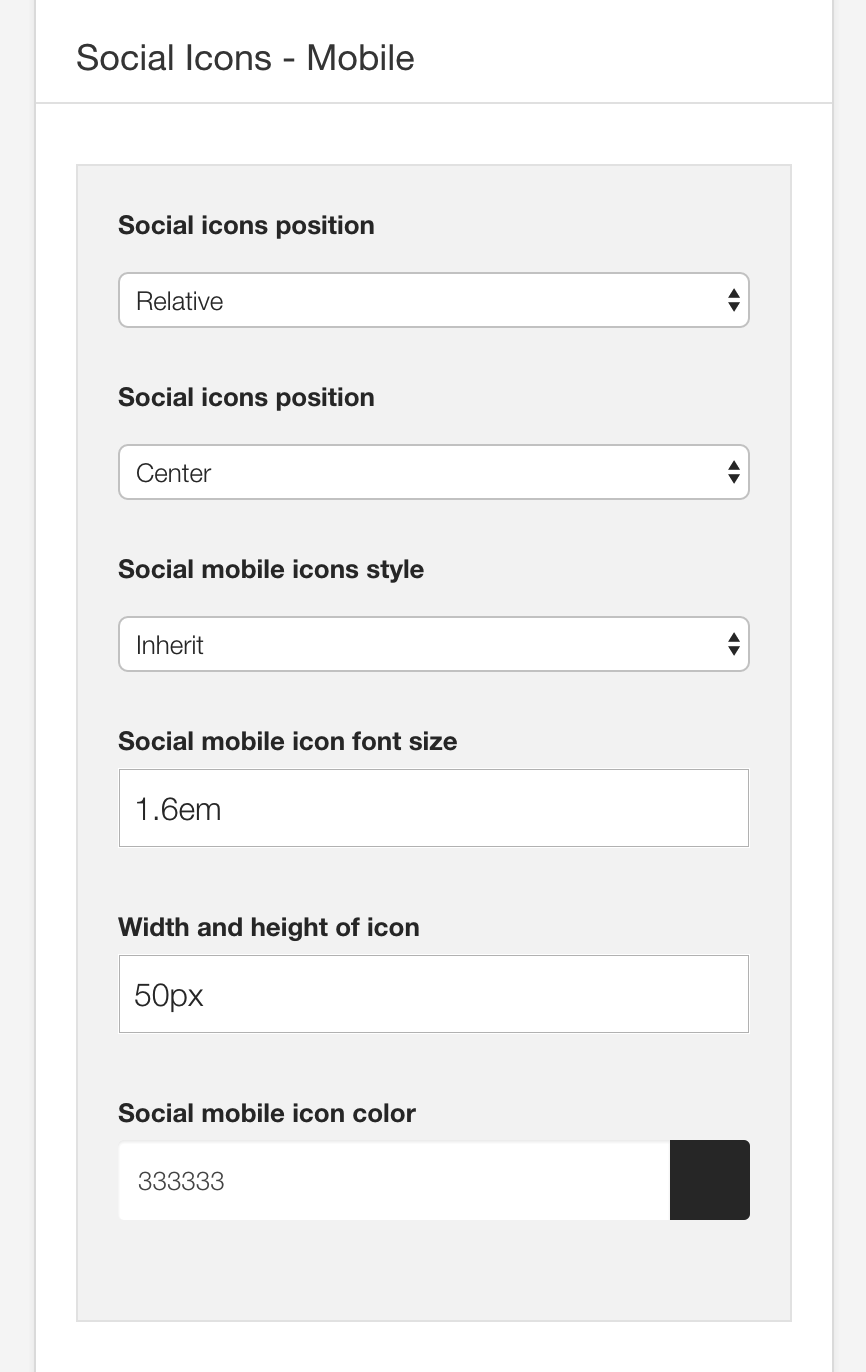
The background used in the breadcrumb is managed by a JB Maps2 module. Where you can change the images,
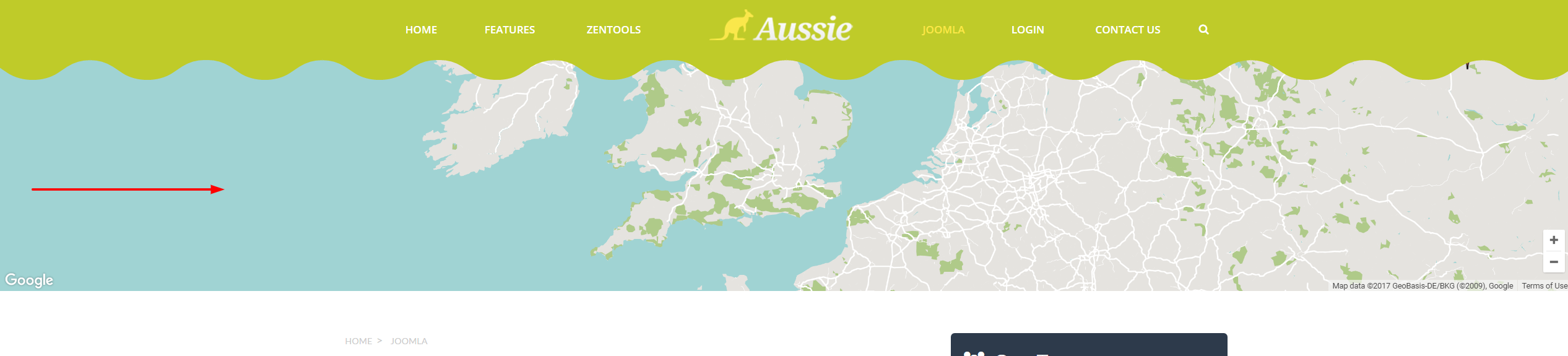
The settings you can see in the images: