
This article is incomplete and will be updated shortly.
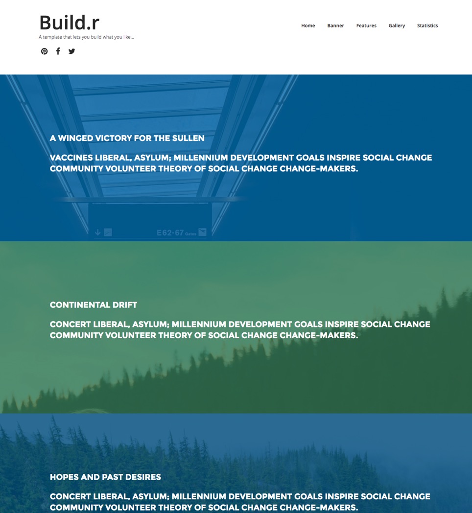
The Rows template is a one page design that showcases the Build.r functionality of being able to display an image underneath the content across multiple rows on the page.
Custom html module published to the logo position.
Social icon block generated by the template.


Offcanvas trigger generated by the template.

The offcanvas trigger is positioned in the template via the layout tool.

Features such as the button style for the offcanvas trigger, the side of the screen the offcanvas opens on, when it becomes visible and the text for the trigger are controlled in the menus > offcanvas panel of the template.

The color of the offcanvas button is controlled in the row settings panel for the top-right position. The btn-empty style inherits the color set in the colors section of the top-right row settings panel.

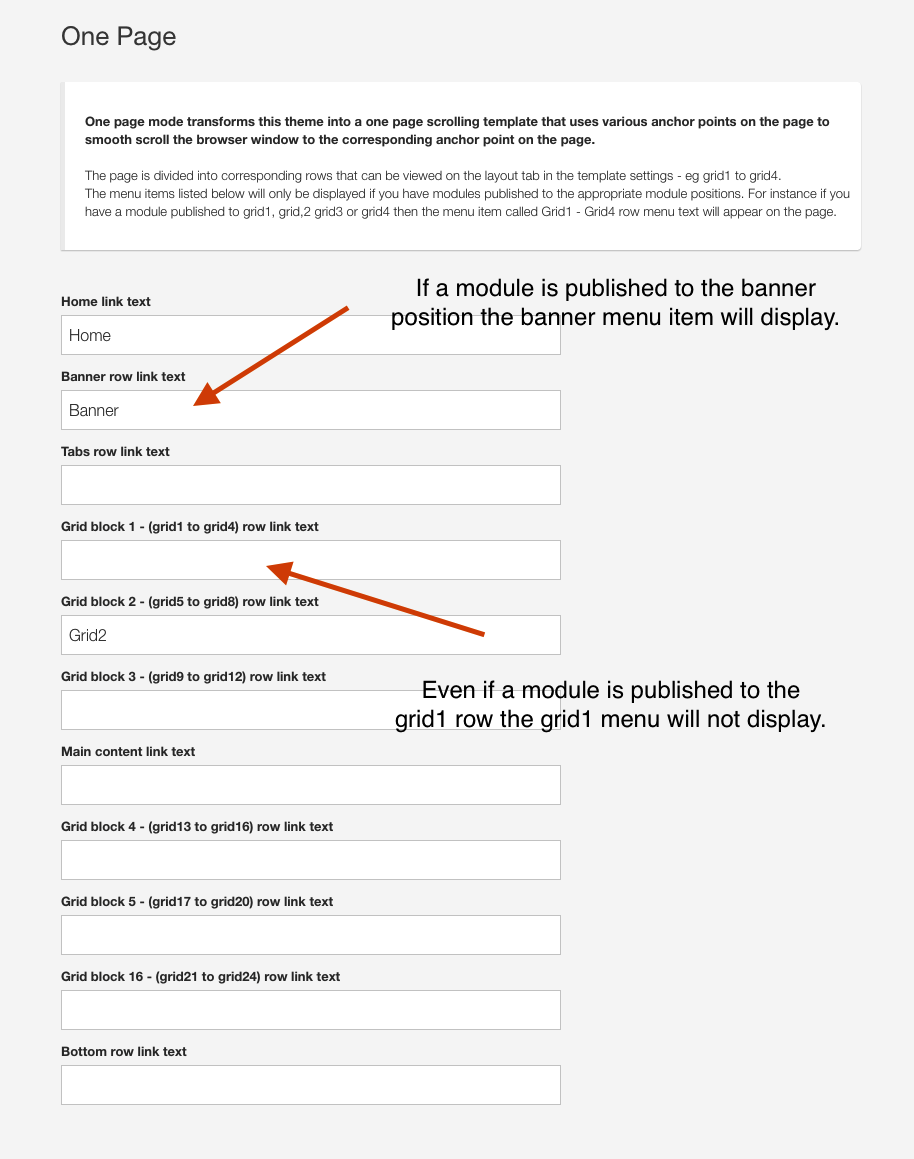
The menu is an instance of the Onepage menu layout block.
The menu is automatically created when you add a module to a specific position and the menu title for that position is not blank in your template settings.

The four rows of content that use the rows of colour with the image underneath are an example of applying images to rows via the row settings and applying a transparent overlay to the row.
The content is derived from a custom html module published to the following positions:
The image for each row is set in the row settings for the corresponding row.

The overlay colour is referenced from the colour assigned to the background for each row.

The % transparency is referenced from the Overlay fade setting (%) found in the general settings panel under the Background Overlay accordion.

The modules published to each position use the following module classes:
Each row is given a no-margin row class which ensures that:

These two modules are instances of the Skillset module.

Skillset provides the ability to display numbers and percentages in three different ways. The Buildr template shows the circular and the bar layout. The additional layout is the count down layout.
The module is published to the following positions:
The row is assigned a vertical padding class.

The bottom modules are a collection of custom html modules.
Published to the bottom1 position. Uses Zen Shortcode syntax to render the icons

Markup Used
Note the use of the zen classes on the list:
zen-lines renders lines underneath the list items
<ul class="zen-nav zen-nav-stacked zen-lines">
<li><a href="http://www.joomlabamboo.com">{zen-heart}{/zen-heart} Origin Story</a></li>
<li><a href="http://www.joomlabamboo.com">{zen-truck}{/zen-truck} Meet the Team</a></li>
<li><a href="http://www.joomlabamboo.com">{zen-search}{/zen-search} New additions</a></li>
<li><a href="http://www.joomlabamboo.com">{zen-users}{/zen-users} Want to work with us</a></li>
</ul>Published to the bottom2 position.

Markup Used
Note the use of the zen classes on the list:
zen-lines renders lines underneath the list items
<ul class="zen-nav zen-nav-stacked zen-lines">
<li>New York</li>
<li>Sydney</li>
<li>Barcelona</li>
</ul>Published to the bottom3 position.

Markup Used
Note the use of the zen classes on the list:
zen-lines renders lines underneath the list items
<ul class="zen-nav zen-nav-stacked zen-lines">
<li><a href="http://www.joomlabamboo.com">{zen-bug}{/zen-bug} Licensing</a></li>
<li><a href="http://www.joomlabamboo.com">{zen-table}{/zen-table} Terms and Fees</a></li>
<li><a href="http://www.joomlabamboo.com">{zen-certificate}{/zen-certificate} Agreements</a></li>
<li><a href="http://www.joomlabamboo.com">{zen-bicycle}{/zen-bicycle} Statutory regulations</a></li>
</ul>
This is a html content module containing dummy content. There is no functionality attached to this input.
<p><input type="text" placeholder="Email" /><button class="btn">Submit</button></p>Joomla menu published to the footer position

Zensocial module published to the footer position

Custom html module published to the footer position
The menu in the offcanvas position is automatically rendered from the menu module.

The Offcanvas menu is set to display on the screen and at all screensizes because of the following criteria.
Collapse menu set to display offcanvas
The collapse menu type is set to use the Offcanvas panel.

The recent news module is an instance of the Zentools2 module displaying Joomla content using the list layout.

Module

Options

Content
