In Progress
Colourshift2 is a child theme of the Build.r template. This means it uses the Build.r template and applies Colourshift2 specific style via Build.r's built in child theme functionality.
The files for child themes are located in the templates/buildr/child folder and are selected in the template admin design side panel. You can read a full explanation of child theming in Build.r here.
Colourshift2 uses child themes for colour variations.
The following applies to situations where you have already installed the Buildr template on your site or are installing buildr for the first time.
Step 1 - Download and install the latest version of the Buildr template.
Step 2 - Once installed navigate to the template manager and edit the Buildr template.
Step 3 - Select Colourshift2 as a preset.
Step 4 - Select the Colourshift2 example configuration from the load saved settings dropdown.
After doing this the Colourshift2 child theme will be selected and the Colourshift2 preset will be set in the preset dropdown list.
Applying the Colourshift2 example configuration sets the required theme panel options including the layout blocks used on the demo site in the layout tool.
Step 5 - Click Save. After clicking save the required assets for the Colourshift2 theme will be generated (theme files, css files etc) and will now be available for use on your website.
If you are starting a new website from scratch we recommend installing the Colourshift2 quickstart package. This is by far the simplest way to recreate the demo site on your server.
Learn about installing the quickstart package.
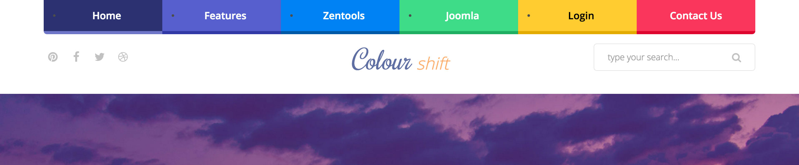
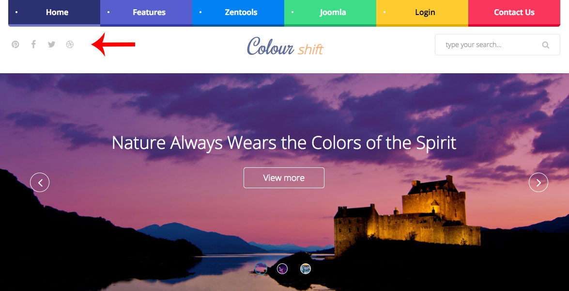
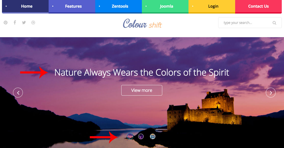
The menu colours, like you see on the image above, are configurable using special classes via menu settings, in the images below you will be able to see how it is done.
POSITION
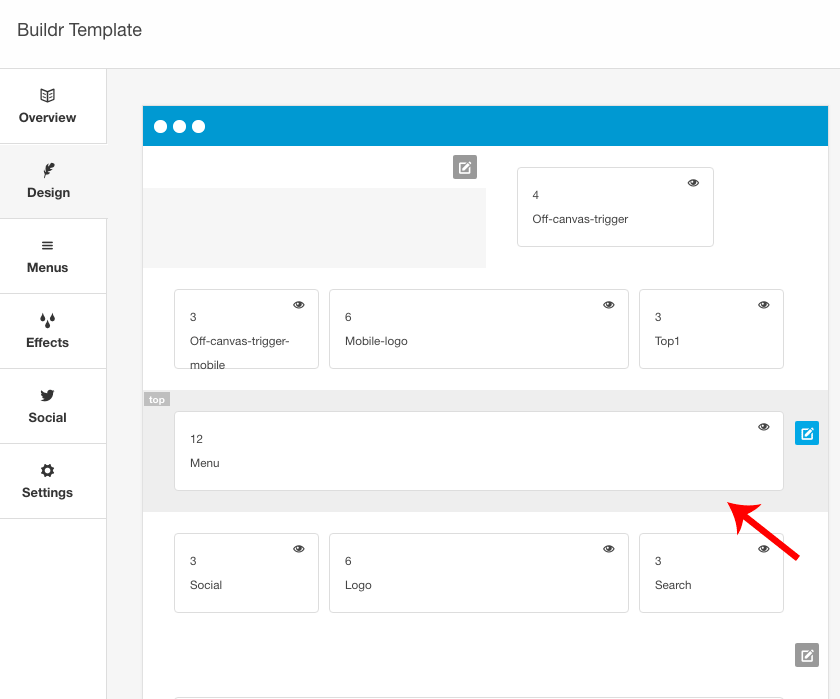
On the demo site, the menu is in the top position, however, it can be moved to another row.
COLOURS
First of all select the colours you want to display - you can find all colours here. After you the select the colour to use, go to your Joomla Administrator area and in the top menu area, go to
menu > Main Menu > [YOUR MENU]

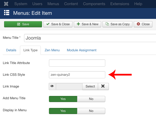
Open the Menu Item that you want to change the colour of and click on the tab Link Type. You will see a field Link CSS Style, just add the desired class to this field and the menu will get the colour you applied.
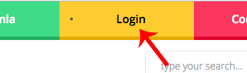
You can do even more here... If the menu colour you chose is light, you might want to have a dark text color. You can achieve this by using an additional complimentary class.
Example
zen-senary2 zen-menu-text-dark
You can see this example applied to the Login Menu Item on our Colourshift2 demo.
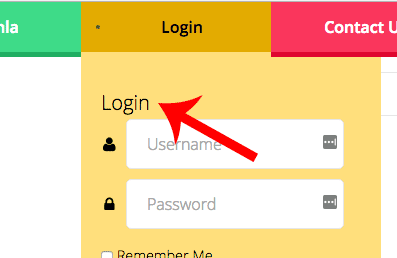
If you want to make the submenus have dark text as well, you can use the following class:
zen-submenu-text-dark
You can see an example of a submenu with dark text on our Colourshift2 demo under menu items Joomla and Login
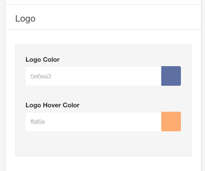
The logo in the Colourshift2 template uses a custom html module published to the logo position.
The markup used in this position is:
<h1>Colour <span>shift</span></h1>To set the colours, just choose using the editor panel on Buildr. Use the Logo Hover Colour option, to set the shift part of the logo.
The social icons in the top left hand corner are rendered via the template.
To control the position of the social icons navigate to the design panel in the template settings. The social icons can be placed anywhere in the template layout. The demo features the social icons displayed in the left of the logo row.
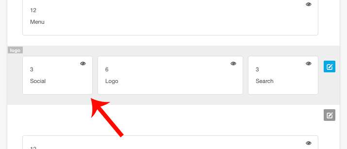
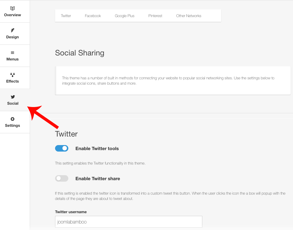
The content for the social icons can be set in the social tab of the template panel.
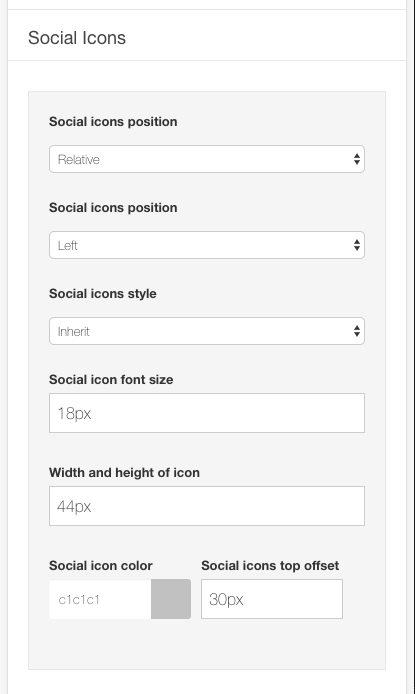
The colour, size and other aspects of the social icon appearance can be controlled via the general settings side panel in the template's design tab.
On the demo, when the template is viewed on smaller screens, the social icons are no longer displayed in the top left of the screen, but are moved to the bottom.

This is achieved by adding the social-mobile block from the top row to the bottom position.
The slideshow used in the Colourshift2 demo features a new type of slideshow which is not currently available in Zentools2, instead, it is only available for the Colourshift theme.
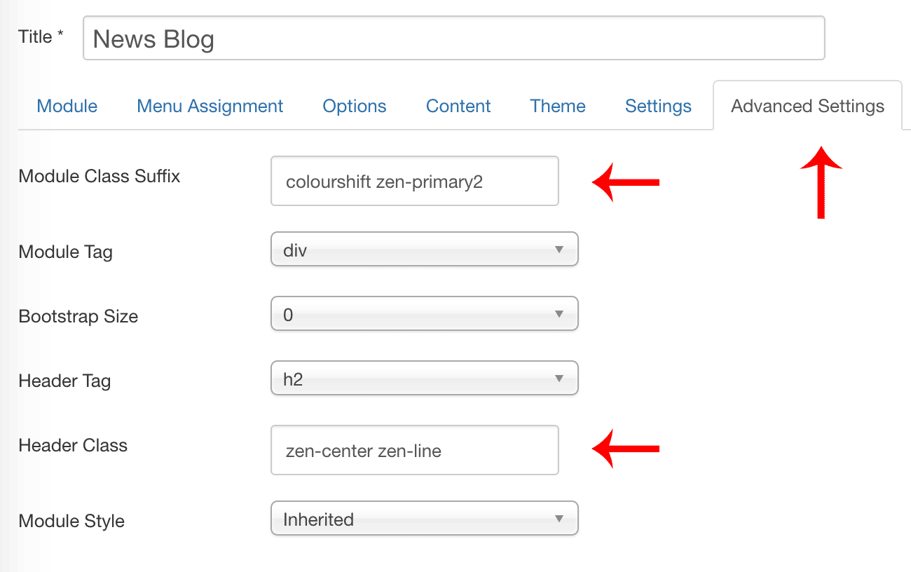
The slideshow is a adaptation of the Slideshow Hero layout and uses additional CSS only available in the Colourshift child theme (applied using a module class suffix in the modules advanced parameters tab).
colourshift

The slideshow features a number of options, as per the screenshot below, including:
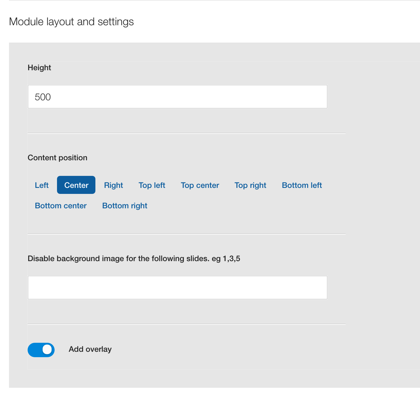
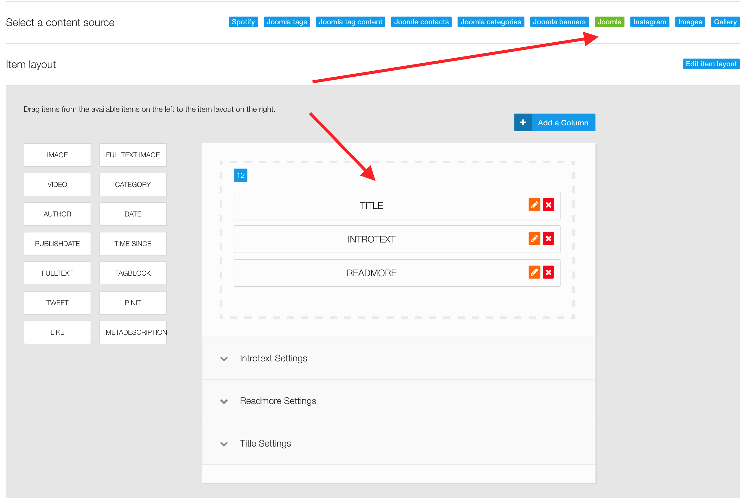
The demo for Colourshift2 uses the title, introtext and readmore elements in the main content area and uses Joomla as the content source.
The image is automatically retrieved from the item currently set to display however if the image doesn't exist then the slideshow will display a blank tile which uses the primary color set in the Zentools2 theme panel.
The Colourshift2 Template brings a new feature to ZGFv5 (ZenGrid Framework Version 5), this is the ability to override the .xml files in order to add or remove fields.
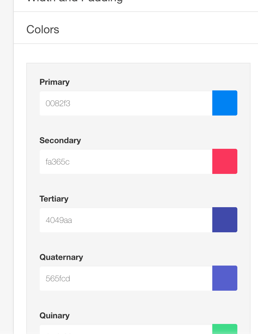
In this template, we added an override that adds extra colors, and based on those colours, we can set variations for menu items and modules.
Just go to the Colour section on any item and choose your own colours.
New Classes were introduced in the Colourshift2 Theme - you can look at these classes in the Modules Variations Page.